Vozhegov Ivan
New Member
August 18, 2026
Question

Figma folders

  • August 18, 2026
  • 44 replies
  • 805 views

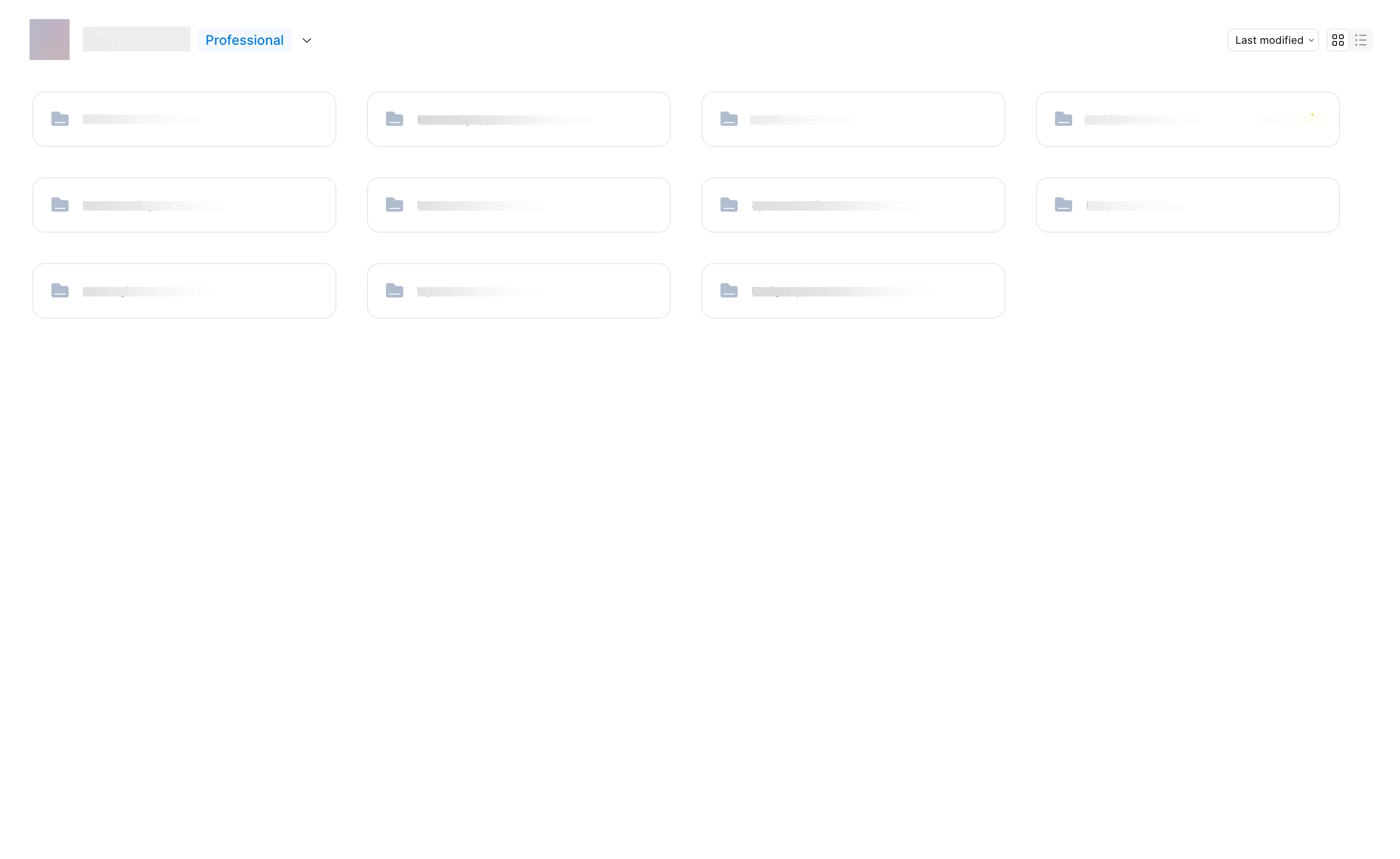
I’m working with a team on a large project, and we have a complex file structure. Removing the file previews has made it much harder to navigate our file system. Each group of files has its own color; previously, you could just glance at the main screen and understand where to go or see the file name in the preview. With only the folder icon and name, it’s much harder to remember where something is located. Please give us the option to revert to the previous interface with clear file previews.



44 replies

Gayani_S
Figmate
Community Support
August 18, 2026

Hey ​@Vozhegov Ivan, thanks for reaching out! I completely understand the frustration, when you're navigating a complex file structure with a team, being able to scan visually instead of reading every name makes a real difference.

As part of a recent update to how content is organized in Figma, projects were renamed to folders (with a few other changes like nesting and simplified sharing). One side effect is that folder tiles in the file browser no longer show file preview thumbnails the way project tiles used to, so you lose that at-a-glance color cue from your files' cover images.

I can't bring back the file preview thumbnails, but you can now color-code folders directly, which gets you back some of that visual scanning:

  1. Open the folder from your file browser.
  2. Next to the folder name, click the folder dropdown.
  3. Select Change folder color.
  4. Choose the color you'd like.

You can find the full walkthrough in Create and manage folders.

I know this isn't a complete substitute for seeing actual file previews, but I've passed this feedback along to our team.


Let me know if you run into any issues setting up the folder colors, or if there's anything else I can help with!

Tom Spetter
New Member
August 18, 2026

Adding my voice to this, and I'd like to explain why folder colour doesn't solve the problem.

Cover thumbnails gave us a unique images per folder. Our brains recognize a picture almost instantly, without reading. A 36px icon with a slight tint gives us far less to work with, and the tints sit in such a narrow tonal range that pink and purple read as nearly the same colour at that size. So instead of recognizing a folder, we're back to reading every name in the list.

There's an accessibility angle too. When colour is the only way to tell items apart, it fails for anyone with a colour vision difference, and low-contrast tints at small sizes are hard for a lot of people to distinguish. Thumbnails carried logos, shape, layout and text, so they worked without relying on colour alone.

Could thumbnail view come back as an optional setting? People who prefer the compact folder list keep what they have, and teams with large file structures get their visual scanning back. That seems like the fix that serves everyone.

Jaycee Lewis
Figmate
Figmate
August 18, 2026

Hey ​@Tom Spetter  ​@Vozhegov Ivan  👋 stepping in for ​@Gayani_S 🤩 I shared your feedback with the team. I don’t have an update to share at this time. And I’ll follow up here if I do. Thanks again! — Jaycee 

Iain M Norman
New Participant
August 19, 2026

Absolutely! We rely a lot on those project previews here for quick visual acquisition. 

I’d like to see the option to toggle the old project card view that shows the files within.
But I’d also like a way to show a single card for those very busy projects, not sure where we’d pull that from or if it would just be attaching an image like one does for a user avatar?

Maksym Hordiienko
New Member
August 19, 2026

Hey ​@Vozhegov Ivan, thanks for reaching out! I completely understand the frustration, when you're navigating a complex file structure with a team, being able to scan visually instead of reading every name makes a real difference.

As part of a recent update to how content is organized in Figma, projects were renamed to folders (with a few other changes like nesting and simplified sharing). One side effect is that folder tiles in the file browser no longer show file preview thumbnails the way project tiles used to, so you lose that at-a-glance color cue from your files' cover images.

I can't bring back the file preview thumbnails, but you can now color-code folders directly, which gets you back some of that visual scanning:

  1. Open the folder from your file browser.
  2. Next to the folder name, click the folder dropdown.
  3. Select Change folder color.
  4. Choose the color you'd like.

You can find the full walkthrough in Create and manage folders.

I know this isn't a complete substitute for seeing actual file previews, but I've passed this feedback along to our team.


Let me know if you run into any issues setting up the folder colors, or if there's anything else I can help with!

Please bring back the Projects-style view inside Teams

When nested folders were announced, our team was genuinely excited — we assumed folders would work *inside* projects, adding a deeper level of organization. Instead, folders fully replaced projects, and the team page took a big step back in usability.

What we lost:

The old Projects view showed each project as a large card with thumbnails of recently used files. That was our main navigation pattern: open the team, visually spot the file you worked on yesterday, jump straight into it with one click. Now every top-level folder is a small, identical row — just an icon and a name. No previews, no visual hierarchy, nothing to scan. Finding a file now takes several extra clicks and you have to remember exactly where everything lives instead of recognizing it visually.

I'm attaching two screenshots: how the team page looked before (project cards with file previews) and how it looks now (flat rows of folders).

What we're asking for:

1. Bring back the card/grid view with recent-file previews for top-level folders inside a Team — at least as a view option. Nested folders are a great addition, but they shouldn't have removed the browsing experience that made Projects work.
2. Invest more in the folder UI itself. Right now it honestly looks unfinished: folder covers or auto-previews from files inside, larger card sizes, and better visual differentiation would go a long way.

Nested folders solve a real problem — but replacing the Projects view instead of extending it broke a daily workflow for teams like ours. Please give us the visual, preview-based team page back.

Miranda Dietrich
New Member
August 19, 2026

Adding my frustration on this. I would love if there was at least the option to go back to the old version of viewing Figma Folders. I’m constantly going back and forth now to get to my files. 

New Member
August 19, 2026

Designers are highly visual people. Losing the preview is frustrating. Plus changing the color of the folder that have little to no contrast between the colors is pointless. The scanability is just not there.

If we can bring back the preview (or provide the option to) + improved color contrast between the folders would be great.

- M
New Member
August 19, 2026

Please bring back the project previews for those folders, the thumbnails help to locate the files! The new grid view is almost the same as that table view, which doesn’t make sense.


hum_stevie
New Member
August 19, 2026

Adding to the feedback here, it's been frustrating as designers to navigate projects when even the folder descriptions aren't visible alongside the title and icon. For our Product and Content teams, however, it has been borderline non-functional. Even the ability to use an emoji instead of a generic colored folder icon would be extremely helpful in improving discoverability here.

dani321
New Member
August 19, 2026

Echoing what’s already been said. It’s very hard to know what’s in a folder without the thumbnails. Color of a folder does not mean much. I’m not sure what a color would do to explain what is inside. Seeing the actual files within it is the most important thing. There is also no longer a count for how many files are in a folder either so it’s unclear if anything is in there.


I appreciate that we are now able to add subfolders into a folder, but without seeing what is in those folders it is just a recipe for losing files.