same after the latest update! i was gonna report this too. just at the right time i need to screenshots them all and document it, now I need to wait this until it’s fixed.
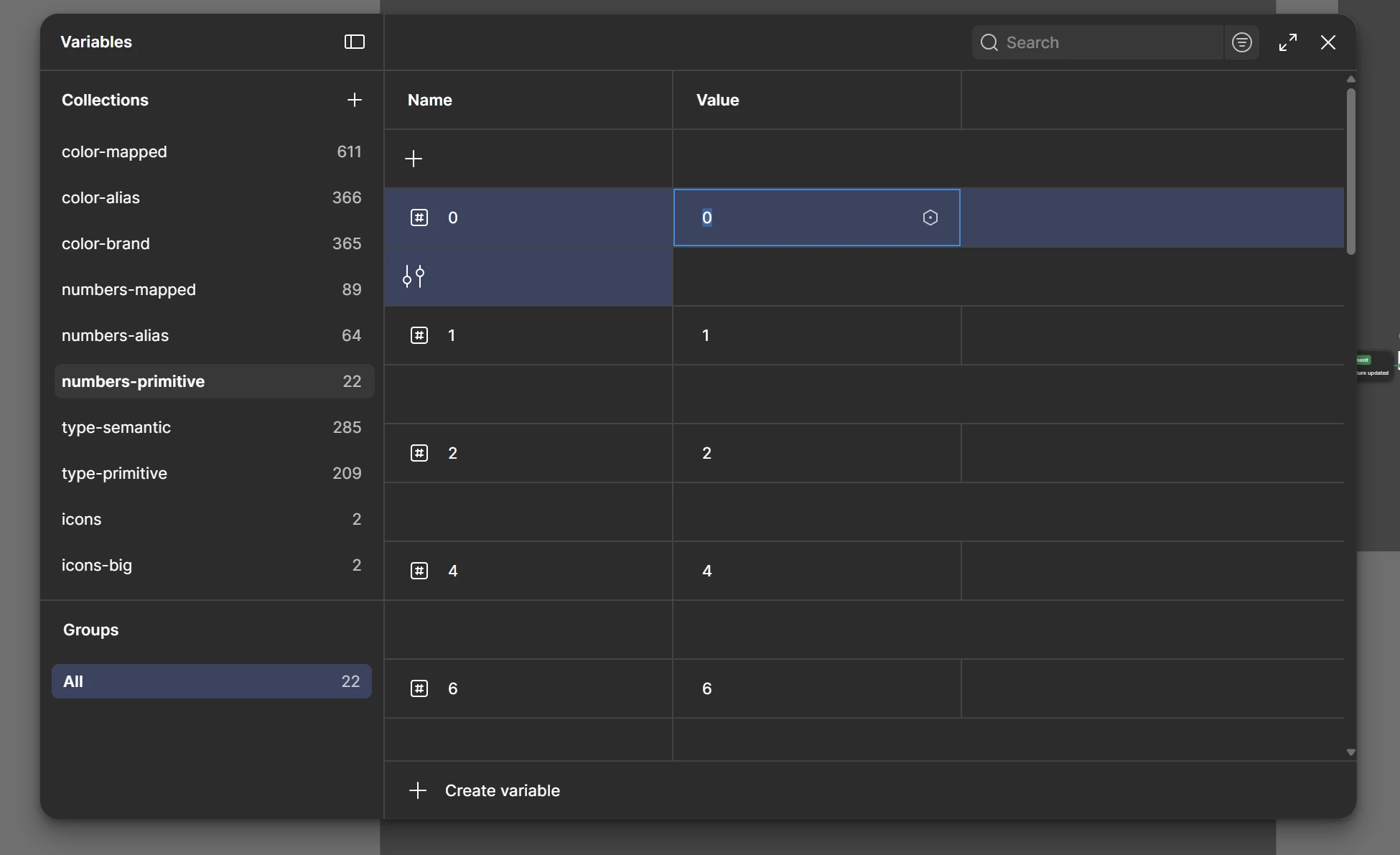
Logged in this morning to find the variables are split with the ‘edit variable’ now appearing under the variable info. I’m on a 27” screen with only one mode.
I’m not sure if this is an intentional update or a bug, but the Variables panel now displays items in two rows instead of a single continuous list. This makes it much harder to quickly visualise and compare all variables within a collection at once, especially for larger collections.
Since very recently variables on the variables panel use 2 rows instead of one. It seems it’s an UI bug. The settings icon breaks to another like so everything takes double space.

Same issue. Found today. Super uncomformable and problematic to use. In my case columns aren’t resizable, so string variables (especially with long names) are hard to view.
Having the same issue, started today. Would be great to resolve. It looks like it’s the ‘edit variable’ button that got pushed down and it now takes the whole row. Surely UI bug? Thanks!
The new layout in the Beta version of Figma has a spacing row between each variable which only has the “configuration” control within it for the row above. This makes viewing variables very painful as they are now so spread vertically and you can only fit half as many items on the page.
Came to confirm that it was a known bug and not just a glitch on my side. Surprisingly hard to use event though you wouldn't think it were an issue. Seems fixed now.