My organization has a product that we are white-labeling. This is our first time white-labeling the product, so I am trying to set up a good system for my variables so that as we grow, it is easy to add new white-label brands.


I have set up 5 variable collections, following the instructions from this video: https://www.youtube.com/watch?v=rQqueggLBfs.


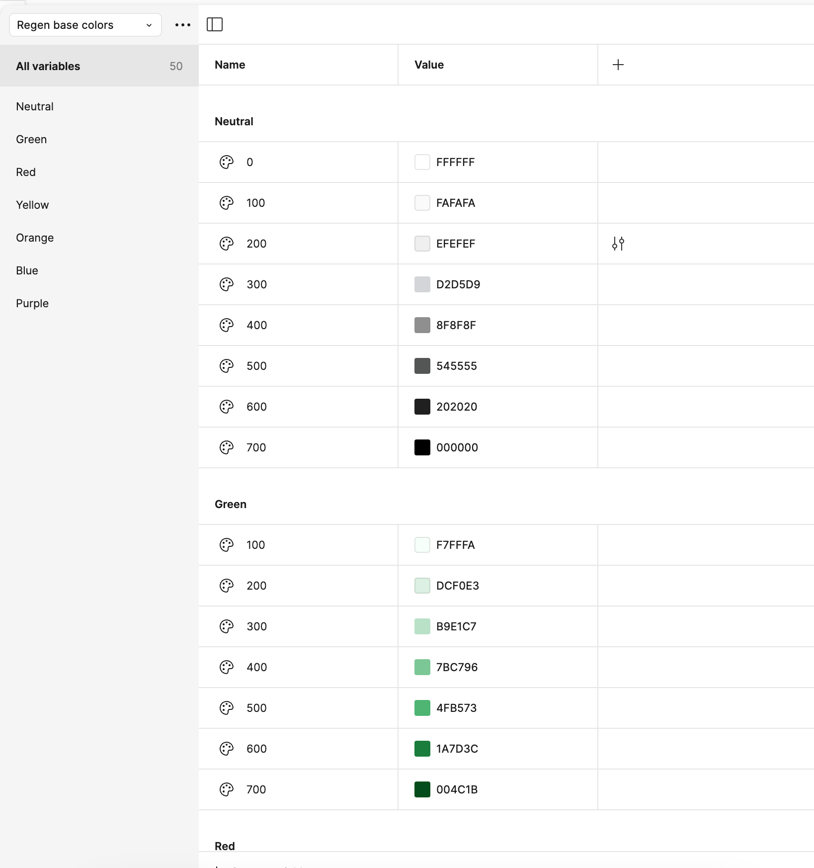
This is the main brand’s base color variable collection:


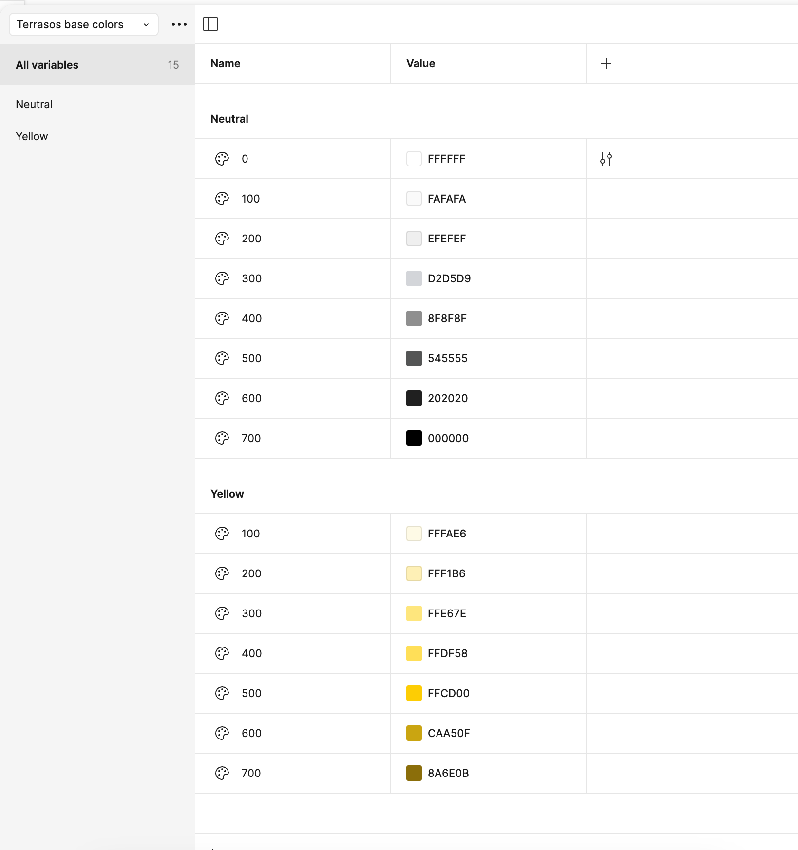
This is the white-label brand’s base color variable collection (still incomplete because I didn’t want to do more while this approach is still not working):


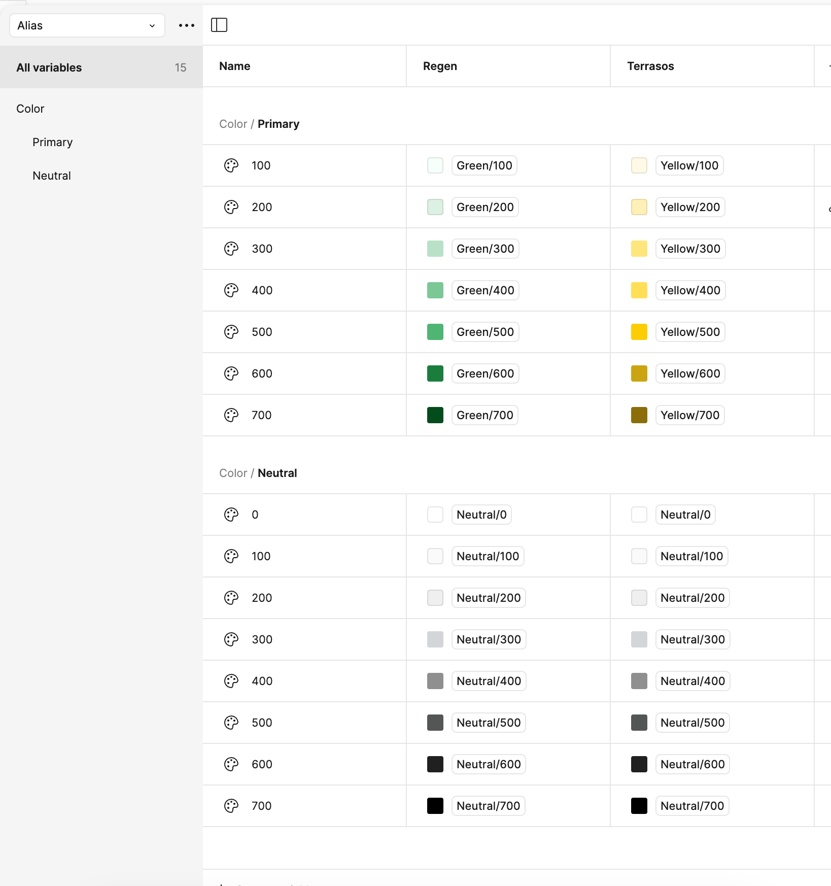
Here is my alias collection (I have not finished building it out as it does not seem to be working as intended):


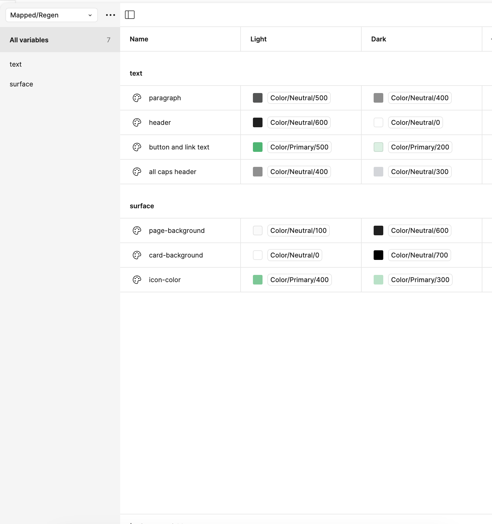
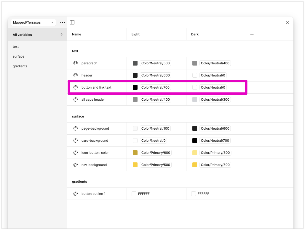
Here is the Mapped collection for the main brand:


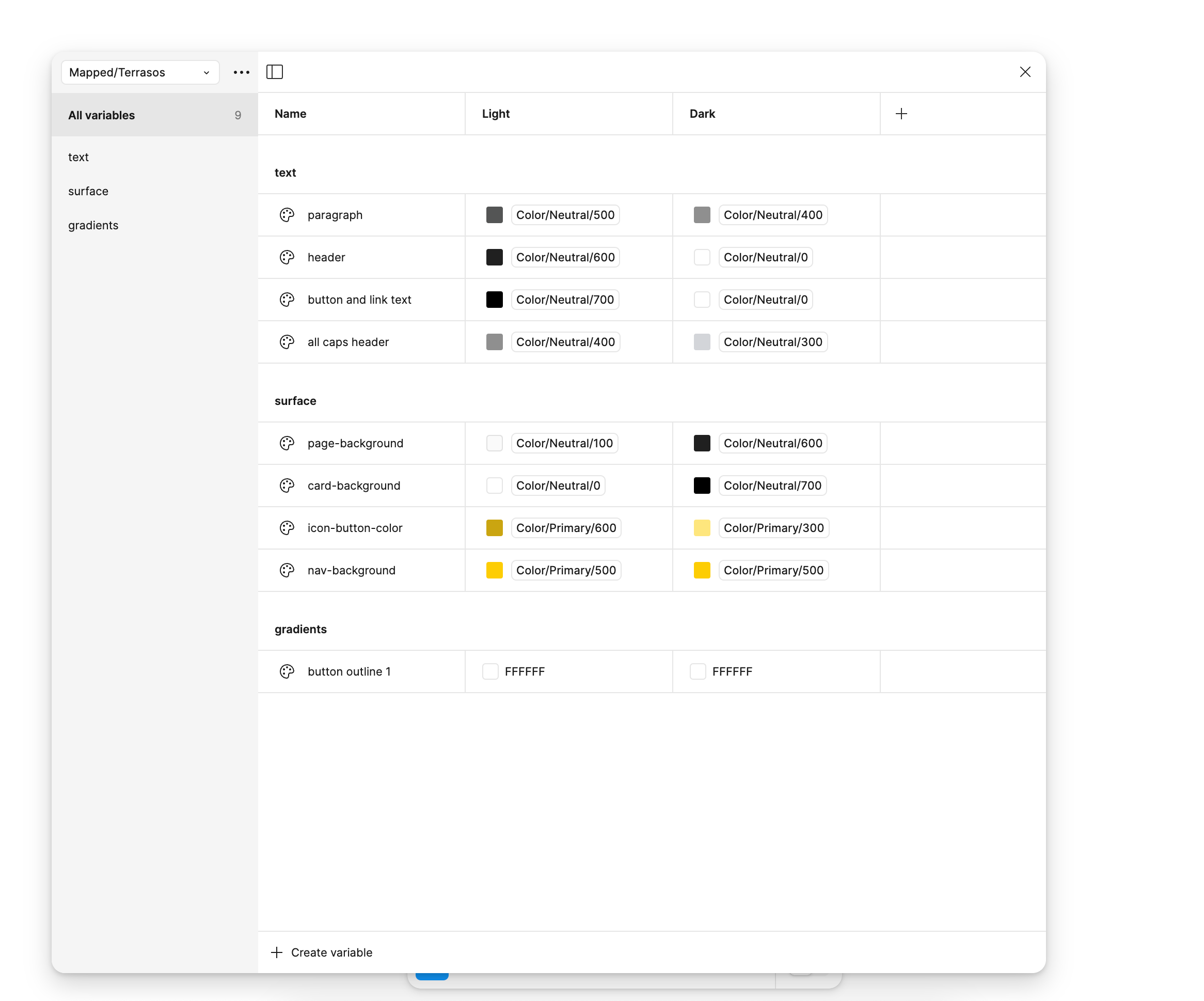
And the Mapped collection for the white-label brand:


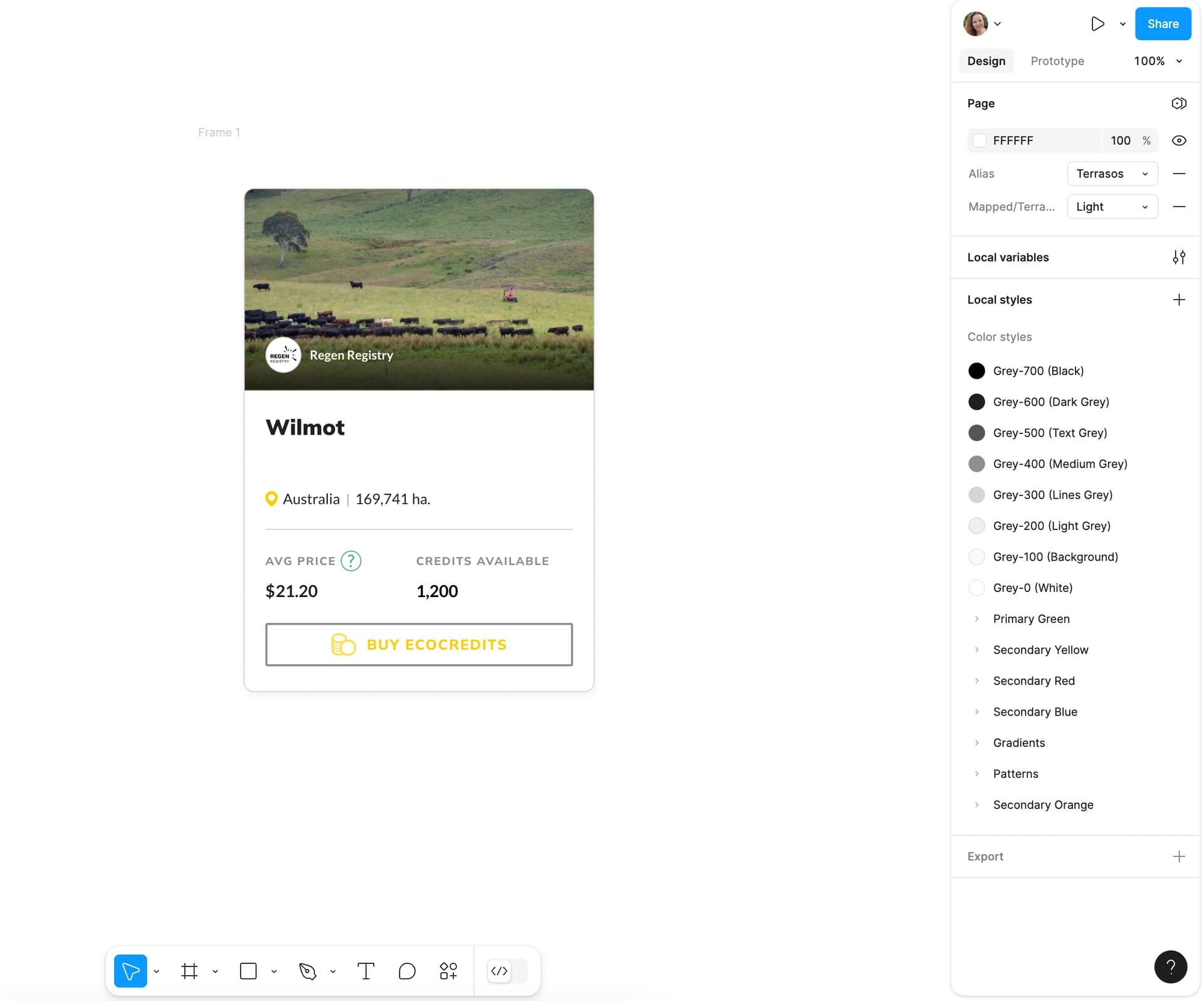
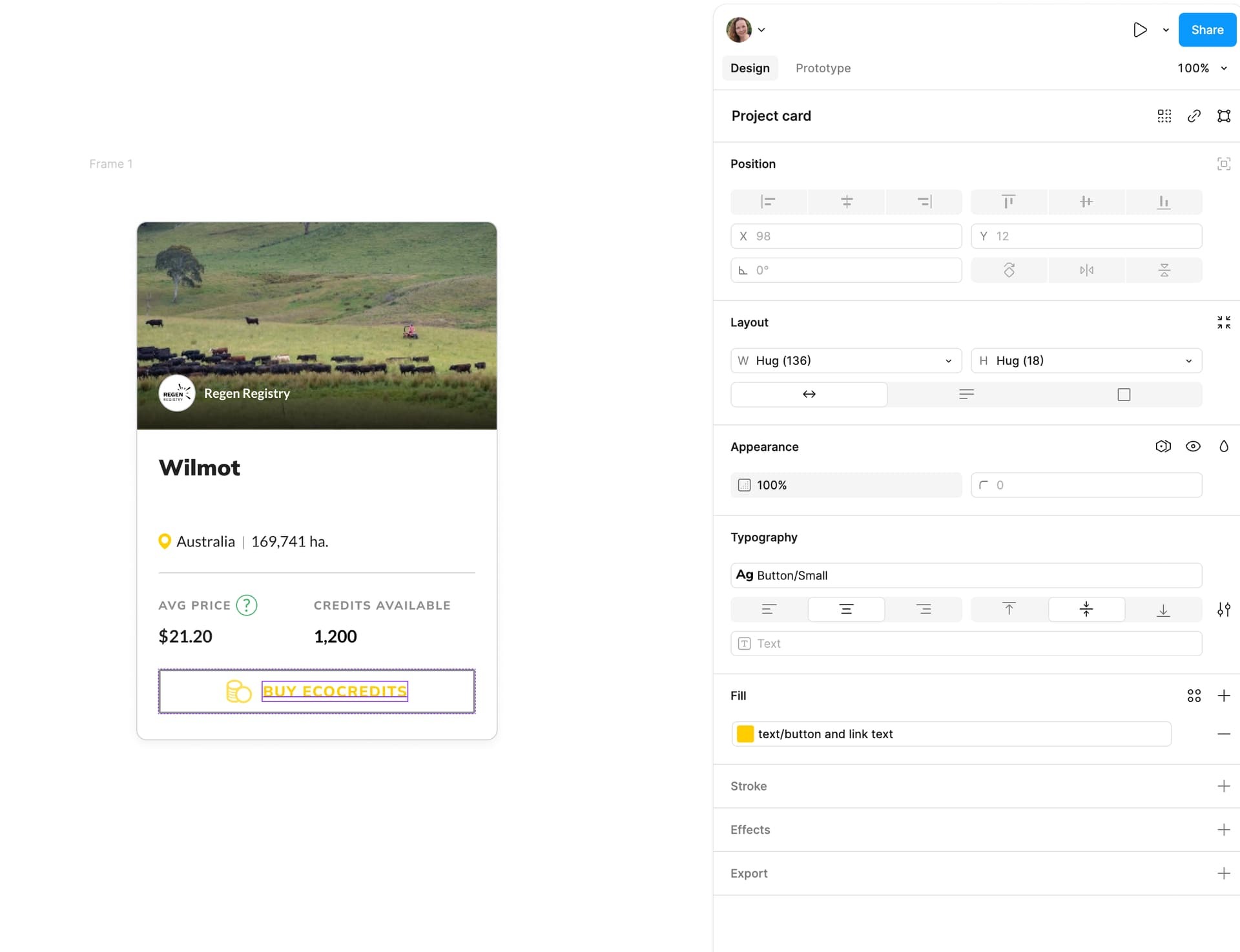
As a simple example, here is a component that I am wanting to turn from the main brand (green) to the white-label brand (yellow and black). What it appears to be doing is changing the alias colors from the main brand (Regen) to the white-label brand (Terrasos), but essentially ignoring the Mapped collections. As you can see below the button text color is this unreadable yellow color, even though I have it mapped in my Mapped/Terrasos collection to be black actually in light mode.


Can someone please tell me what I am doing wrong here? I am tempted to ditch Figma Variables altogether and try out Token Studio, or to ditch the Alias level and combine the two Mapped collections into one file with four modes, one light and one dark for each brand. However, everything I’ve read about variables is that having the Alias level is the way to go, and this guy in the YouTube video seems pretty knowledgable, so I don’t understand why his approach does not seem to be working for me.


Thank you!

It seems I can’t edit posts so here is the white-label brand’s base color collection, I put the wrong screenshot above for the second screenshot.


When you select rouge text layer, what it shows in props panel? Which variable is bound? Does default theme work?


Thanks for replying! The button and link text variable is bound but it is showing as yellow instead of the black that I defined in the Mapped/Terrasos collection. Any idea what I’m doing wrong here?


Doesn’t seem so obvious, hard to say without digging into a file. Is there like multiple aliases somewhere?


The only thing I can think of is that there are chain of aliases and some modes are conflicting


I only have one alias file and then the two mapped files that reference the one alias file.


How do modes generally conflict in your experience?


Did you ever find a solution?

I have the same issue now.


Yes, the solution that I used in the end was not to have two Mapped collections, but just one with 4 columns called “Mapped” with each brand in light and dark mode. Now if I switch the alias and the mapped modes to the brand I want, it works correctly. I think this is fine, though that Mapped collection will get quite big as we add more brands, but I couldn’t get it to work otherwise.


Can you post a screen shot of the solution please? @Erika_Logie


Hey @Erika_Logie,


I was also struggling with setting up variables for multiple products. The issue with the video you describe (from what I can see) is that it is set up in a way that you use the same color value for a the same element in all the products. I.e. the primary button color for product A and B is primary 400. But that might not always be the case. Product B could use primary 600 as the primary color.


The problem I encountered for example is that the color of the button-text for product A is white and black for product B. That’s quite a challenge if you want to variables in a way that you can automatically switch between products-themes and light and dark mode.

To make it even worse we work with the Material UI framework which consists of hundreds of components that are already mapped to a default ‘pallette’ collection which you can’t change because of development issues.


The way I solved it is creating 3 collections:


  1. Collection Brand colors:

    ONE collection with ONE mode of all the colours across all products. Every color has around 10 shades, 50, 100, 200, etc. following the Material system


  2. Collection Product:

    THREE modes, for each product ONE mode (depends on your number of products, we have three), here I made a variable for every color that doesn’t align across the products. Like I mentioned earlier the primaryButton-text needs to be white in product A and black in product B. In this collection I mapped the colors to the right color in the Brand colors.


  3. Collection Pallette:

    Material UI has a standard collection called ‘Pallette’. This collection has TWO modes, lights and dark. Almost all colors from Palette are by default mapped to the brand collection. But to make it work for multiple products I mapped the colors that did not align across the products to a variable in the product collection.


An example: I created variables for the following in the product collection:

-primary button color in light mode

-primary button color in dark mode

-text color on primary button light mode

-text color on primary button dark mode


And I mapped the primarybutton-light variable from the pallette collection to the

right variable in the product collection, which is again mapped to the brand colors collection.


I had to create lots more but that is because we have lots of differences in colors across our products. If you are smart you try to get that to a minimum.


Bottom line is that if you want to create a system for different products and use light and dark modes you need to build a collection layer between your brand colors and the light/dark mode collection. Make sure that from your design you always map your colours to the light/dark mode collection (Pallette in my example) and only make changes in the products collection. Good luck!


Reply