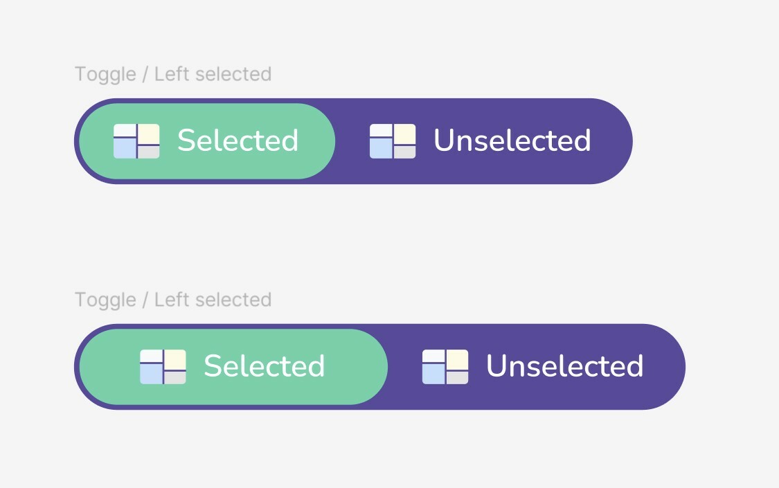
I want to create a responsive toggle element for my design system, with a text+image label for both sides (selected / unselected states).
The text length may be different depending on the feature.
But, I want my toggle to do an equal width for both sides, adding padding where needed to the side with shorter text, to ensure the “split” between the 2 is in the middle of the element.
To show what I mean, the top image is the current implementation using hug/auto layouts and padding - the shorter label’s side is narrower.
I want to achieve the bottom variant, obviously I can do it by hand but I want to make the component responsive so I can type whatever label I want and it would do it? Is this possible?

