

Maybe its because I’m almost 50 years old, but the arrows on the Start and End point interface are hardly visible for me (and maybe others too).
Can’t these be a little bit more exaggerated?
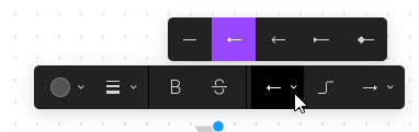
Current view:
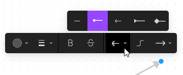
A subtle increase (faked it, within FigJam):
PS: Maybe this difference in size also applies to more of the interfaces, like for instance Figma itself. I think this would improve usability of your product, for all generations/users!