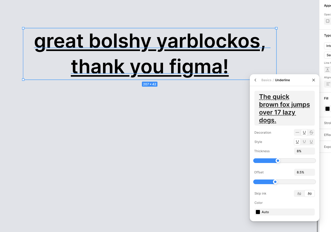
Underlines have been broken since I started using Figma when it first came out. It is the only thing that frustrates me (this program is perfect in every other way, seriously).
There have been several tickets opened about it that were auto-closed due to inactivity:
- Text underline "ink skip"
- Fancier underlines for links
- Type setting for underline to ignore descenders
The basic problem (and I will re-use an image from that first link, thank you @jdb) is that descenders (seen on glyphs like “g” or “j”) are overlapped by the underline in text elements. The top example (without ink skip) is the way it currently works, and the bottom (with ink skip) is the default behavior in web browsers and is currently not possible in Figma:
Is there a possibility that we can get a font option to allow for this behavior? As @Lino_Ramirez and @Gary_Tam have mentioned, this is a CSS option that can be configured.
I understand that it’s most likely not as easy as adding an option to enable some CSS property, but I would love to hear if others are in favor of this functionality! Or if there are inherent limitations with WebGL, etc. Thank you!


