Parent/Child boolean property logic

Today I was trying to create a very flexible input component using the new Figma features. Namely, the boolean show/hide properties you enable in the Layer panel.

I tried adding a boolean property to a button inside a Label area of an input. And then added a boolean to the Label area. However, when I hide the Label in an instance, the Button toggle remains visible.

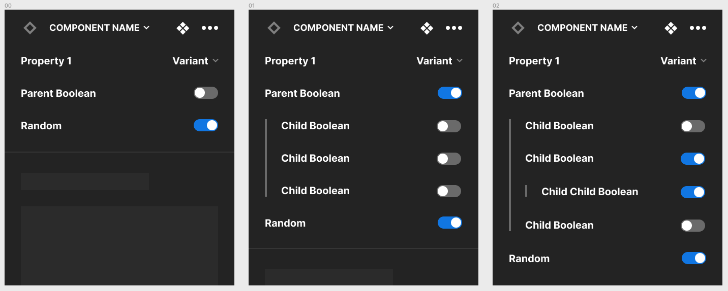
In my head, if you hide the parent, why would you need to show the controls for a hidden child element?

I mocked up this idea for nested booleans that would only show if the parent would be enabled.

I can see it becoming too complex if we had letā€™s say 4 levels down. So no idea how to solve that one. :slight_smile:

Or maybe an option to show properties of nested symbols? Who knows.

Thanks for your time! Would love to hear your suggestions or if Iā€™m doing something wrong.

2 Likes

Thank you for sharing this Omar! I just came here to suggest the exact same thing ā€” the variant properties for my card component are getting out of control; I have on/off for each row of possible content, and then 3-5 more properties within each row for possible content that I wish would be hidden if that whole rowā€™s boolean property = False.

Also I love the idea of showing the properties for nested symbols; Iā€™ve been duplicating them for the parent properties so that I donā€™t have to select the nested component itself to make changes.

2 Likes

Definitely seems messy if you go down too deep but I think for most cases it could work. Iā€™m definitely interested in booleans being nested to reduce component complexity greatly.

Hi there.

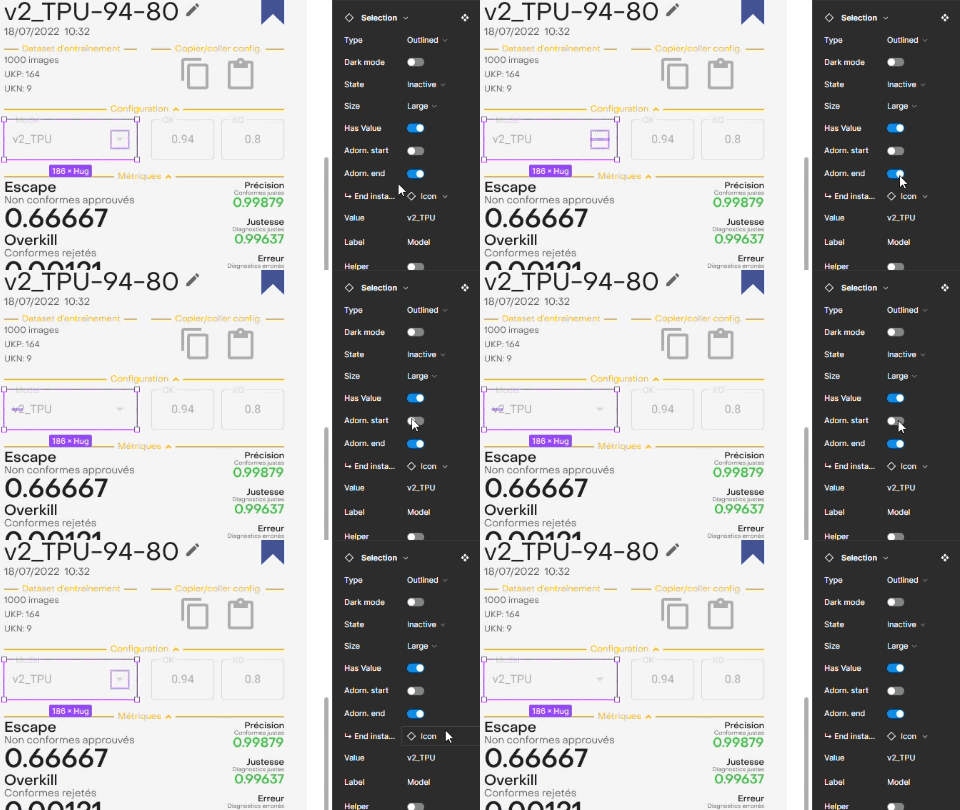
Iā€™m not sure this is what youā€™re trying to achieve, but you can have properties of child components disappear from the panel if theyā€™re inside a hidden parent component. Itā€™s kind of dependent on the structure of your component, I believe. In order for the child component property to disappear when the parent component is toggled to ā€˜falseā€™, the child component needs to be nested inside the parent component, or at least it does with the instance swap property I set up on the example below. Additionally, you can add a special arrow character (ā†³ ) in the name of that child componentā€™s property to give the illusion itā€™s ā€œunderā€ the parent component property.
Figma_subcomponent-property

1 Like

Hey there.

the idea of naming is quite impressive. However, that only helps if the property we want to hide is the one that has the boolean property. sometimes, you have many frames that you want to set the boolean property on a parent frame. child properties would be good to hide or somehow be shown in a hierarchy.

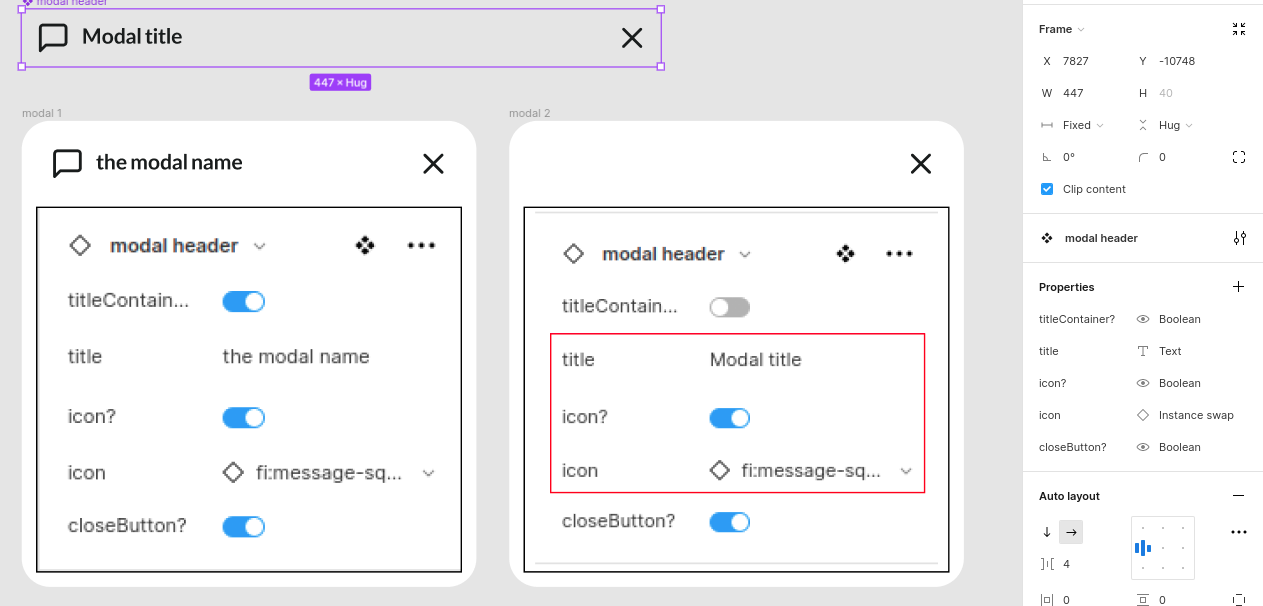
see this example. letā€™s assume we have a modal header component, sometimes, the header doesnā€™t need a title and icon, we can set a boolean property for the parent of the title and icon. of course, we need a text property inside for the title and an instance property for the icon. it would be great if inside properties would hide by turning off the parent boolean. see this image below, the red box is the one we like to hide after turning it off.

there are much more examples and of course, there are not-so satisfying solutions for them, but this feature can be the thing we need. :smiley:
hope it helps.

For me this is becoming more and more important. Imagine I have an auto-layout with content on the left, and actions on the right. In the actions auto-layout, I have two icons. Right now, I can add booleans to toggle on and off either of the icons. If I toggle just one of them off, things behave properly. But if I toggle off the second icon, the ā€˜actionsā€™ container continues to take up space, even though I currently have no visible items in it. To resolve this, I add a boolean to the actions container to toggle its visibility.

But then I have three toggles - one for Actions, one for Action One, and one for Action Two. Turning off the parent still leaves you with the other two, and you need to manually turn them off as well. No amount of reordering ā€˜nestsā€™ these items. Messy and non-intuitive for the end user. It would be fantastic to have this as an option - even if limited to a set number of levels.

1 Like

This topic was automatically closed 90 days after the last reply. New replies are no longer allowed.