Any chance to get a response?
Came across the same issue.
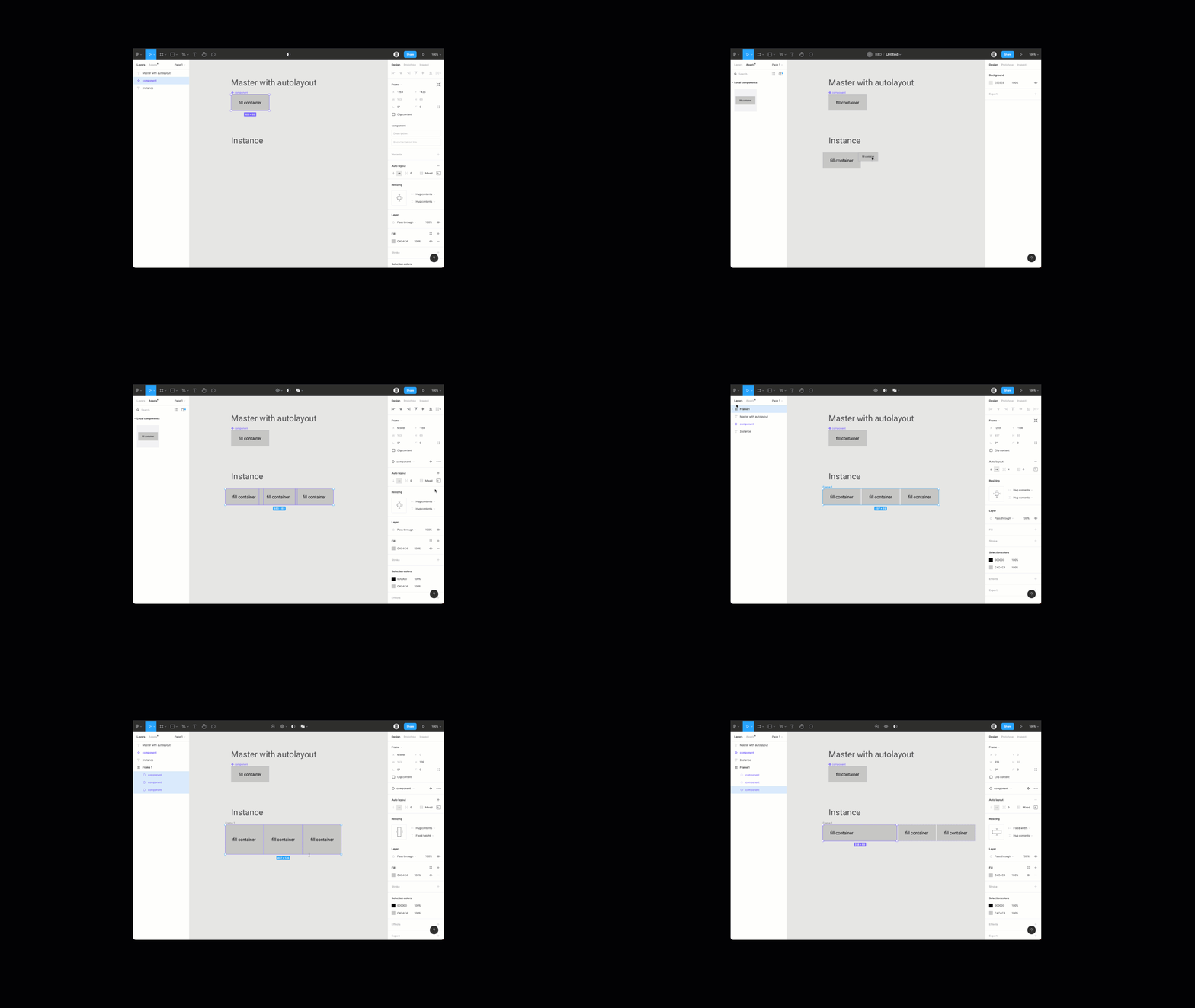
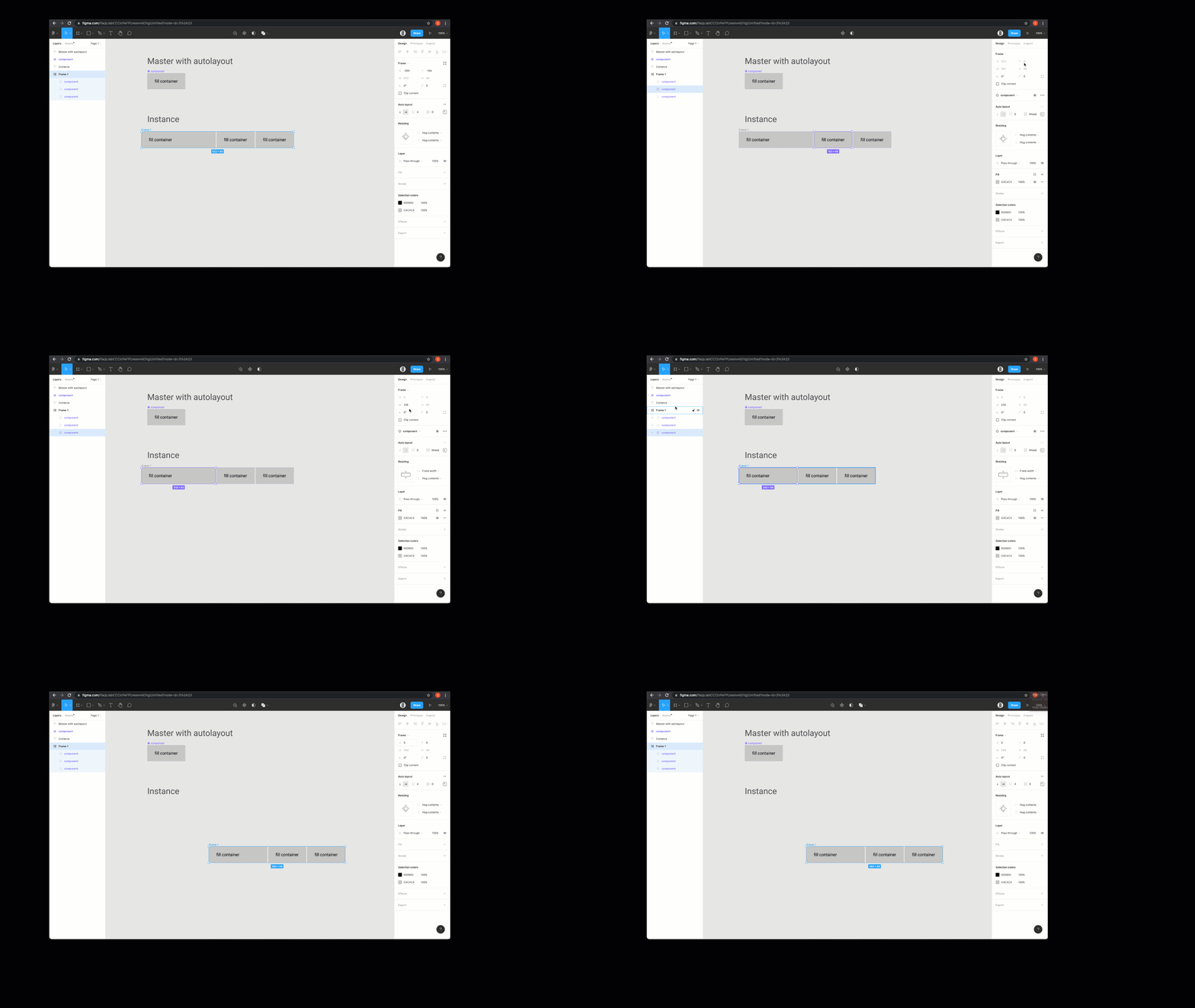
I’ve made an exact copy of your file, check out the video below.

As far as overriding the X and Y, looks like you just ned to be on the correct layer. Video below.

Looks like you just need to select the correct layers in both cases, hope these help.
@sous, please note that you are trying a completely different scenario in the above video and screenshot.
What you are showing:
You are resizing instances as a whole, which are placed inside a regular autolayout frame, not a parent component instance. Resizing this way is possible, but does not allow creation of a master component for a data grid / table for example. Not even a row or a column. Just cells.
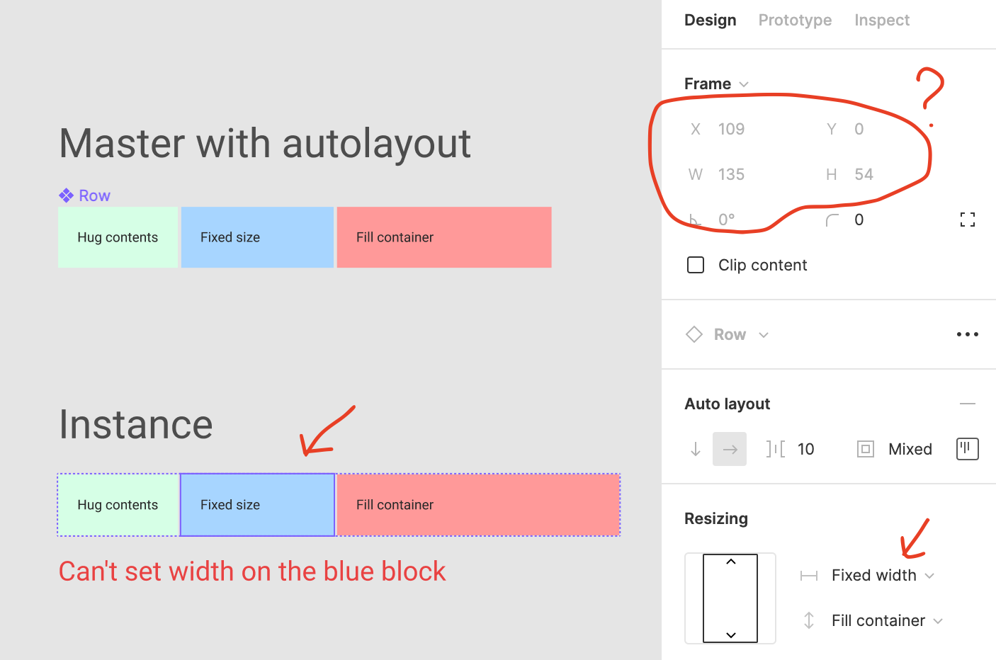
What I am trying to do:
Create a master component and name it ‘Parent’. Create a few squares INSIDE the Parent and name them ‘Child’. Set the width of Child to fixed. Now create an instance of the Parent. Inside this new Parent instance, try to set width in px to any Child. You can’t. That is the problem.
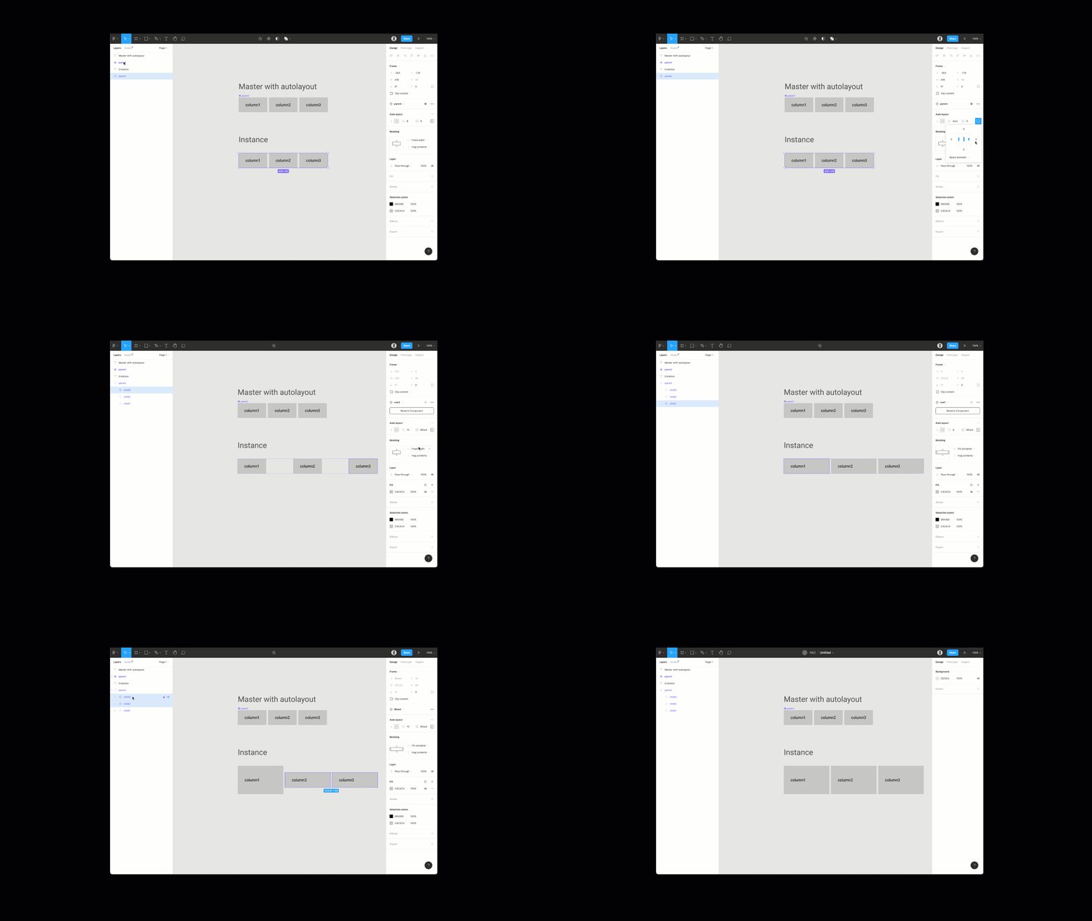
Thanks, great explanation to your problem. Can you try this?

This is currently expected behavior and therefore not a bug. You basically hit a wall in what Figma is currently capable. Layout/Sizing is a very complex topic but I’m sure there will be a better solution in the near future.
As a workaround you could add different column width presets as variants (column narrow, column default, column wide) and then switch the instance accordingly (the auto layout should shift the content accordingly).
@Marci Auch. I was afraid of that.
Adding something like 10 basic sizes to 12 already existing cell types would force us to create 120 variants. And we haven’t even started on states, where adding just 1 state would double the variants to 240. This workaround is quite costly and not worth the effort.
Without this ability we are losing on so many more abilities, like setting up component modules, with nested resizable instances, across all of our design system.
Is this already on the roadmap?
This would be an amazing feature. I’ve also encountered this problem when designing tables. And now again when designing templates with very set-constraints so other people can build designs/graphs quite easily, without messing with the design-system.
Is there any chance this will be implemented??
This topic was automatically closed 30 days after the last reply. New replies are no longer allowed.
- Describe the problem your experiencing and how your idea helps solve this
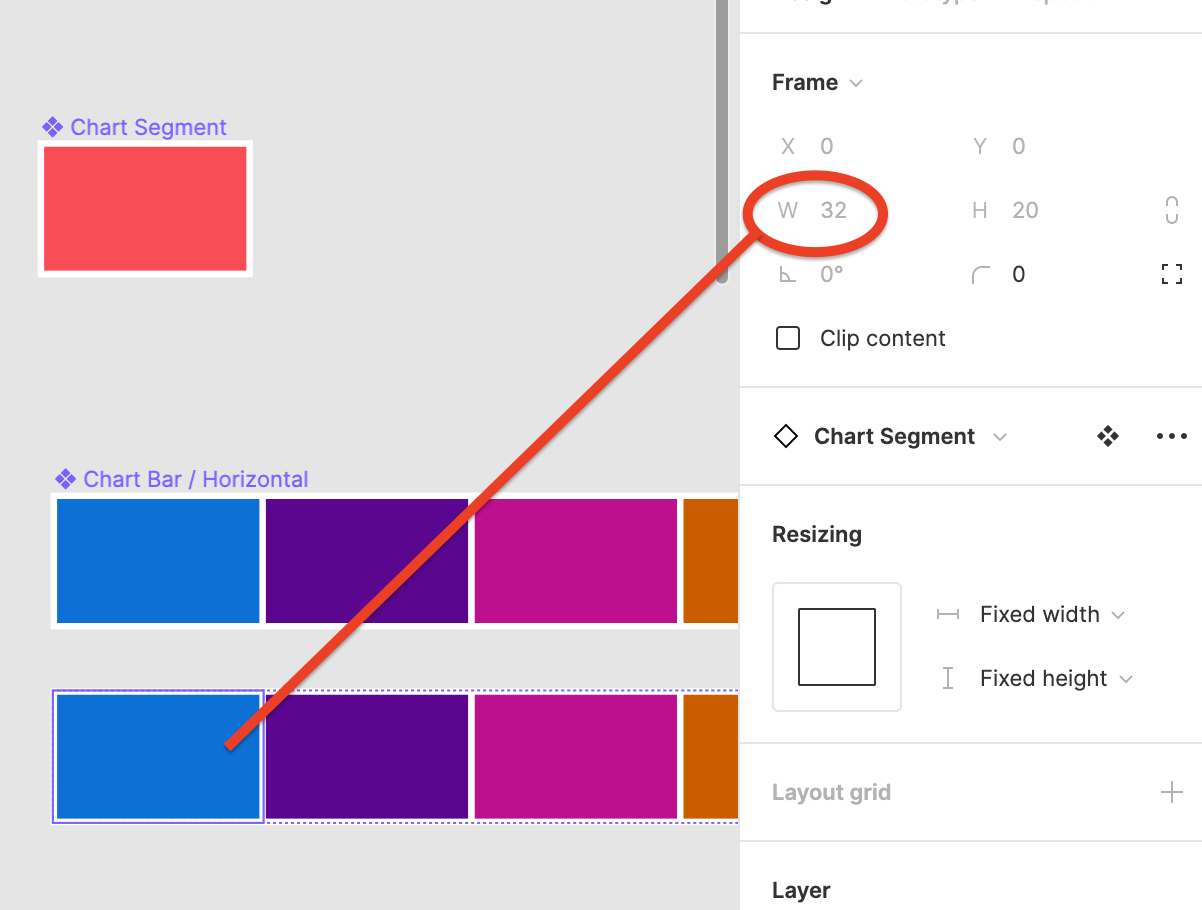
I’m working on data vis components. The atoms can’t be resized when they’re nested in a higher level component. For example, a stacked bar graph might have 5 series represented by 5 bar segments in a stack. If my component stack looks like
graph > chart bars > chart segments, and I want to change the segment heights to create some variety in the bars, I can’t drill down to the graph segment and edit its size.
Allowing the size of nested instances to be edited would let me take advantage of the auto layout features to make some great customizable components.
Add as much context as possible (screenshots, Figma files, mockups, etc.)
Ask questions to bring the community into the conversation
Is there a solution to this issue that I’m not aware of? I know the Charts plugin exists, and I could probably do the config work to make it work for my team. But this seems like a pretty obvious pairing for auto layout to make great graphs.
If minor hacks are allowed then it’s possible with a moderately complex autolayout setup.
Use a vertical autolayout with a 0 size frame that contains your text. This is so the text stays centered horizontally. Don’t forget to check that the frame doesn’t clip content.
Next item in the vertical autolayout is our hack, a horizontal autolayout frame with two 0 size frames inside, this way we can size it with spacing, which also works on instances.
Figma – 16 Dec 21
If the text needs to also be constrained vertically to the center then you’re out of luck I’m afraid.
This topic was automatically closed 30 days after the last reply. New replies are no longer allowed.


