Yes instance property requires you to rethink old design habits. But logically I think it makes sense.
Variants are supposed to be different versions of the same thing, icons generally are not that. I.e. an icon of an umbrella is not a different version of an icon of a clock. They represent different things.
So switching from using component sets of icons to treating them as properties, the best way is to not make icons a component set, but instead as individual components.
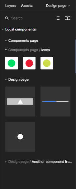
But as you say when swapping an icon to another, all other components show up, when what we want is just icons. To categorize icons into their own group you can frame them and just have a default icon property inside that frame. Then when swapping icons, only icons within the frame will show up.
I’m looking to do the same thing. It’s actually quite maddening Figma has restricted us in this way since variants were presented as the go to way of swapping component instances until now.
Thx a lot !! You’re right, we have to change our habits and like that it’s quite powerfull ! Thx again !
Hmm, I completely disagree. Looks like Figma broke their own logic. From component swapping to variants in step one to make everything more organized. And now next step is to add the component properties however the instance swap work only with a component not with the variants. So they just kill a variant and create confusion about when you should use it. I don’t know maybe it is so hard to use swap instance and add as well swap inside variant properties but hey. As it is now is more like a step-back, unfinished feature.
It’s a good for a bad I agree, but I’m sur they are allready working on Variant Swap 😉
I’m not a Figma employee, what their logic behind the change is I don’t know. What I said earlier was just my own internalized logic for it.
I think it might be harder for people having used Figma for years to accept change, because of old learned behaviors. After all, it’s easier to learn something completely new than it is to unlearn old habits.
In a nutshell, the new way let’s you expose properties of the children to the top component object. That’s what it does. It has limitations and maybe there are reasons for them, but the thing is that it’s a pure addition to a designers tool set. No feature has been removed. If you want to change child instances the old way using variants, you still can. If it’s difficult to adjust, then don’t force yourself to use them straight on. Learn from colleagues and the community and eventually it’ll become second nature.
Well, once again I don’t agree with you. It’s not about a new setup, refactoring, or removing old habits. Till now all design systems use variants to store the components. So buttons, toggle and let’s say radio button. All those components have been stated (on/off active focused disable etc). With the new component logic if we want to use this existing components storage in variants we can’t right 🙂 So ok we can remove all variants and just store all components separately like toggle/on toggle/off component. Last but not least how do you want to deal with your assets panel? Variants were invented to easily swap components around and make the assets panel less messy because you always saw one option from the variant set - for example, the primary button.
Ah I also forget about interactive components for all those buttons and toggles. Now it won’t work eaither. And trust me I hope I’m wrong and you can build better components now with new component properieties feature just I can’t see it.
And you don’t have to. There’s no right or wrong here.
I’m sorry I don’t understand. What exactly can’t you do?
Yes, component variants drastically reduces the amount of objects listed in your assets panel. But like I said, there’s no one stopping you to keep using component variants. You also don’t have to use component properties. But if you do want to use component variants, you still have options organizing your components. It might not be as neat as organizing with variants, but what you can do is put your components on separate pages, in separate frames, or a combination of the two.
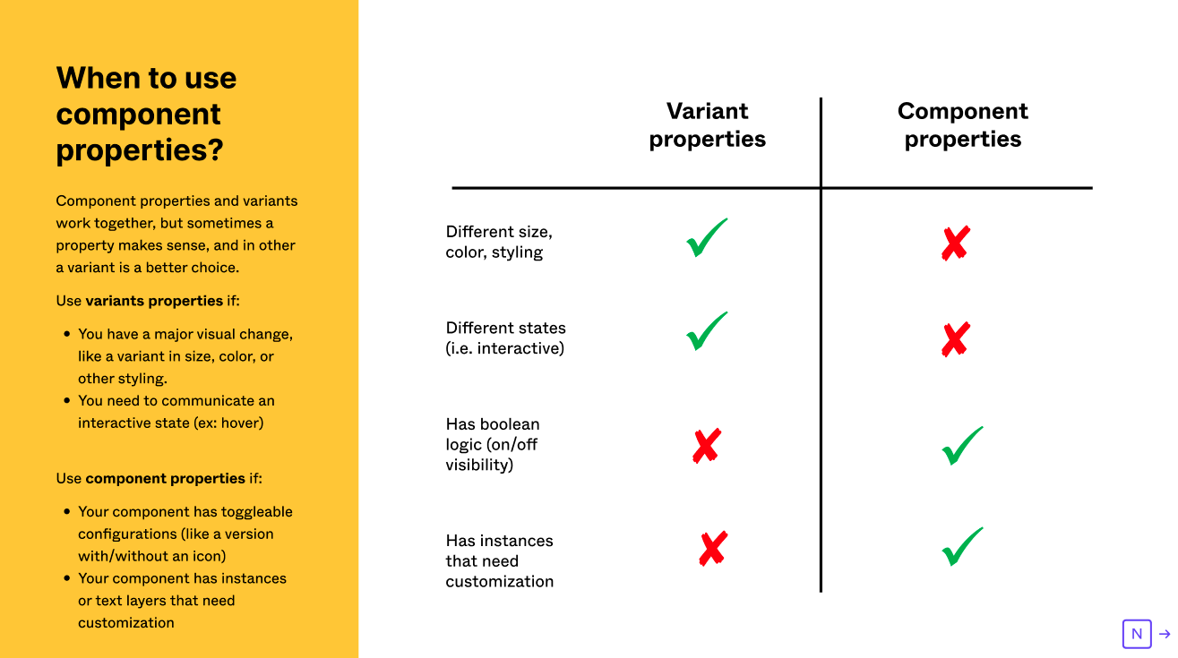
Yes, interactive components are not supported for component properties. They fit for certain use cases, and component variants fit for others. Here’s a table that can help you decide when to use which:
The way I think about it as I explained before, I wouldn’t want to use interactive components with component properties anyways, but I suppose that depends on what you do and what you want to accomplish.
Well, so Figma created two different ways how to deal with components. It just brings confusion across the design team and design systems but luckily we can still use the old way and keep variants. And this helps us in what way to build advanced design systems? You didn’t answer how we should deal with the crowded assets without variants. What without smart components? So what are the benefits of a new feature?
Yes I did. Use pages and/or frames.
There will still be entries in the assets panel but they are collapsible.
Same deal with instance swapping.

I don’t understand the question.
It exposes properties to the main component. That way you don’t have to dig down the layer hierarchy to override component values. This helps with onboarding, is a general QoL improvement after having created a design system with this in mind, and perhaps other reasons.
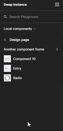
Notice when changing instance property that
only the button components on the right shows up. That’s because I’ve framed them. That’s how you can organize things to reduce clutter. But also note that this is only a demonstration, with buttons I might actually want to use interactions, thus component variants would be the better way to go. But it’s not a question of choosing between component variants
OR component properties. You can mix and match however you like. So even if you have trouble adjusting I don’t think it’s a step back since no one is forcing you to any particular workflow. You still have the option to do what you’ve always done before.
If you already have a design system in place built on variants then it might not be worth the effort to change it just to make use of component properties. But if building one from scratch, doing things this way may make things easier and logical to use.
Again, there is no right or wrong way to do things. These are just options.
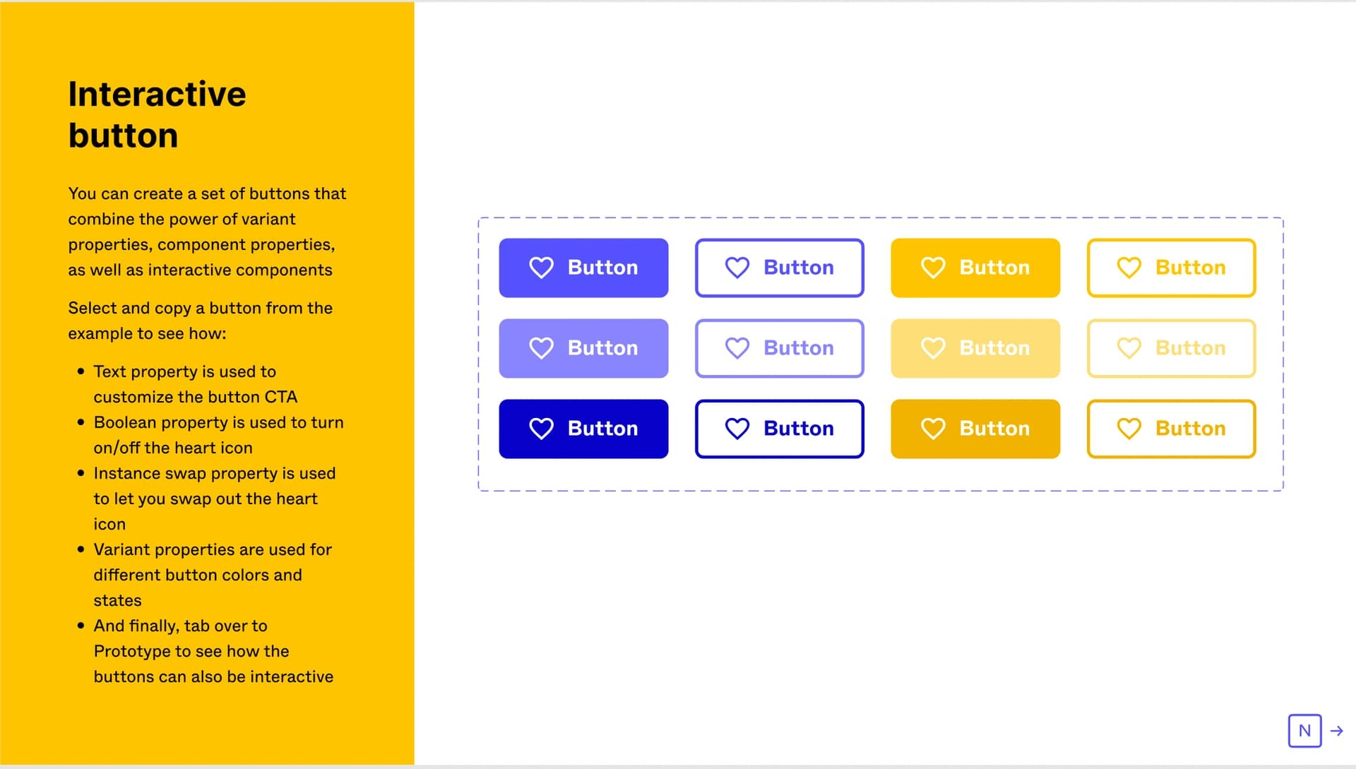
Ok, so let’s focus on your video. It’s great on the left side you showing the old way. On the right way, you showing the improvements in how easily you can change the text and button from Primary to Secondary and that’s amazing we all want this.
The tiny detail which ruins everything here is the Figma approach because if you want to fully use component properties you need to create all your button as a component not as a variant.
From the other side, Figma shows how to improve the button variant with new component proprieties.
And this is the whole point if I would like to use my variant with buttons that make sense and the variant now looks and works better with a new feature I just can’t use those buttons with the same future while building the card and would like to use again the same future. So it’s a broken logic.
Also If I decide to store the buttons like you in the second case separately (this is back to the Figma from pre variant state) then I also can’t use this one https://help.figma.com/hc/en-us/articles/360061175334-Create-interactive-components-with-variants also pretty big feature presented year ago?
I still struggle to understand what you mean.
In one sentence you are practically saying that mixing variants and properties can’t be done:
…and the very next thing you do is post a screenshot of Figma mixing variants and properties.
So forgive me if I fail to see the point you’re making. Maybe broken logic isn’t the right words you’re looking for? You might find it un-intuitive, confusing or whatever, but I don’t know the logic behind how it was built so it’s a strong claim to say that it is broken.
Idk Klesus maybe this will help you
Medium – 4 Jun 22
This is spot ON.
To add insult to injury, the variants panel -now turned into edit variant property with a values list that is a mess to work with if you add new ones and need to sort them. Oh, and the swap instance takes you back in time as well… overall this feels baked overnight and disconnected with actual usage and logic as pointed above.
Well done, amazing, simply amazing!
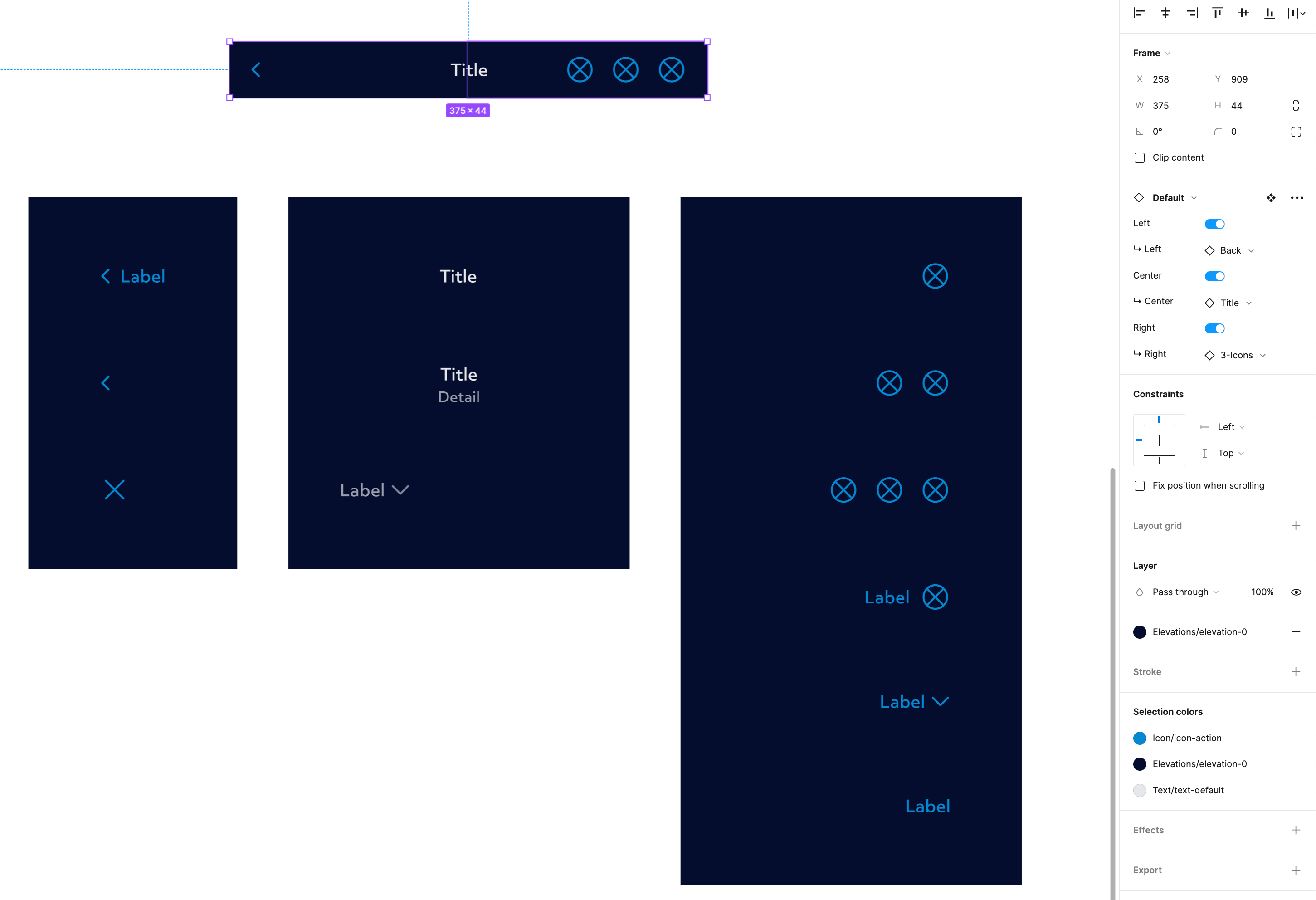
This topic is clearly a fiery one! Slightly deviation of topic but… we’re currently updating our system with comp props where necessary. Like many, perhaps I am struggling to know when to use variants vs instances… Where before we had a nested component with variants, now we have broken those out of variants so we can use the instance swap comp prop instead. I’ve included a screenshot so you can see whether or not this is a stupid idea or not. Essentially our top bar is split into 3 areas; Left, Center, Right – then for each we have a few options that are component instances and each one can then be selected at the parent level. Does anyone see any problems with this?
Perhaps my worry is partly due to the fear Figma will forget which instance should be applied to which component when it comes to doing a big update and all the components may return to the default – but maybe this will be OK, time will tell!
Agree with sentiment that CP’s good concept but only half thought out… Another issue I’ve noticed specific to buttons is padding. Unless horizontal padding is universal for all instances, swapping icons/text in and out won’t look right (and goes against best practices).
I.e. Buttons with icons on either side has (or should have) less padding on icon side than the text side, or a button with just text. Way it is now I’d have to manually adjust padding for each instance that had an icon.
This topic was automatically closed 30 days after the last reply. New replies are no longer allowed.


