Hi all,
I am a Sketch user and having to learn Figma. When I designed in Sketch I wold make for the typography text styles black aligning left/center/right. Then another group in blue left/center/right.
I notice Figma doesn’t do this. How do I approach this? Do I just ignore the multiple alignments? Any directions or best practice would help. Same with the color regarding text styles. Trying to find tutorials on best approach.
In sketch I would a number of colors as color styles/layer styles. Then I could apply those colors to buttons etc in sketch.
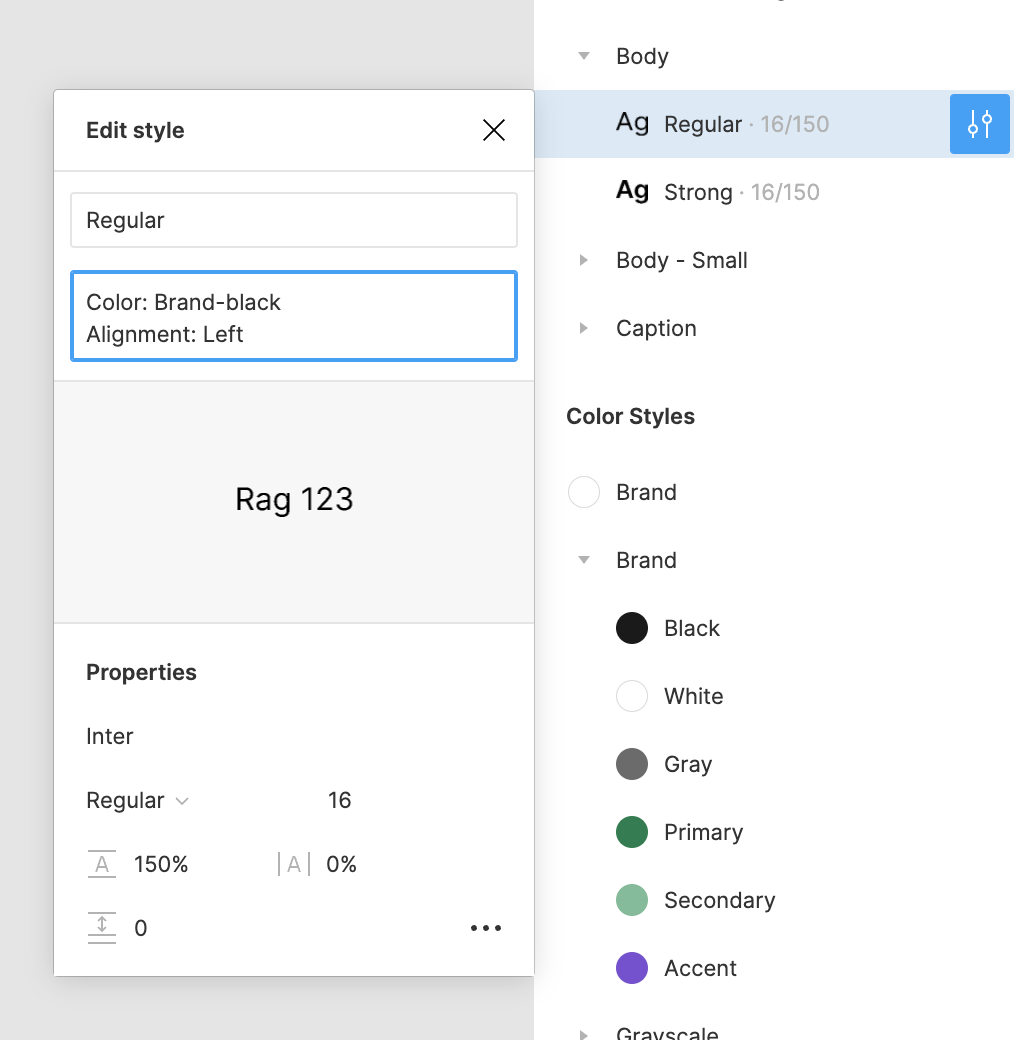
Hi! Text styles in Figma do not have a specific alignment and color applied, meaning someone could use a Header type style and adjust the color and alignment to whatever they want without detaching. The nice part of this is that it allows for more flexibility, but I can also understand your want for having alignment and colored tied to your type styles. Some approaches you can take to help clarify to designers which alignment/color to use is:
Name your colors in a way to show which type style to use it with. If there’s a shade of dark gray you use for Body text, name that color “Body text”
Use style descriptions to communicate what color and alignment should be used.