I’m having issues with building my components.
The idea is to have a base component where I can edit the styling. Then I work with nested instances and make variants of them.
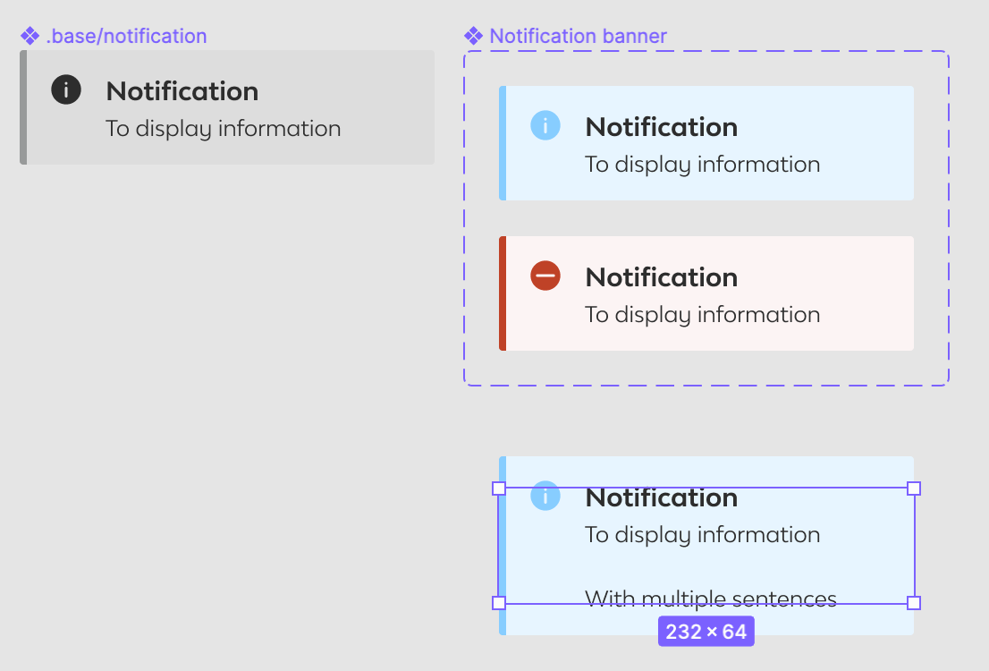
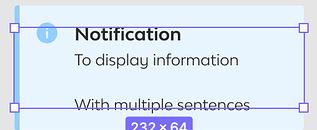
However, when using this component across design files I can’t figure out how to make sure the frame resizing works correctly when changing the amount of text lines for example (see screenshot).
Is this even possible to have the frame grow evenly with the base component frame? Or is there another work around.
I am not 100% sure I fully get what you mean, as in the frame growing by using auto layout? play around with that would make things resize after content.
alternatively when you mean that you have resized content but the frame stays the same as in your screenshot
What you could do then is: when you’ve selected it, in the frame part on the right-hand side, press the four arrows in the top right
I mean that the component is working as it should, only the frame doesn’t take the correct size (as shown in the screenshot) therefore it would be hard for other designers to mark the right margins.
The issue seems to be in the fact that I use a base component (.base/notification) and then nest the component (Notification banner) in it.
I created a Figma file that gives a better demo of the problem I’m facing. I need some assistant here
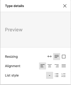
You’ll also want to ensure that you’re using auto-height on the text layer itself. Attached a screenshot with the proper selection on the Resizing attribute of the text layer.
On Mac use CMD + Click + Drag on the side of the component you would like to extend. This will make the component the size you desire. (Assume you would replace Command with Control on Windows)
Hi Gerrit, I’m on Mac usingCMD + Click + Drag on the side of the component I want to extend but it makes the elements inside of it bigger as well. I need to expand the component frame without the elements inside of it getting bigger. Do you know how I can do this?