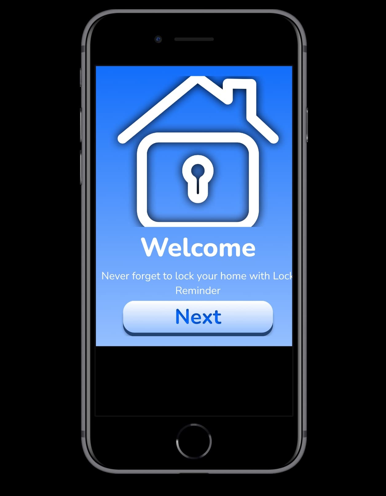
Hi! I am new to Figma, and I was learning about how to use Auto Layout. I got all my components into the right spot, and when I change the dimensions of the frame they’re in, they adjust accordingly. When I run it and preview the frame in a different devices however, the entire frame itself just sticks out and doesn’t fit the screen. Here is an image showing what I see
As you can see, there are still some black spaces. I was wondering how I could make it so that the frame will always have width and height dimensions that change depending on whatever screen I choose, so that one design fits all.
The frame containing your design needs to match the the size of the device that you’ve set in the Prototype panel. In your case, the frame is probably smaller than the device. If you set the frame bigger than the device, the frame could be dragged around
Thank you for your help, but I was asking if there was a way to always have the frame fit ANY device. I am looking to create a one size fits all type of design, so that I don’t have to make new designs for EVERY single device.
Sadly Figma app doesn’t have this feature yet which I find quite shocking they could make it be that once you design your frame is responsive it should also be responsive in the app the only way to display full screen in any device is to make the frame responsive and adjust the height and width to each device per viewing