How to do component based hover with overlaying borders?

I want to create a prototype with a button bar, where ideally each item is based on a component with a regular and a hover state. But I’m struggling with how to do the border. Since the hovered instance is often lower in the stacking order of the auto layout, some of it’s borders are under other instances.

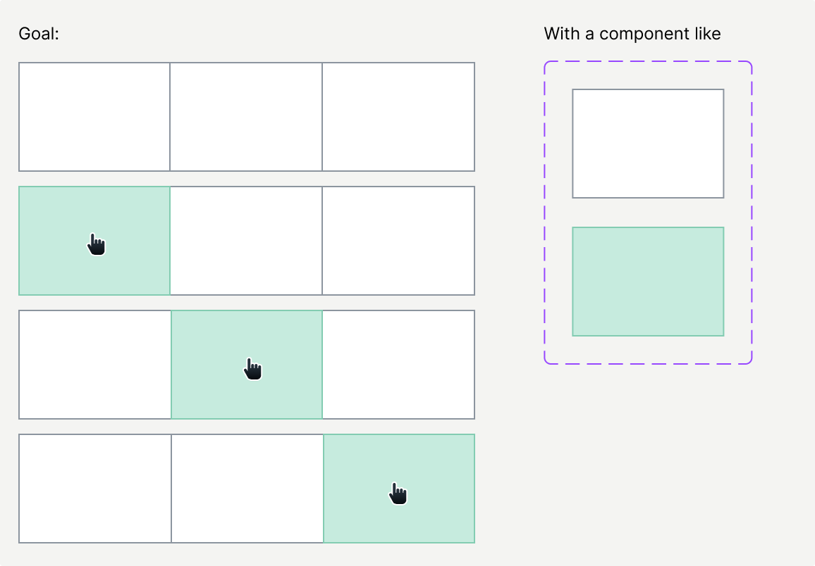
When the last or first item doesn’t need a hover state this is probably easier.

In CSS I would probably just increase the z-index on hover. I know there are plenty of feature requests for z-index in Figma.

But maybe there is another trick in Figma for this?

I think I found a reasonable workaround

  1. Create Button component (without left border) (centered border)
  2. Add hover variant (with left border)
  3. Add the interaction so it switches from default to hover on hover.
  4. Create the “button bar” auto layout frame with:
    1. Add a couple of Button instances
    2. Give it a 0 gap
    3. Give it a left (also centered) border (to compensate for the missing border

Note that the button can’t have a fill, otherwise it will hide the button bar’s left border.

Simple example: