I’m building out a design system. I have many icons (which I’ve turned into components) that can be used in a variety of components that may affect the size and color of the icons. I’ve seen other design systems get this to work by creating every possible combination as a variant, but I want to try to avoid that to save time. I’ve tried creating a component with different sized variants for the icons, as well as a component for the different colors. I’ve nested the color component within the size component. When I make an instance of this, I am able to swap sizes and colors, however as soon as I change the icon to one that is not a perfect square, the vector icon stretches out to match the parent frame (which is the component level). I’ve tried messing around with the icon and vector’s autolayout, and huge/fixed settings and etc, but I still can’t get it to work.
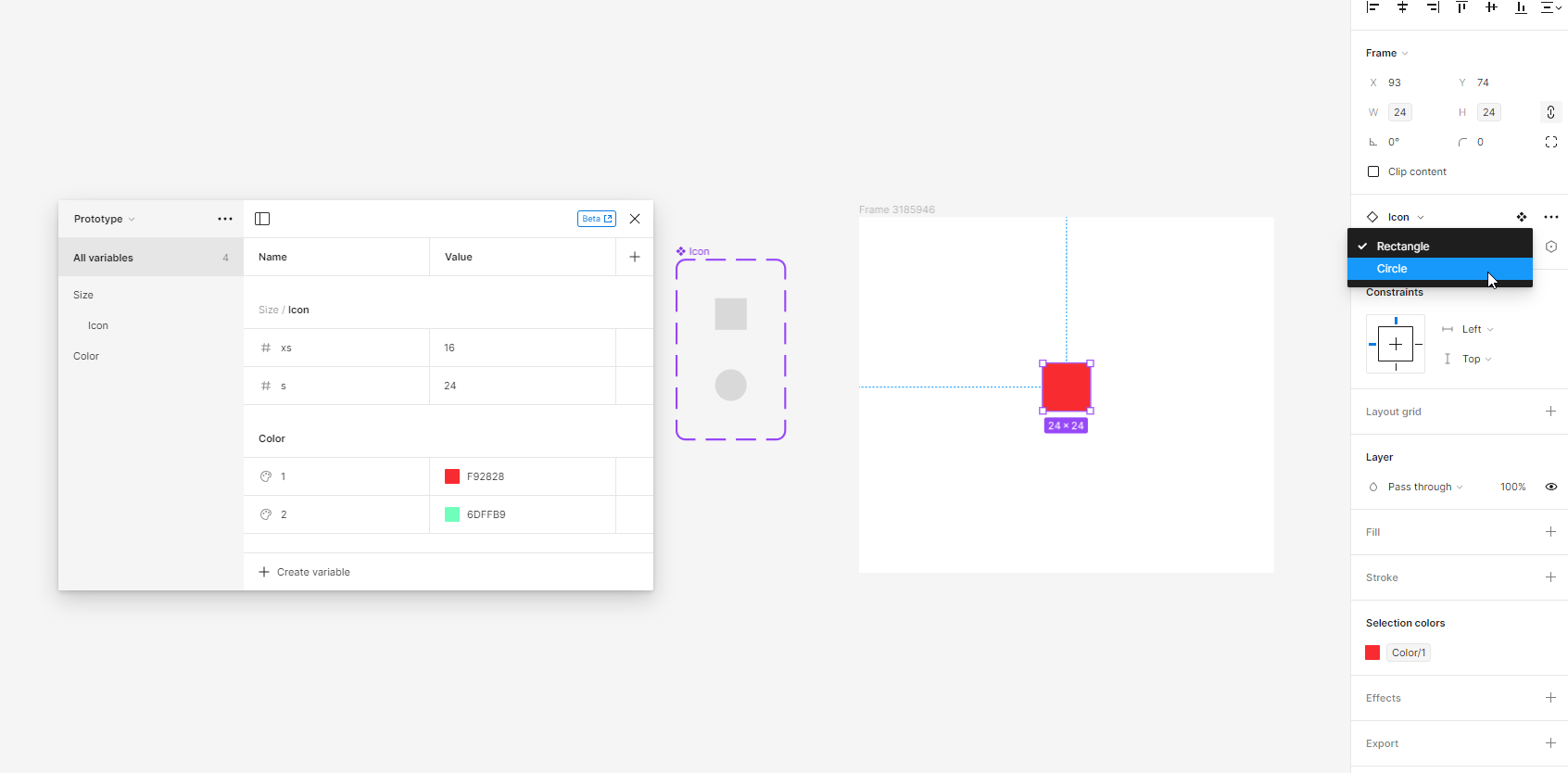
Also, there are some boolean layers within the components and that’s because I used the tips described here to get the colors to work so far:
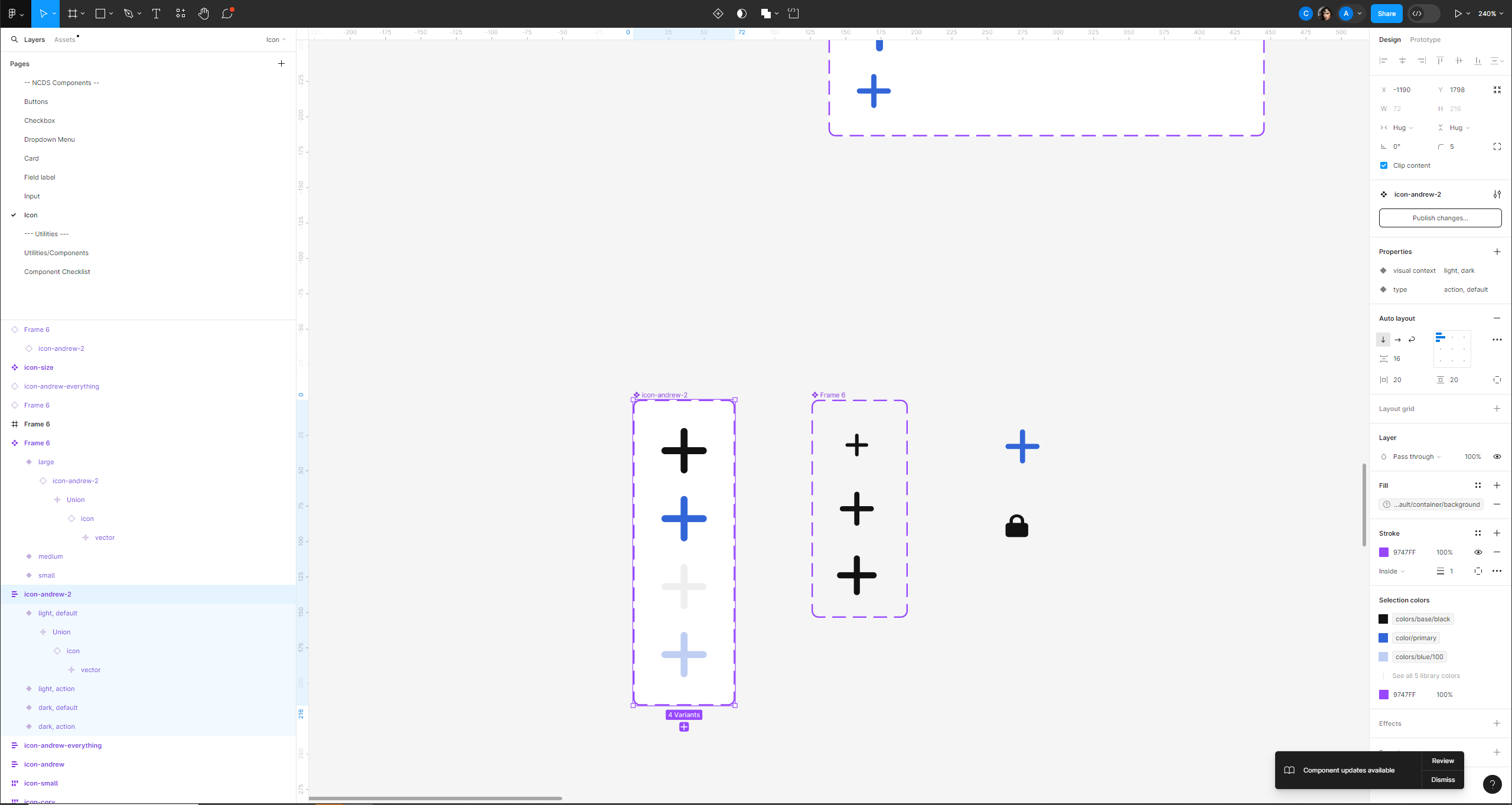
FigmaHere’s a screenshot of what I’m working with.
icon-andrew-2 is my color variants
Frame 6 is my size variants with instances of icon-andrew-2.
Any help is appreciated.


