
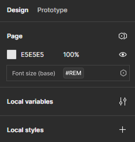
On the web, we create components based on font-size by utilising the em unit. A Button’s padding or margin, or maybe even fixed height for example is relative to its font-size. This is not possible in figma at the moment, but an essential paradigm in current modern UI/UX design. Small Elements with a single text line can at least have their height (or vertical padding) be font-size relative, by setting a %-based line-height, but this fails on the horizontal axis, where we have no way of making anything font-size relative.
This would be fine to be confined to auto-layout for the start imo. Having more relative units that mimic mediums like the web platform would be great in general, but maybe being able to define spacing/padding as 2em to have it relative to font-size would be a good start.
Of course implementing the cascade would be even better, but I think confining font-size relative sizing for certain attributes in components would be enough to start. It would bring figma closer to the web platform’s native capabilities that are currently lacking.