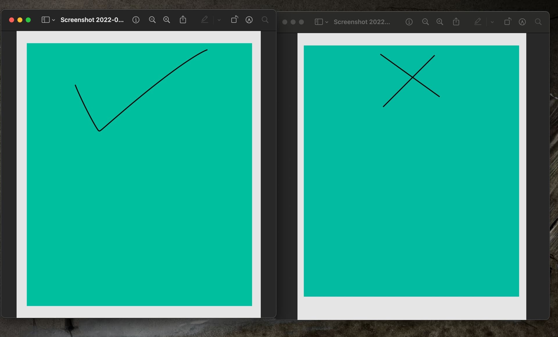
Basically I am working on a project and designing on “unmanaged colour preference”. I liked the main colour theme a lot but whenever I share a prototype link, the colour always gets dull. And same happens when I change my colour preference to “sRGB” I just loose my original colour.
Please help me solve this issue, My whole project looks dull and dirty.


