The original problem that sparked this post was that I was trying to create some table rows with centered icons and maybe some h-padding. Then I wanted the text to flex-grow to fit the available space, aligned left.
Part of the reason I had this problem is I’m sure how the library I was using built its components (but we often don’t have control over that). Icons stretched instead of centered, which was frustrating. Flexbox/CSS grid would eliminate this problem – you could align objects in a frame agnostic of the component, and give them padding/margin (flexible or otherwise), and you could either control it at the parent level, or the element level.
There is an actual bug here, or at least a very unexpected and unexplainable problem:
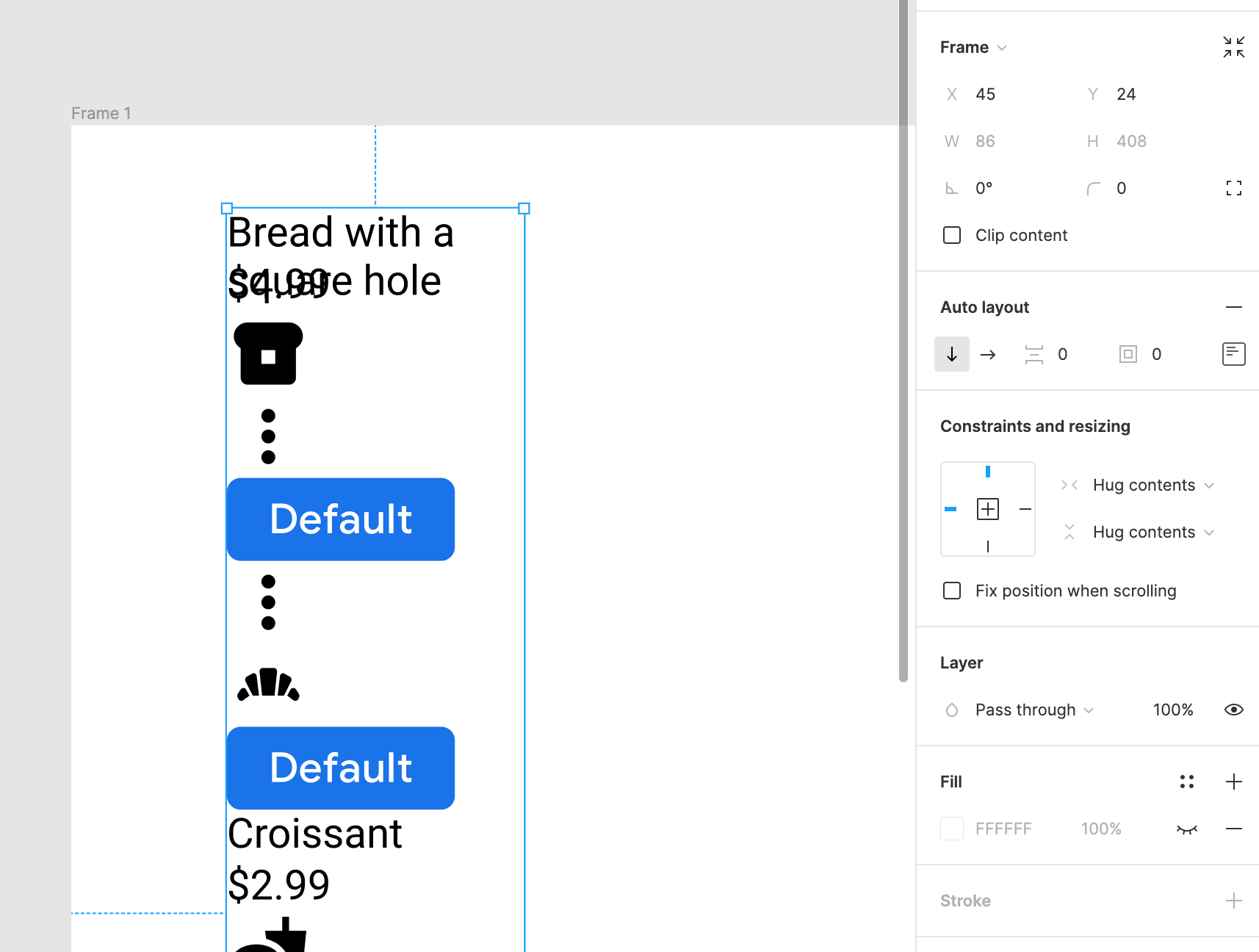
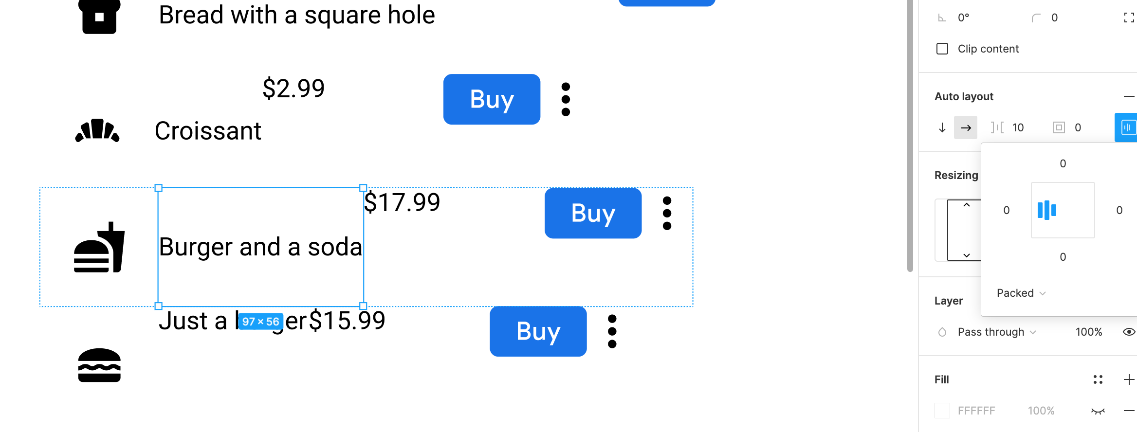
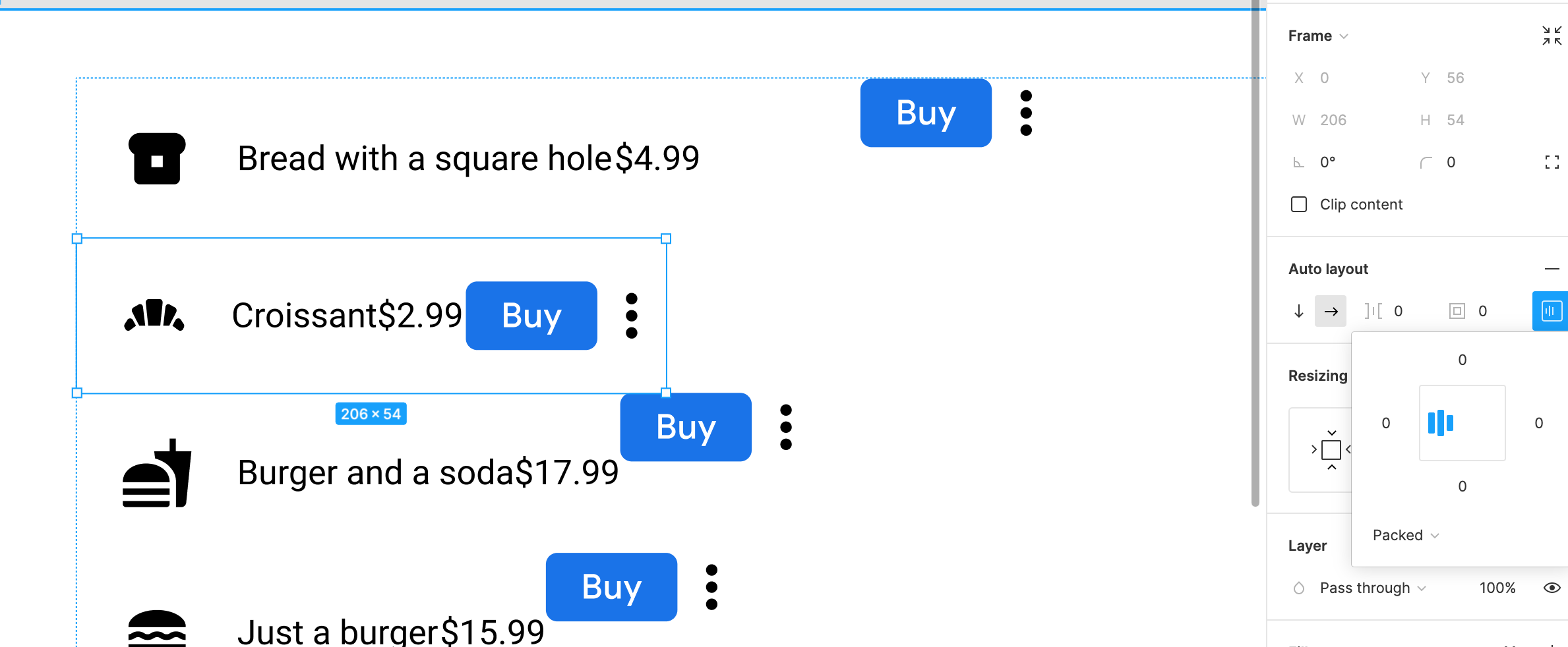
Because I have a nested frame here now, I need to set the nested frame’s h-auto to ‘hug contents’, which for some reason changes the inner components to fixed width? I can’t change it back. Here’s what happens:
The actual proposal, and how CSS grid / Flexbox-like behavior could be a massive improvement to the way Auto Layouts are handled.
Defining a flexible column/row layout on a parent element allows you to add an arbitrary number of elements into a frame and have them wrap, grow, shrink, and flow without having to control the AL behavior on the individual elements. Why is that valuable? If you’re using someone else’s components, you don’t have to worry about how they’ve built them. Or if you change things later, you just need to change it once at the parent level instead of each individual element. You can define all of the layout behaviors of each row/column in one central place, and it “just works”, instead of having to adjust each row or column manually and individually.
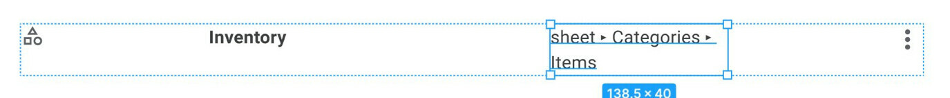
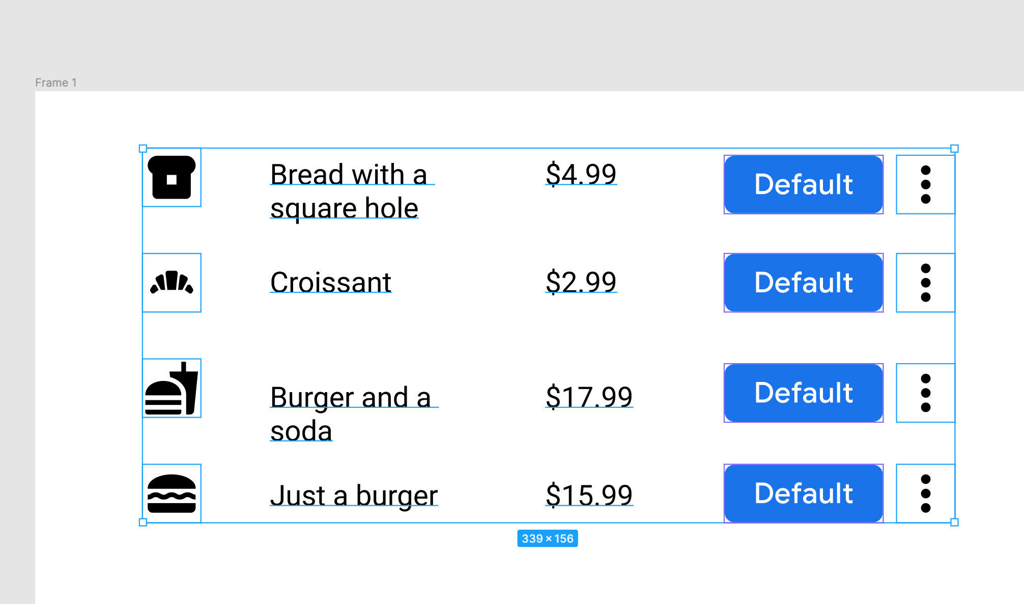
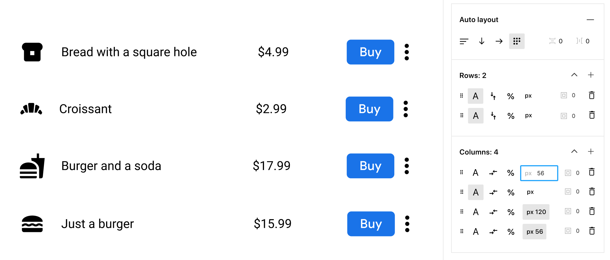
Example: let’s say I wanted a grid layout of some table rows. (I could make each row a component, but for argument’s sake let’s say I’m not ready to do that).
To do this with the current Auto layout model, I have to do a lot of fiddling. Here are some screenshots of my attempts:
Basic frame, statically positioned (no Auto Layout). If I make one change to this, I have to manually reposition everything.
Let’s try Auto Layout! Oh no…
I’ll painstakingly create frames for each of the elements here. Yes this should be a component, but I’m not really ready to make it one yet, especially because I expect I’ll want to change the lengths of some of the text, and maybe add a column or move things around.
I wanted some padding around the icons, and the rows to be a certain height. Off to do this manually for each row. (I actually started doing it per-cell before I remember I could do it per-row). Still, that was a lot of work for 4 rows. Imagine 400! We also get the added benefit of cell sizing affecting the entire grid – expanding text would cause an entire column to grow, not just that row’s cell.
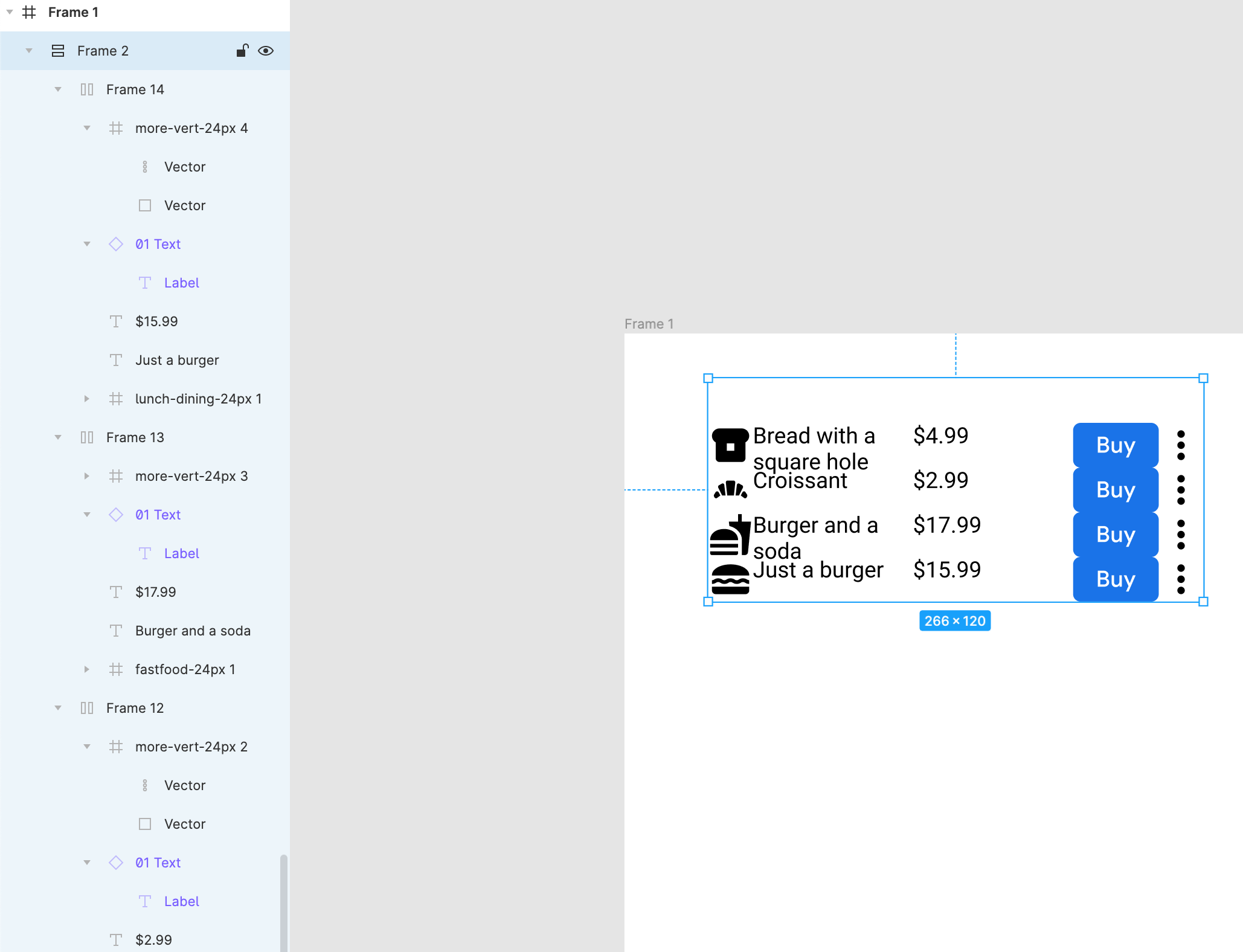
What if instead, I could just add all my elements into a frame, and do this on the parent frame? 🥰
(This post was inspired by my tweet thread here.)
This topic was automatically closed 30 days after the last reply. New replies are no longer allowed.
- Describe the problem your experiencing and how your idea helps solve this
Auto layout might be one of the best design tools to help bridge the gap between designers and devs, but we still have ways to go, I’d love for figma to take a page out of webflow’s features and implement even more dev ready elements to flexbox
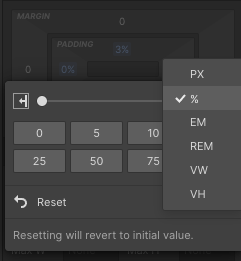
being able to pick more units besides pixels like percentages, ems, rems, vw and vh.
max and min-width using said optional units
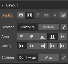
wrapping for flexbox
- Add as much context as possible (screenshots, Figma files, mockups, etc.)
While auto layout gives us a plethora of options for better scaling, sizing, and visual cohesion, adding even more of these web ready features would save time when working with breakpoints, fluid design and less doubts when we hand off to devs, less back and forth.
- Ask questions to bring the community into the conversation
Anyone working on a plugin for working with other units, or
Agree, all of this would be amazing! But at the bare minimum, I think implementing max and min-width would solve so many problems. I’ve been wanting that for a long time now.
