Duplicates Component Prop

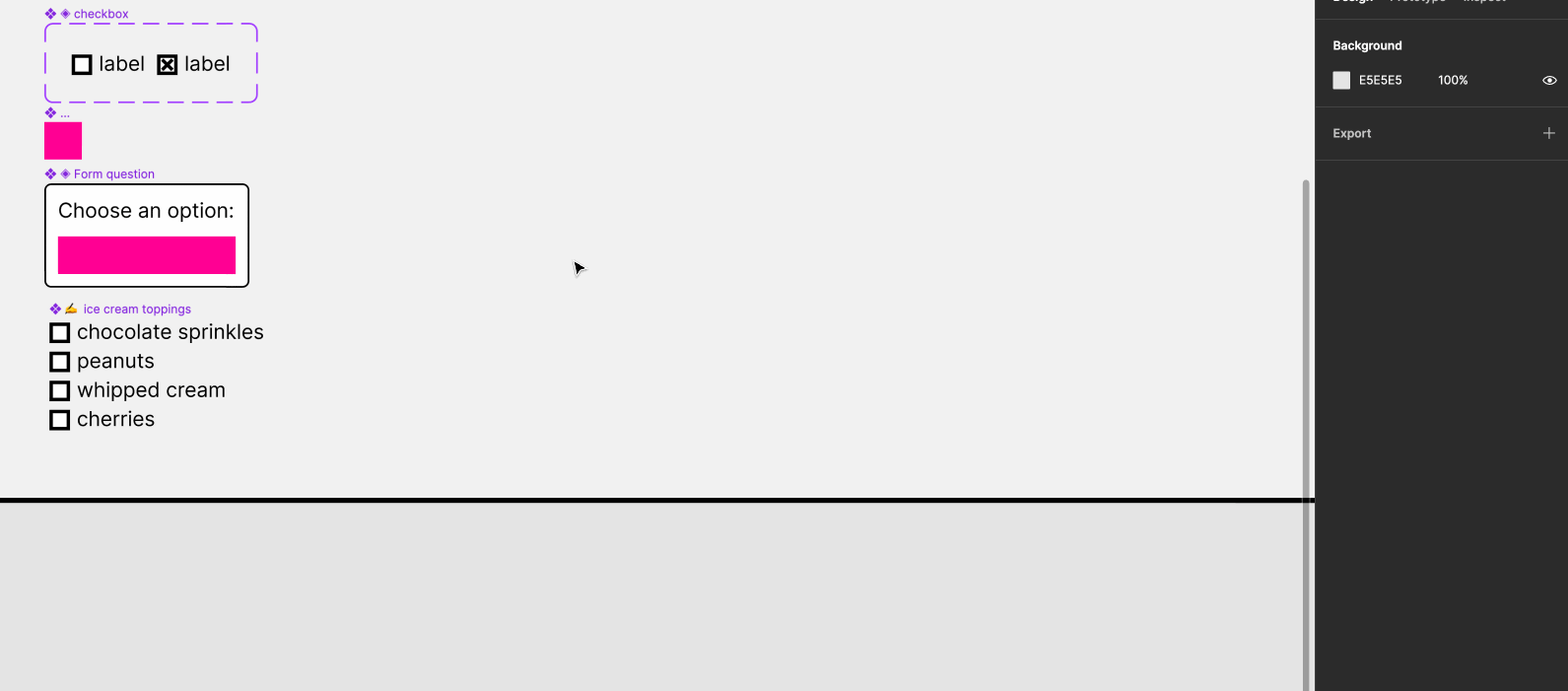
I work on a design system team and have an issue with creating components or patterns with multiple elements or utility components inside of them. (For example, multiple radios or checkboxes inside of a checkbox/radio group component.) As a result of designers not being able to have the amount of items needed within their specific workflow, they have to detach the component and copy the elements and utilities manually in order to accurately mockup a user flow.

This inherently creates a divergence between our components and the designer’s figma files as they’re no longer using the design system’s components.

Workarounds currently for this are to create a component with a massive amount of duplicate elements in order to solve for larger edge cases, or to make a massive amount of variants just for the quantity of elements or utility components inside of them.

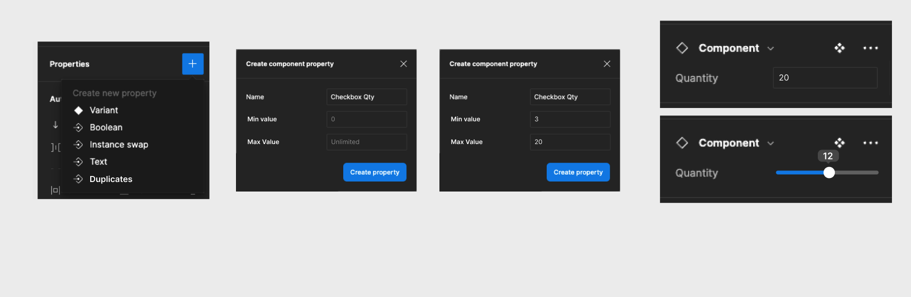
That’s why I want to propose a new prop - A “Duplicates” Prop. What the workflow would be is that it would live as a prop alongside the Boolean, Instance swap, and text properties in the current component options. When a user selects an element or a utility component they want to duplicate, a modal appears giving a value range for a minimum amount of copies of the element (Optional) as well as a maximum value (Also optional, and unlimited by default.)

If a value range is left to be unlimited, the duplicates prop is set to be a text field where users can enter a number value to represent the amounts of the duplicates they’d like within that component (Can also set a default value from the master component). If a user selects either a maximum range or both a minimum and a maximum range, a slider appears that allows the user to easily add and remove duplicates based on the range set.

1 Like

Hi Dylan! Definitely agree that some sort of “repeater” functionality would be a huge quality of life boost for component users and speed up folks workflows greatly.

Until Figma releases something like this, I wanted to ask if you/your team have tried working with placeholder components? The idea is you make a simple component out of a single frame, give it a funky color (one that clearly doesn’t match the visual design of the rest of your components so everyone understands it’s a placeholder), add auto layout, and then nest this “placeholder” inside of other main components where the content is highly variable. This is often the case for list-like things, like your example with checkboxes and radio groups.

Designers would be able to grab an instance of that piece of interface, swap out the placeholder for the actual content (which would be made up of smaller components, like a checkbox with a label). It would look something like this:

Dylan component swapping

In the demo above, the ◈ checkbox, :scissors: Placeholder, and ◈ Form question would all be components that live in a library. The :writing_hand: ice cream toppings component is like a little content-management-system component (I call these content carriers), and it would be created in a local file used for mocking something up or prototyping (rather than living in the library). Those pictograms I’m putting in front of the names represent a few different types of components (my hunch right now is that there’s 7, maybe more!)

Here’s view-access to the Figma file I used to take that GIF, in case you’d like to have a closer look at the layers and auto layout settings.

This topic was automatically closed 90 days after the last reply. New replies are no longer allowed.