I use auto layouts because I want my components and layouts to be reposnsive and reflow at any size withtout having to redraw them.
Spacers are a neat attempt to workaround missing design tokens. These days you can use variables to achieve the same result without increasing layers complexity
Thanks, Pavel. Could you please share with me how you achieve flexible spacing using design tokens and variables? I did some searching but couldn’t find any information on how to accomplish this.
Sure deal
For flexible spacing, I made a simple component, like this
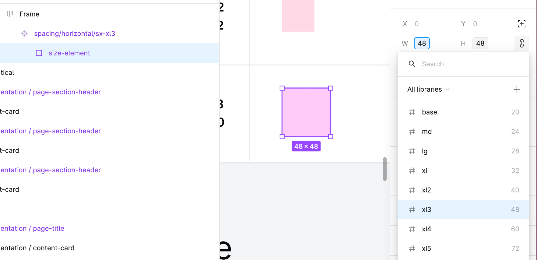
It’s just an auto-layout frame that holds a size element inside. This way I can place instances inside other components and be able to swap them left and right whenever I want different spacing settings.
The size element has width and height bound to my spacing tokens, whenever I change these variables all my spacing components get updated in no time
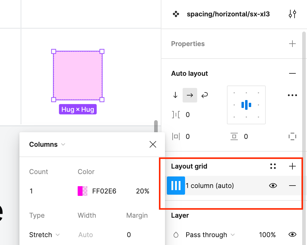
And lastly, I made them discoverable with a simple layout grid, like this
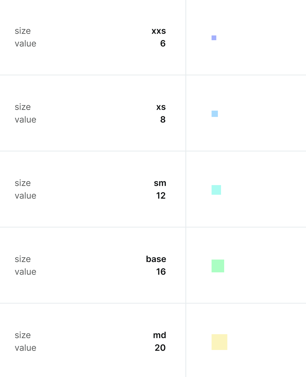
I have different colours for different values so it is kind of a neat way to differentiate tokens visually. With the layout grid, I can toggle their visibility with a Shift+G
Hope that helps mate
Thanks you took the time to write this down Pavel.
Very helpful and very much appreciated!


