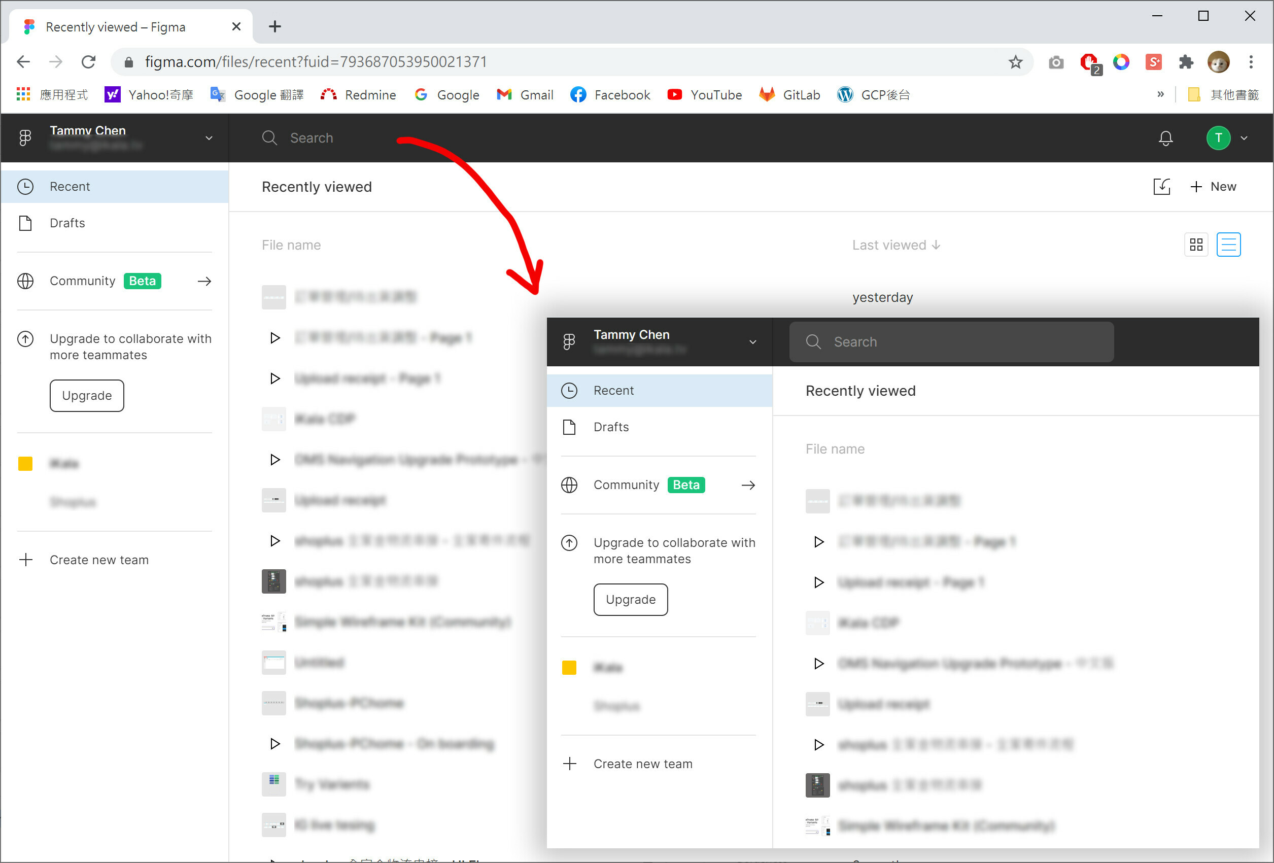
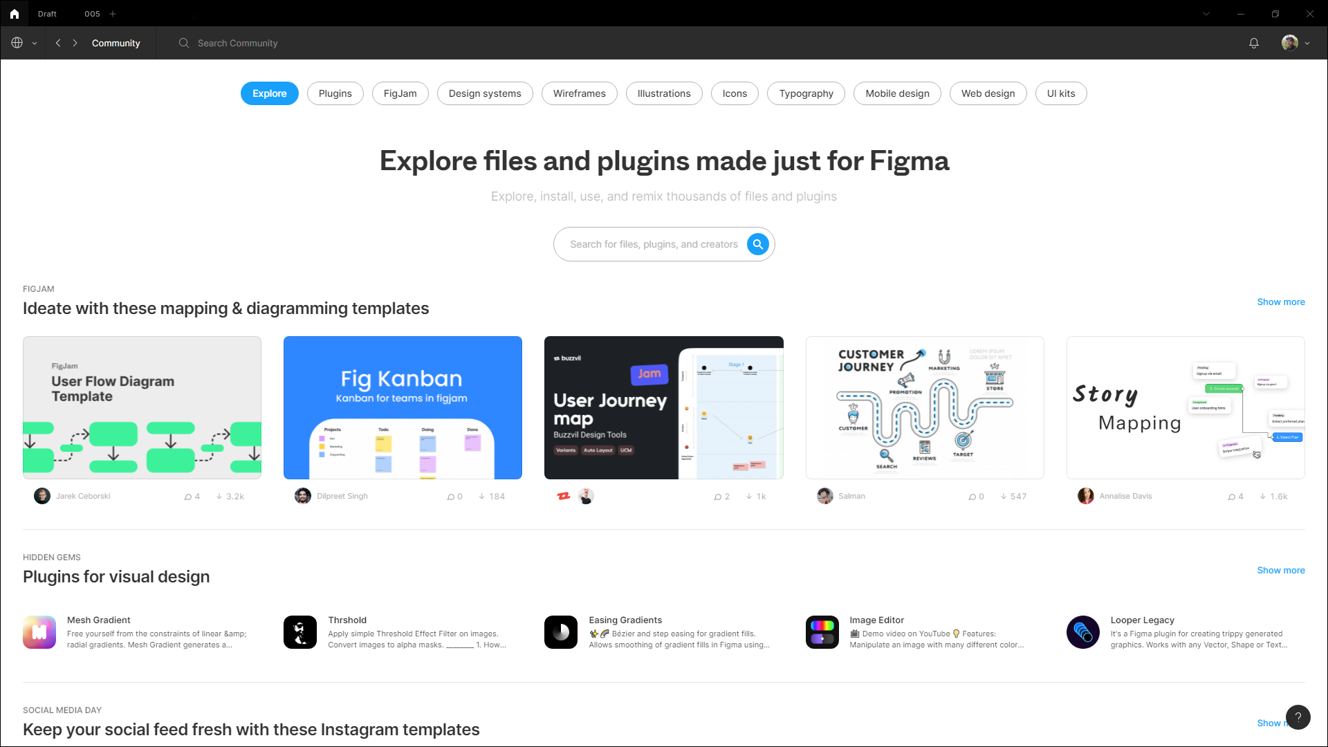
Figma has a new interface redesign recently. 👍 👍
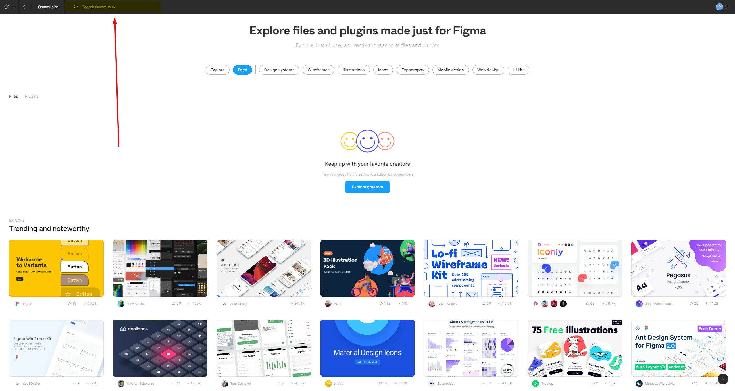
But i found the search bar it’s not easy to find. This makes me a little confused, It’s not obvious. 🤔
I think search bar was used vary frequently, hope figma team can improved it.
Maybe just let it has a background color.
The change of search bar in community feels intuitive.
When I look the page, the search bar usually should be in top or right top area. But it confused that it is appear in the far away top area. About more than 3s thinking time in trying to find the most important search feature for me in community page.
When in community page, I cannot really find a way go back to main page directly (the page that I can see all my projects).
These two confusions I had when I try to search something in community. Does anyone has some ideas on how to solve it? Thanks.
After your last update, the community page no longer has a search / filter input field.
That makes me having to use Google to find plugins. Why did you remove it?
And why can’t I add a screenshot in this product feedback
You need to click your profile switcher at the top left and then select Community. I have no idea why it’s hidden so well, I agree it’s super inconvenient.
I spotted that change pretty quick. But once you open the Community page in Figma, the search field is gone. I don’t see it - you can only filter by category.
There is also no selection for if you want to see Figma files or Plugins (in the top)
The same search field that is used for searching for files in your workspace gets repurposed for community search when you open it. It’s at the right of that account switcher menu.
Yeah, I didn’t see it. The search field, if I remember correctly, was by the filter tags.
Now that I know where it is, I’ll use it. But for better user experience it should be easier to spot.
PS. How did you manage to add a picture to your reply?
You can drag & drop it, paste it from clipboard, or use this button:
I agree that it should be easier to spot… like Dribbble’s one in my opinion:
But since I don’t use it frequently, it’s not a big deal for me.
Gleb replied to you about the screenshot attachment 😃
Agreed. The search bar is pretty undiscoverable given the importance of the task on the page—you’re either browsing or searching.
Open to any improvements. The current implementation is easy to miss.
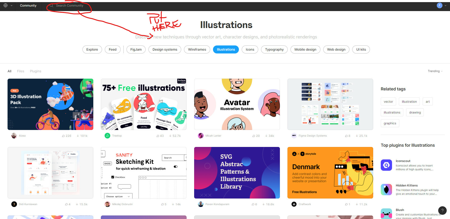
It took me 2 weeks to finally discover the SEARCH BAR for the Community Plugins. I kept landing on the page, wondering how to search. I never saw it in the toolbar.
The color is faded grey in a black toolbar. It is barely visible. Not discoverable.
OPPORTUNITY:
- give the search bar a white background. Do not include hint text (makes it less discoverable; confused as button instead of input).
- include search on the page content itself, near the filters to be in proximity to content it is filtering.
this is a decent video on search UX: https://www.nngroup.com/videos/designing-search
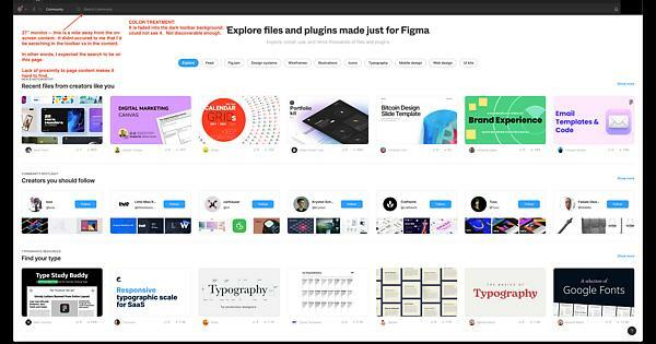
Screenshot of my UI analysis of this UX issue.
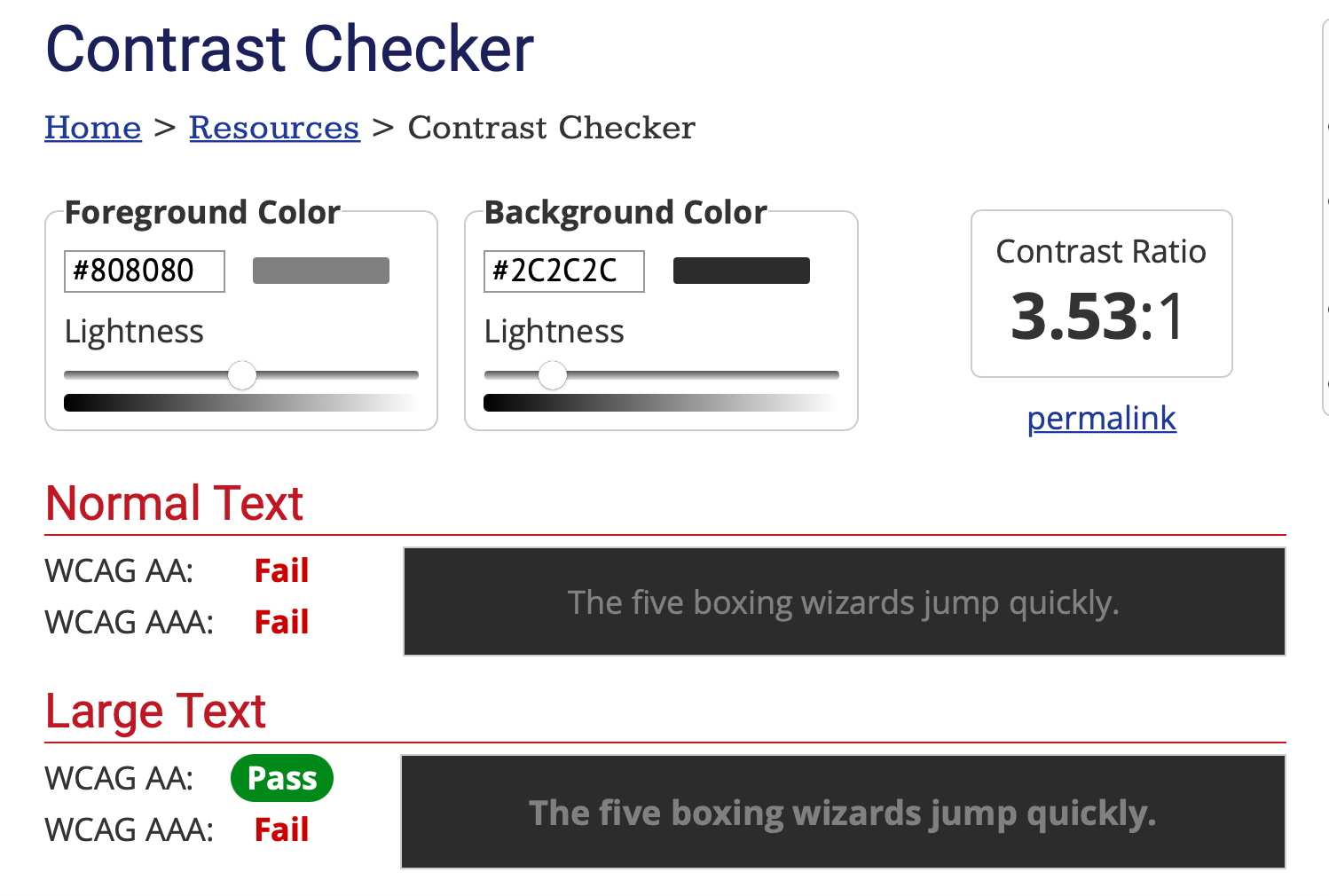
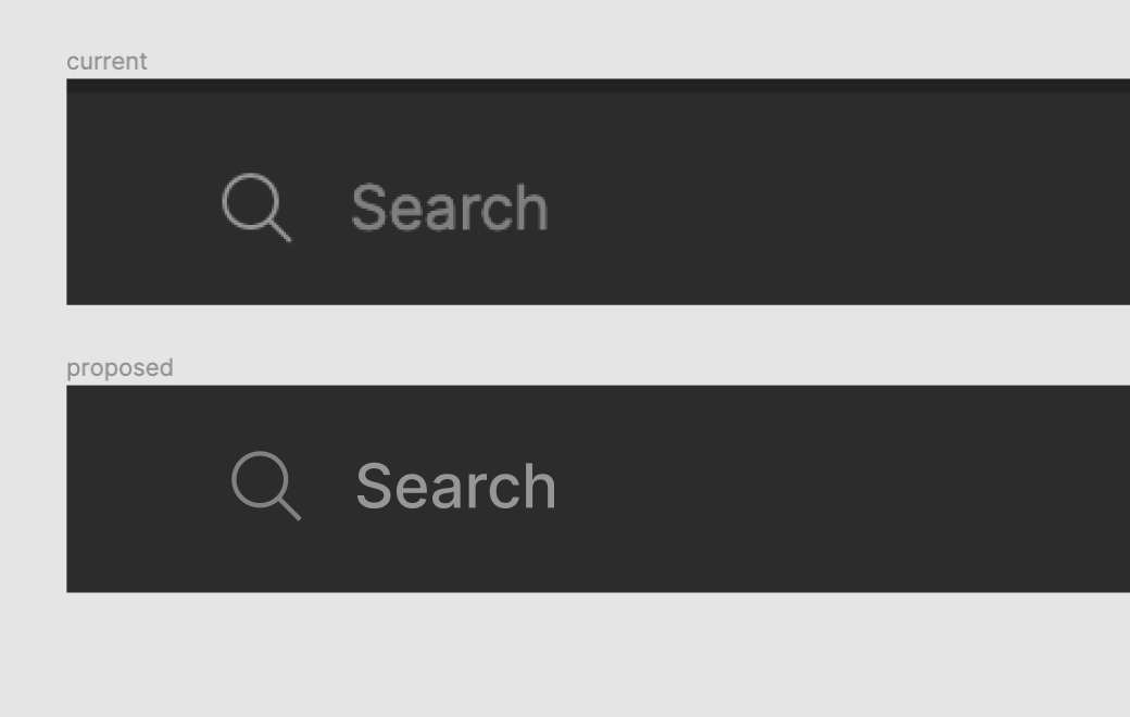
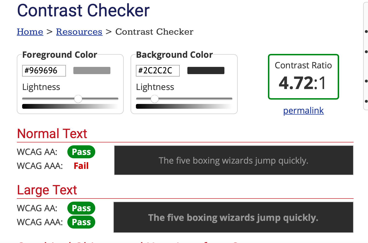
The current search bar within figma fails to meet minimum color contrast requirements set by WCAG. This makes it hard for those with low vision to see the field.
I personally have my screen set to fairly dim and cannot see it either.
A proposed solution would be to lighten the gray font color used to at least a 4.5:1 against the background.
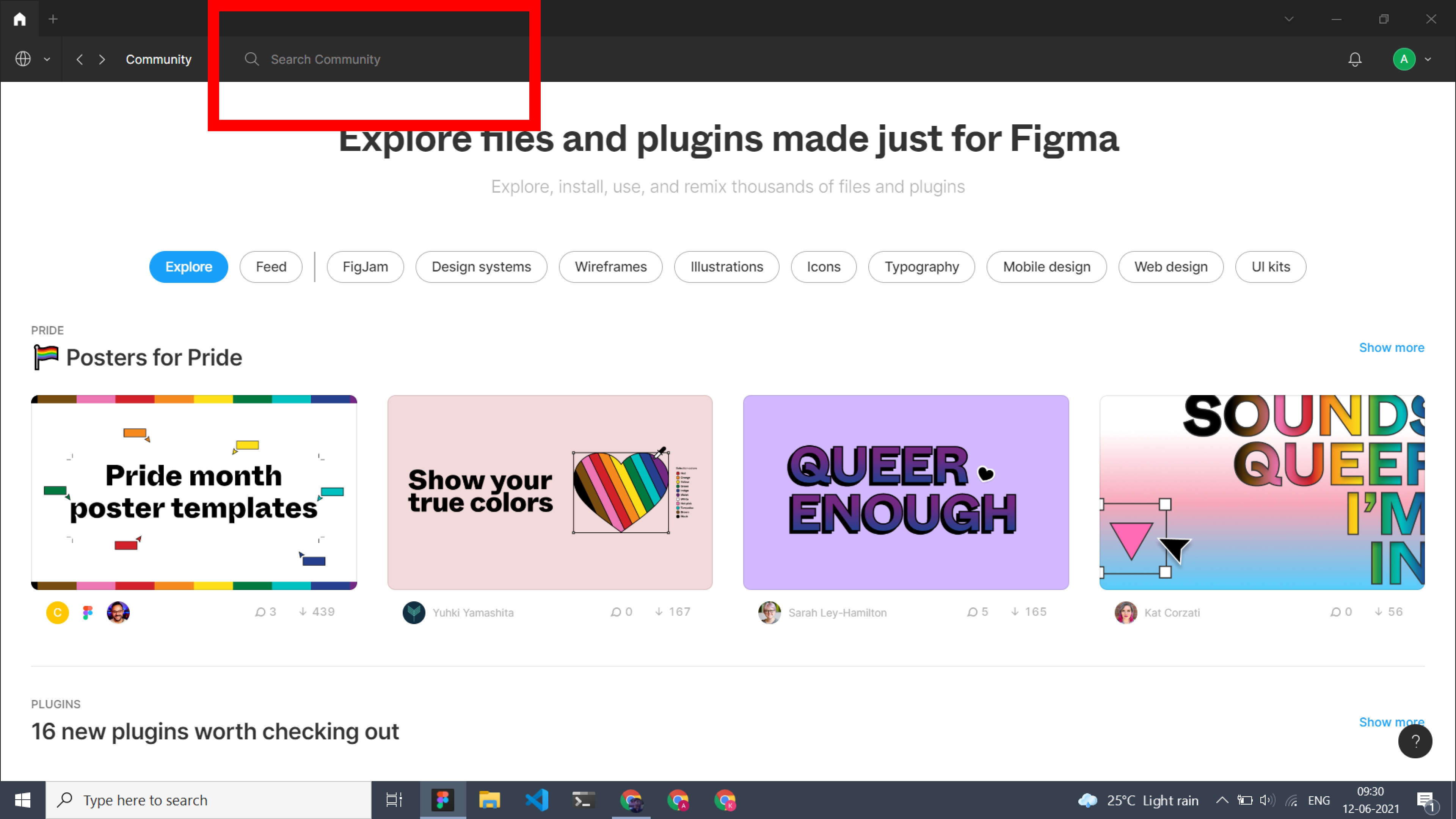
I really love the explore section in Figma but, whenever I want to search for something in the community, I find it hard to locate the search text field because of its light colour (currently located at the top left side ).
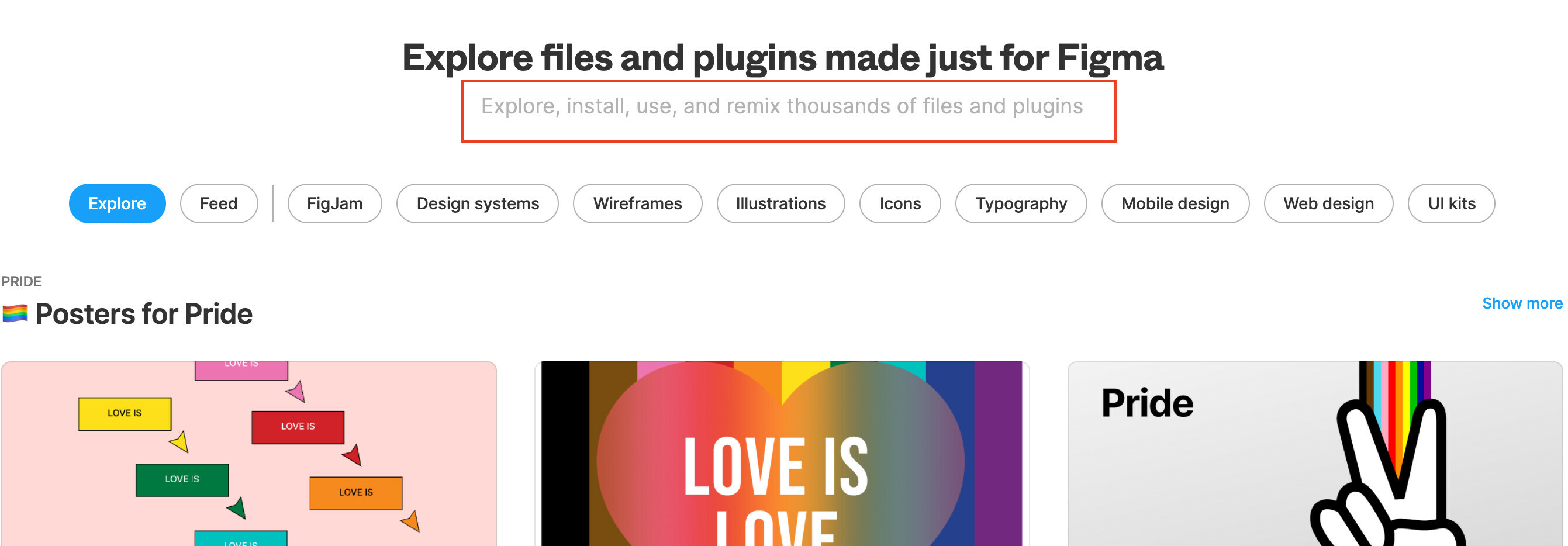
I have highlighted the search area with a red box
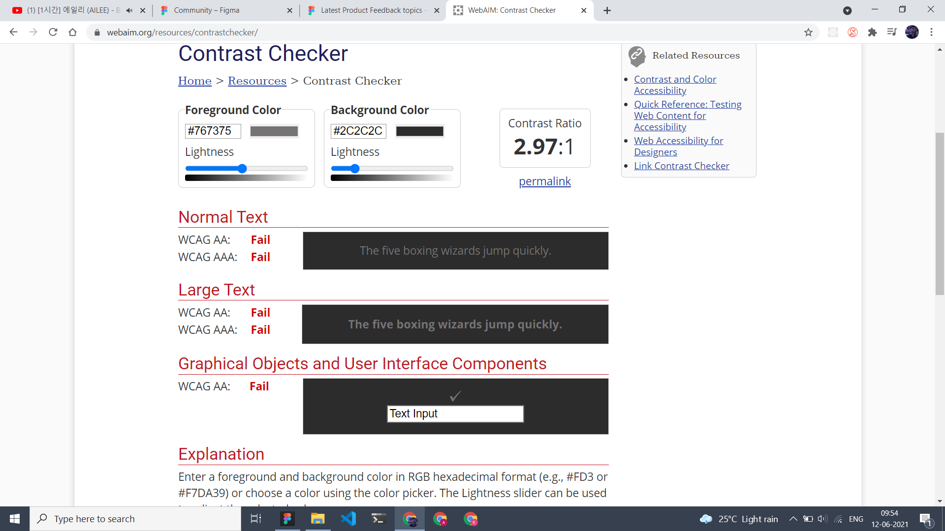
I even checked the contrast ratio and it is around 2.97:1. Here is the screenshot
It would be better if the search text field has a white background.
Does anyone also find it hard to locate the search text field?
I have a very small problem, but that bugs so much when I am searching in the Figma community. 99% of the times I enter the page to search for something, every single time I click the second heading thinking that it is the search bar. It then takes me about a second to realise I have done it again and that the search bar in fact is located above in the grey top bar.
Maybe the reason is a mix of that I am used to that search fields are located at that spot, that the heading starts with “Explore”, that search field placeholders often are grey as this text, and that it is placed close to the “filtering” chips.
Are anyone else experiencing this usability issue?
ohhh! I have the same issue! I’d give a vote if I weren’t out of votes xD
yes, check out Search bar is not easy to find!
Just put the search bar into the body of the home Comunnity always i’ll check I tried to click on that place
Hello everybody! Figma has added a search input to the expected place for many people. The Figma Community page now looks like this:
Hi Team Figma,
I’m a 1-week old user of this amazing app and I wanted to explore some plugins by searching specific keywords. However, I couldn’t find the search option in my few initial attempts. So, can we have a search bar above or below of “Explore Creators” button for easy access?
Reply
Enter your E-mail address. We'll send you an e-mail with instructions to reset your password.


