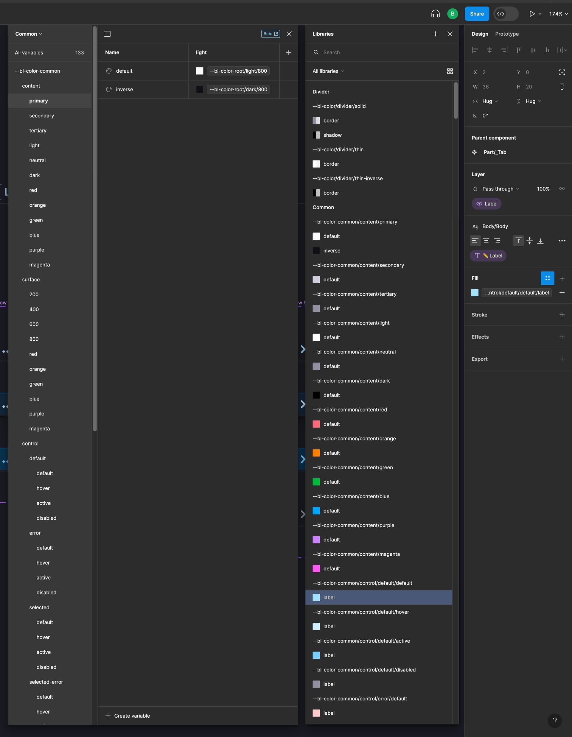
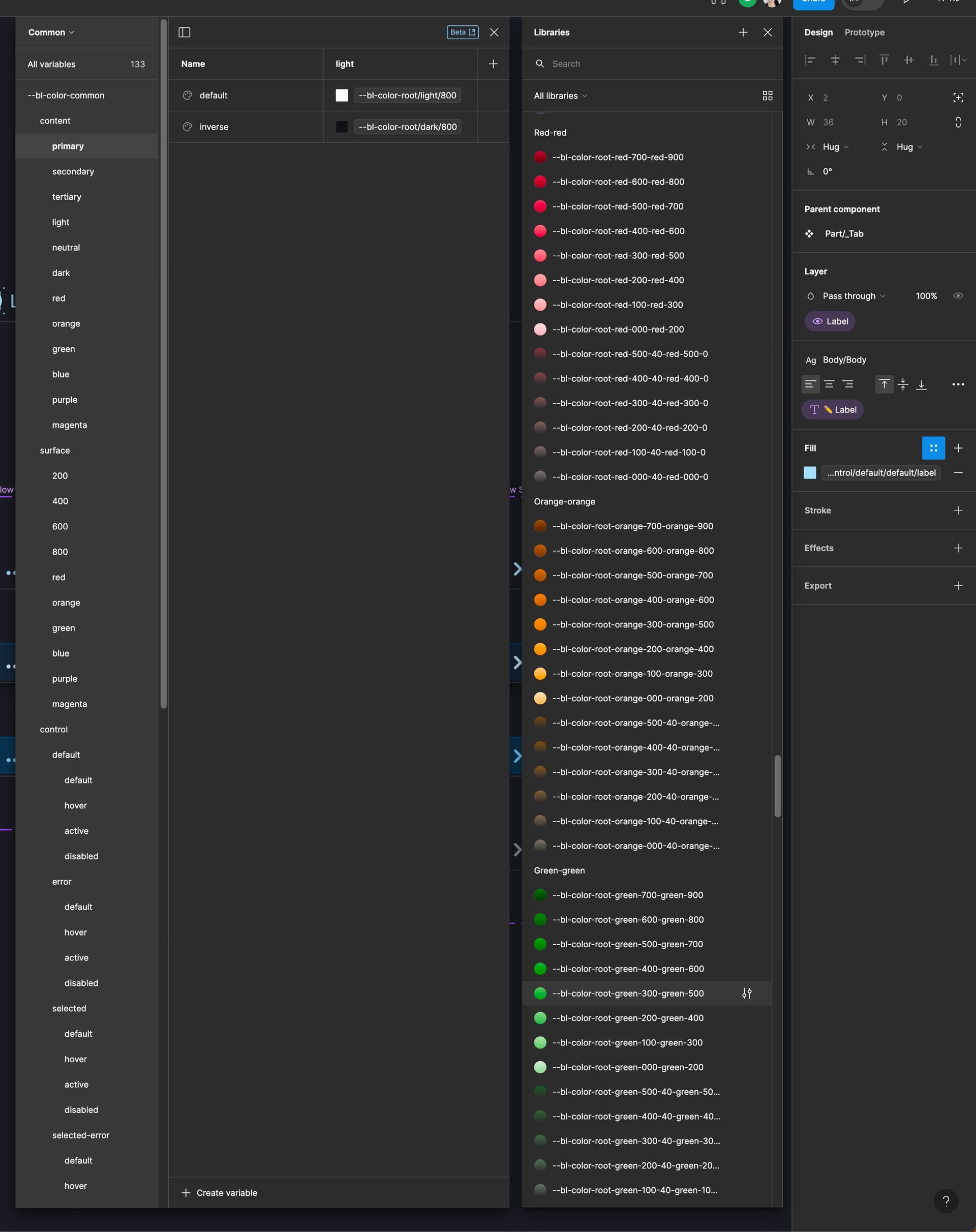
Selecting color styles/variables, text styles, or anything else from one of these narrow and short popup windows in Figma is like trying to read a book through a keyhole - a major usability issue considering that selecting these things is one of the most common operations that a designer does.
I have modified a few lines of CSS in Figma to demonstrate the glory of a wider and taller color styles window, where style names are not truncated so that I can actually read them, and my screen space is being used to its full potential.
Sadly, the changes don’t persist after the window is closed.
This would be a very nice and probably easy little big update, eh Figma? 🙏 A few lines of CSS can improve the lives of many.


