Color contrast is the most common accessibility concern for UI designers. There are a lot of great plugins out there that help check color contrast. But what I’d like to see is Figma auto checking contrast and flagging things that don’t meet WCAG spec. Bonus points if you can detect other accessibility issues like small tap targets.
- Describe the problem your experiencing and how your idea helps solve this
Checking contrast between items and their background is currently subbed out to 3rd party plugins. Having the ability to check your contrast ratings as you are making decisions on color gives you the ability to adjust and check the work at the same time.
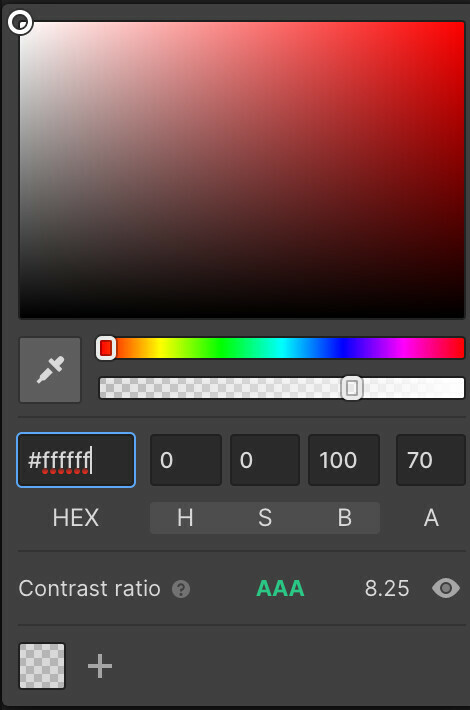
Here is an example of how it works in Webflow. This is selected on a bit of text over a dark background currently.
Agree this would be good as a native feature. My plugin Contrast does update live as you change colors with the color picker. So even though it’s a plugin it does at least allow for that immediate feedback loop.
I use that plugin everyday. Thanks @Alex_Carr!
This is a great idea, thanks for sharing @Brian_Clay!
Would you see this as a separate tool or more built into the color picker?
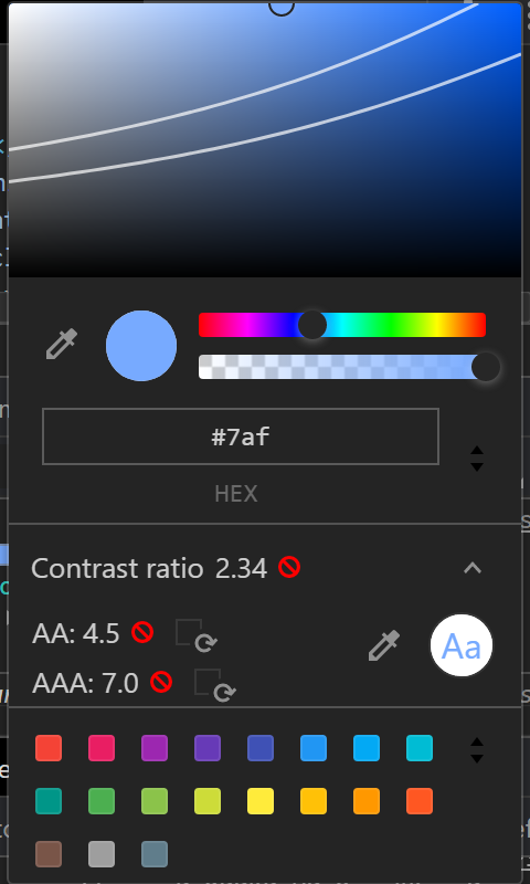
I think it’s best to specify the color accessibility in the Color Picker. In the screenshot below: Color Picker from Chrome DevTools.
I think it would be a good idea to have an “Accessibility issues” panel in the Figma, providing a similar function to the “Errors” panel in an IDE. When hidden, it would show a count of detected accessibility issues, and clicking on it would display a list containing the details of each issue (i.e. “Text in frame Foo fails to meet WCAG AA”, “Colours #FFFF00 and #00FF00 are not visually distinct for users with protanopia”). Clicking on an issue would then take you to the element where it occurs.
This panel could also house other accessibility-related features, such as colourblindness simulation filters.
I think integrating this into Figma would significantly reduce the amount of effort needed to design accessible UI, and in turn improve the state of accessibility on all platforms.
It would be nice to have text accessibility with a built-in color contrast ratio tool. Right now, I have to rely on other tools for that, but it would be nice if Figma had a built-in tool like how Webflow does.
The color I pick from the Figma color picker shows the Content Accessibility Guidelines (WCAG) rating that corresponds to that contrast ratio.
Reply
Enter your E-mail address. We'll send you an e-mail with instructions to reset your password.


