Hello! Our team has been really torn on how to approach certain components that would be considered “organisms” in the atomic school of thought. We need a component that can maintain its styling, but be manipulated structurally in an infinite amount of ways.
For example, a card or a modal. We need consistent padding, drop shadow, stroke, and headers, but the user needs to be able to manipulate whatever goes inside the card or modal. Basically, rather than a fixed component, we almost need a rule or grouping of styles…
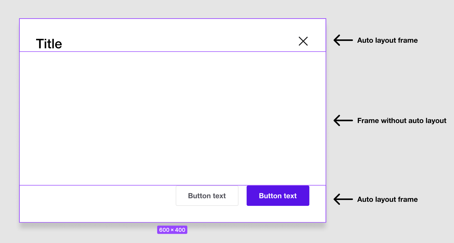
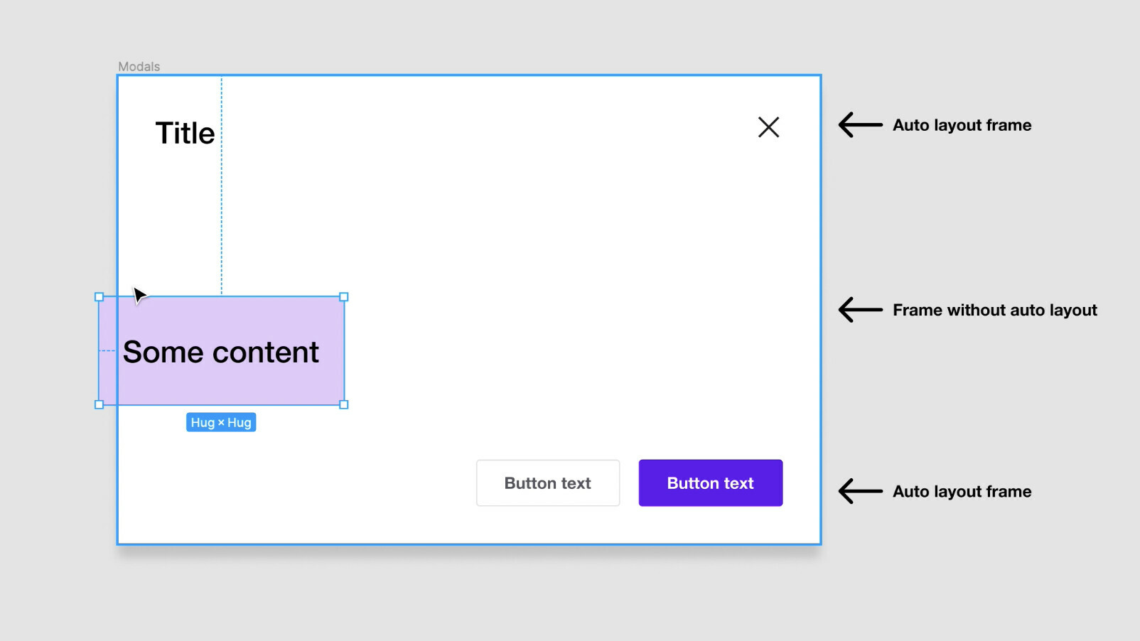
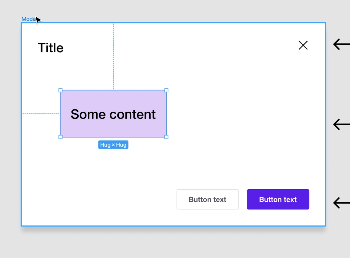
Solution 1: One approach I thought of was making auto layout frames for the fixed content and placing them inside a regular frame (without auto layout).
The designer would still have to detach the component to manipulate the layout, but the styles would remain the same. They could then place anything without the modal frame without affecting the header or buttons.
The benefit here is that we can include the different variants for states in the component, but the designer would have to pick the state before detaching…A bit of a high learning curve especially since some of our designers are new to Figma and some of the experienced ones just get frustrated and detach anyway.
Solution 2: We also thought of doing a “grab and go” approach, combining sub-components to create examples of how a modal could look to use as a boiler-plate or starting point that is not a component itself. The downside to this approach of course is that we wouldn’t be able to update any of the styling via library update if we ever changed the design. It would be floating out on its own 😅
Solution 3: The only other solution I could think of would be to take the “grab and go” boiler-plate approach and style it using a set of redundant, but localized styles inside the component library. This would be a set of styles that would not necessarily be published, specifically for these components (i.e., “Modal-stroke-regular,” “modal-stroke-hover”…). This would allow us to change some of the styles and update them remotely if we ever needed to. We wouldn’t be able to do anything about padding or border radius, though.
Sorry for the excess of detail! Would love to know how other teams are handling this issue! Are we over-thinking it??


