Absolute position background resizes when hugging content

Hey there,

I love the feature, where we are now able to make something inside an auto-layout have an absolute position. Something that I really would like to add to an absolute element inside an auto-layout is to still resize based on the component’s size when hugging content.

Let’s say we have a component that functions as (part of a) background image. We don’t want it to be an element in the auto-layout because it will be stuck between other elements and listen to padding, instead we want it to spread on the background. But when the rest of the auto-layout resizes the component, our absolute background component will stay the same size and not fill (parts of) the background anymore.

Hope this makes sense, would be really nice to have this.

1 Like

You can using constraints, see here for a detailed walkthrough.

1 Like

No, that only seems to work when the background is not a component / frame.

It works with a Frame. Not with a component but it’s a known bug and I’m sure won’t stay that way for long.

1 Like

Doesn’t seem to work with a frame, no. Anways. I’m not looking for a solution for a problem, I have a feature idea that would be awesome in my opinion. To have a button that makes something an absolute background element that listens to the resizing of content.

Easier to discuss with an example. Here’s what I understand you’re trying to do. Maybe I’m reading you wrong.

Hmm, you are right it does seem to work for you, weird, I did exactly the same but it didn’t scale. Still see the problem of the image not resizing right now tough… having a lot of text in your component will make your background image look weird right?

Ah no, it was because you image was cropped. Thanks, let me mess a bit with my example, see if I can get it to work.

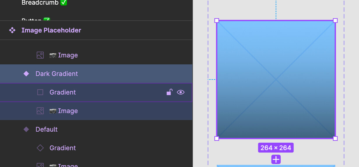
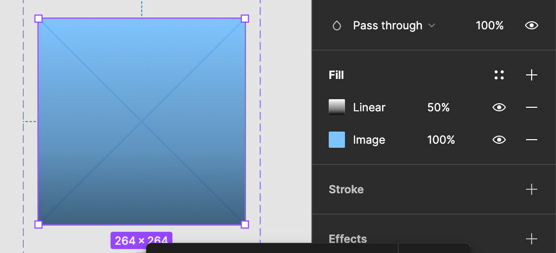
I’ve done it. It’s even possible with a component after all. It seems the problem was that inside the component, someone in our team created 2 layers, 1 with the image and 1 with the gradient, instead of just putting the image and the gradient on the top layer of the component.

Here are the good and bad examples:


Thanks agains for showing me your example, that helped a lot.

1 Like

This topic was automatically closed 90 days after the last reply. New replies are no longer allowed.