

Review updates tool: Issues + improvement suggestions
Hello folks!
First of all, thanks for all the great work you constantly do on Figma. It’s really an amazing tool and keeps getting better and better. ❤️
With that said, I would like to point some issues with the “Review updates” tool, mostly related to how Figma theme interface sometimes make things unusable. 😅
1. Enable user to toggle background color.
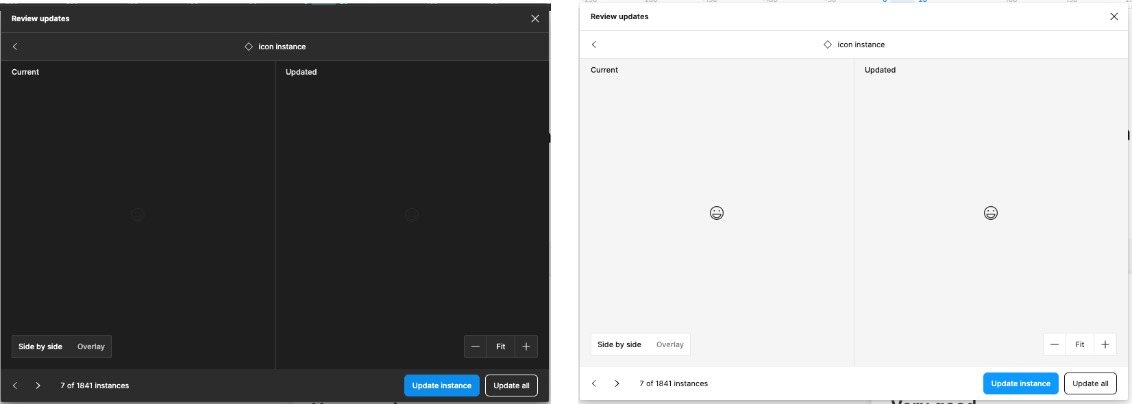
The images above are from exactly the same component. As you can see when we have the dark interface theme enabled, it’s impossible to even see the component in order to review it’s changes. As you can image, the same is truth in case you have light colored components at the light Figma interface theme.
The simple solution / patch here is probably add, near to “side by side / Overlay”, an option to toggle the preview background color. If you really want to go MVP, you can simply change the entire Figma theme with this toggle, kinda like a shortcut of “Preferences > Theme” menu.
2. Hidden elements that need update
I love the fact we move over the file every time I navigate to the next component so I can see it in it’s real place. The problem I see here is, in a lot of situations components to be updated are actually hidden elements so, when the canvas navigate to it, I can only see the “selection box” but not the real component (Since it’s hidden).
For this it would be great to have some options like “Skip hidden elements” or simply made the component visible when it’s selected during the review update process.
3. Review updates window size
I work with a big screen (And I believe a big portion of folks using Figma as well) and one thing that frustrates me a lot is the fact I cannot resize the “Review updates” window. The current size works fine with smaller components (Like atoms) but when things start to get more complex, and bigger, it fills kinda claustrophobic to review a component in that small window with so much screen real state available around… I mean, look at all this space around the modal…
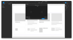
(Sorry for the external link but as a “new user” I can only embed one image to the post. ☹
4. Improve navigation options
If I have 1841 instances of a component (True story), I can check one by one using “<” and ">"chevrons at the bottom left corner of the window. This kinda work. But sometimes, specially in larger files it may take some time to move between instances (I’m not going to dig into performance issues cos I assume this is a constant area of improvement from Figma team side).
My suggestion here is to give users a list of all instances (Kinda like the layers view) so I can select what instance I want to preview instead of have to click multiple times and go one by one, wait it load to click in next until I find the one I want to check.
That’s it for now. I hope it can help you somehow.
If you need more information about any of the items, feel free to answer here or reach me out directly 🙂
Cheers!
Idmar
P.S.: The original post had multiple images to illustrate things but when I tried to post I got this error:
“An error occurred: Sorry, new users can only put one embedded media item in a post.”
Honestly it was extremely frustrating to get this error at the end not at the beginning 😦