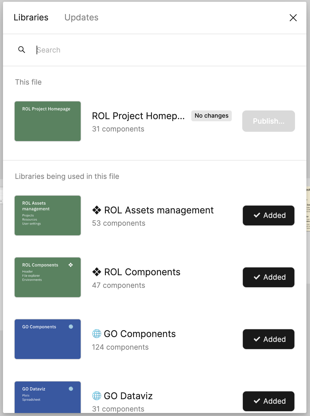
Sorry, but the new design is a total crap.
In the previous version a was able to see a lot of list items, and toggle was perfect choice to indicate status of connection to the file.
Now I can see only few files, as the unnecessary covers and vibrant buttons consumed all the place here. The button as an indicator of the connection status is very bad solution also.
Revert to previous version of the Libraries/Updates window
Enter your E-mail address. We'll send you an e-mail with instructions to reset your password.

