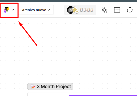
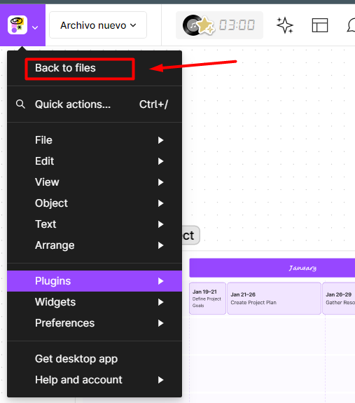
To enhance user experience and navigation ease on the main page, I suggest altering the current label “/Back to files” to “/Back to Home,” and pairing it with the corresponding Figma icon. Furthermore, relocating this button outside of the “Main Menu” and placing it in a more prominent area of the interface could increase its visibility, as there is ample space available for this adjustment. Such a minor modification could likely boost the site’s adoption rate among new users by providing clearer and more direct guidance to the homepage.

I’m relatively new to user experience work, but I believe this suggestion will be valuable!


