

What do you think about having a horizontal scroll on the layers panel? I can’t see the name of the layers and usually widen the panel to be able to see, but since I use a 13", this makes the canvas smaller.
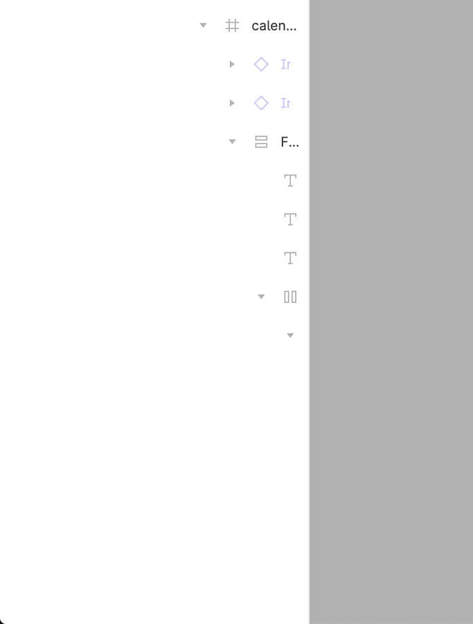
I must admit, I’m fighting a true situational depression right now. My ticket got punched today and I now have access the UI3. Since, in my mind, there is no UI enhancement more important than a horizontal scroll in the layer panel (which I was convinced must be in the new UI), I dove into the new experience with great excitement looking forward to finally being able to access deeply nested layer elements.
Alas, no joy.
So far, I’ve found 2 things about UI3 that seem like progress in the area of User Experience, but it all falls apart when I realize that a horizontal scrolling Layer Panel is not among the changes.
Even more disappointing is the fact that someone published a script block that could be run in the console to create a toggle control that would greatly widen the layer panel. With UI3, that script no longer functions. It wasn’t perfect, but it did allow temporary access to those hard-to-reach places.
its annoying clicking the small hitbox to get a element and even when i could click the element on the canvas i use the layers for that. is this adjustable or fixable.
Why Figma don’t want to do this ? Look so simple and logical.
Give us the option to enlarge this panel !!!
Looking for colors all day long like we do right now (with a extra-small widow panel), is really painfull !!!
I really hope you can add a horizontal scroll bar to the Layers panel. Oh, and by the way, I use Shift + Mouse Wheel for horizontal scrolling a lot, so please don’t remove this shortcut while adding the scroll bar. Thank you 🙏
I hope this message finds you well. I wanted to share an idea for enhancing the user experience in the New UI, particularly regarding the visibility of layers in the sidebar.
As we often work with complex structures involving multiple layers nested within one another, the current sidebar can become quite cramped. I suggest implementing an automatic focus feature for the active layer name in the sidebar. This would ensure that the selected layer name fills the width of the sidebar, making it easier to read long names without the need for horizontal scrolling.
Currently, layer names can get truncated to just a couple of characters, which makes it challenging to identify the layers quickly, especially in intricate designs. Additionally, there is no option for manual horizontal scrolling, which further complicates the visibility of full layer names in complex structures. Adding a scroll feature would provide users the flexibility to see the entire name if needed.
Thank you for considering this suggestion! I believe it would greatly enhance our workflow.
In case of deep nesting, it would be nice to have horizontal scrolling in layers to go to the desired layer that is deep in the structure.
Right now you have to move the mouse cursor to the border of the panel to stretch it. And when you don’t need to focus on layers and need more canvas space, you have to stretch it to a small width again.
So simple horizontal scrolling would improve ux.