

Improve the New Position Sticky Implementation
Am I the only one who’s left wanting by the new position sticky feature?
In my opinion, there are three main problems with the new sticky feature:
- It’s not compatible with auto layout
-
Solution
Make the sticky elements always appear on top of other elements (and later add a z-index feature so we can fine tune the behavior)
-
- The sticky element has to be an immediate child of the scrolling container
-
Solution
Make the sticky behavior relative to the closest scroll container instead, so the sticky element can be a grand child, great grand child etc.
-
- Only works for vertical scrolling and can only stick to the top of the container
-
Solution
Add an offset property (top/right/bottom/left) - like the CSS implementation - super simple, but pretty flexible (only problem with the CSS implementation is the overflow: hidden limitation)
-
What I want to be able to make
None of which is possible with the new sticky feature unfortunately
HTML prototype
- Note the sticky footer inside the container
- Note that the elements stick relative to the window’s scroll position - it doesn’t care that the sticky element is far down the DOM tree
- Check out the Codepen here
Figma prototype
- This, only with auto layout
Sticky on larger screens (multiple columns etc + support for sticky in components)
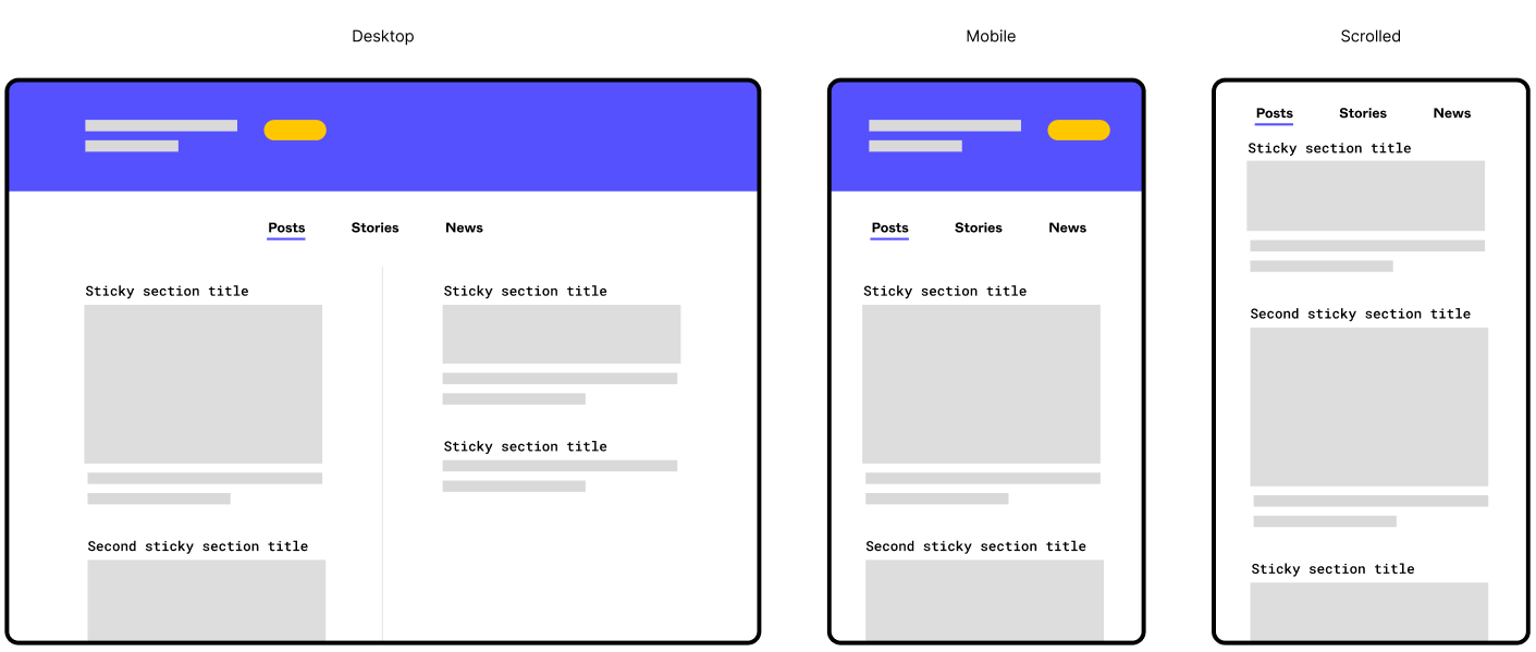
- I actually am working on a layout a bit like this (two columns with multiple sections in each). Being able to more accurately prototype it would be gold!
- I would like to be able to create one component for each section. Within that component, I would then like to set the section heading to sticky
Edit: I initially just wanted to start a discussion and rant about how the new position sticky feature was implemented, but as the post was moved from “general discussions” → “share an idea” section, I felt the need to amend my post. I hid the rant below 😛
Just me ranting about how I'm disappointed by the way Figma implemented position sticky
Figma, why do you mock us so? (Position sticky discussion)
Yesterday Figma announced a lot of really nice quality of life improvements in their Little Big Things update. All good stuff, but the only thing that got me personally (very) exited was the position sticky feature.
Am I the only one who’s left utterly disappointed?
I thought Figma were committed to the auto layout feature, so why do they mock us so? Position sticky is in no way compatible with auto layout! (1)
The best I could do with position sticky:
- Notice the oversized containers (colorized). They have to be that tall to make the element stick beneath the sticky tabs
- The first element sticks nicely, but it will overlay any other sticky layer below it
They can probably fix this issue by just rendering sticky elements above the rest or something, but there is also another, bigger problem.
Problem 2
The biggest problem with the new sticky feature is a more fundamental implementation detail, which I suspect they won’t fix - thus, making me very pessimistic as to the usefulness of the feature (and it’s future). The problem:
You can only set position sticky if the immediate parent container is a scrolling container
This means that if you want to take advantage of position sticky, you have to have a totally flat layer structure - which again, is not compatible with auto layout! Or even components for that matter! (3)
The fact that the direct parent has to be a scrolling container, has always been the case for fixed elements, which has been an ok limitation (3) since fixed elements are detached from the layout flow.
Sticky elements on the other hand is a part of the layout flow, and is only detached from the flow just before it is scrolled out of the viewport. Them being a part of the layout also means that they has to be part of the auto layout, which is probably several layers deep due to how auto layout works.
Foot notes
(1) This is a bit of an over exaggeration. I know position sticky technically is compatible with auto layout, but due to auto layout’s strict z-index hierarchy everything will overlap the sticky element. “Just switch the canvas stacking”, you say? Then the next sticky element will be overlapped by the first element…
(2) When using auto layout you will end up with a deeper layer structure than you would without. This is because you have to the paddings and gaps on the auto layout containers, and in order to have different spacings, you need more and nested auto layout containers. This is perfectly reasonable and a boon to the structure and organization of files. It also makes the mental model of designing within Figma more like the mental model when writing the code.
(You can maybe get away with a flat auto layout structure on mobile mockups sometimes, but on desktop mockups it’s almost never the case).
(3) It’s been an ok limitation, at least after the position absolute feature was released and we could combine position fixed with auto layout.
Notes
I know that implementing position sticky is probably very tricky. But I think this is one of the cases where doing it right or not doing it at all would have served you better.
Figma has again and again spent the time to do it right, which makes me all the more disappointed this time around. It’s been so exiting to read the Figma blog on why seemingly easy to implement features are anything but.
I suspect there won’t be any such blog posts about position sticky 😦
Anyhow; I just wanted to put this rant out there. Please drop a comment if you agree/disagree. Would be nice to have a discussion about this.
Either way, have a good one! 😃