

Folders: I'm missing Folder contents preview/thumbnails

  • August 10, 2026
  • 16 replies
  • 115 views

Adelina3

Hello,

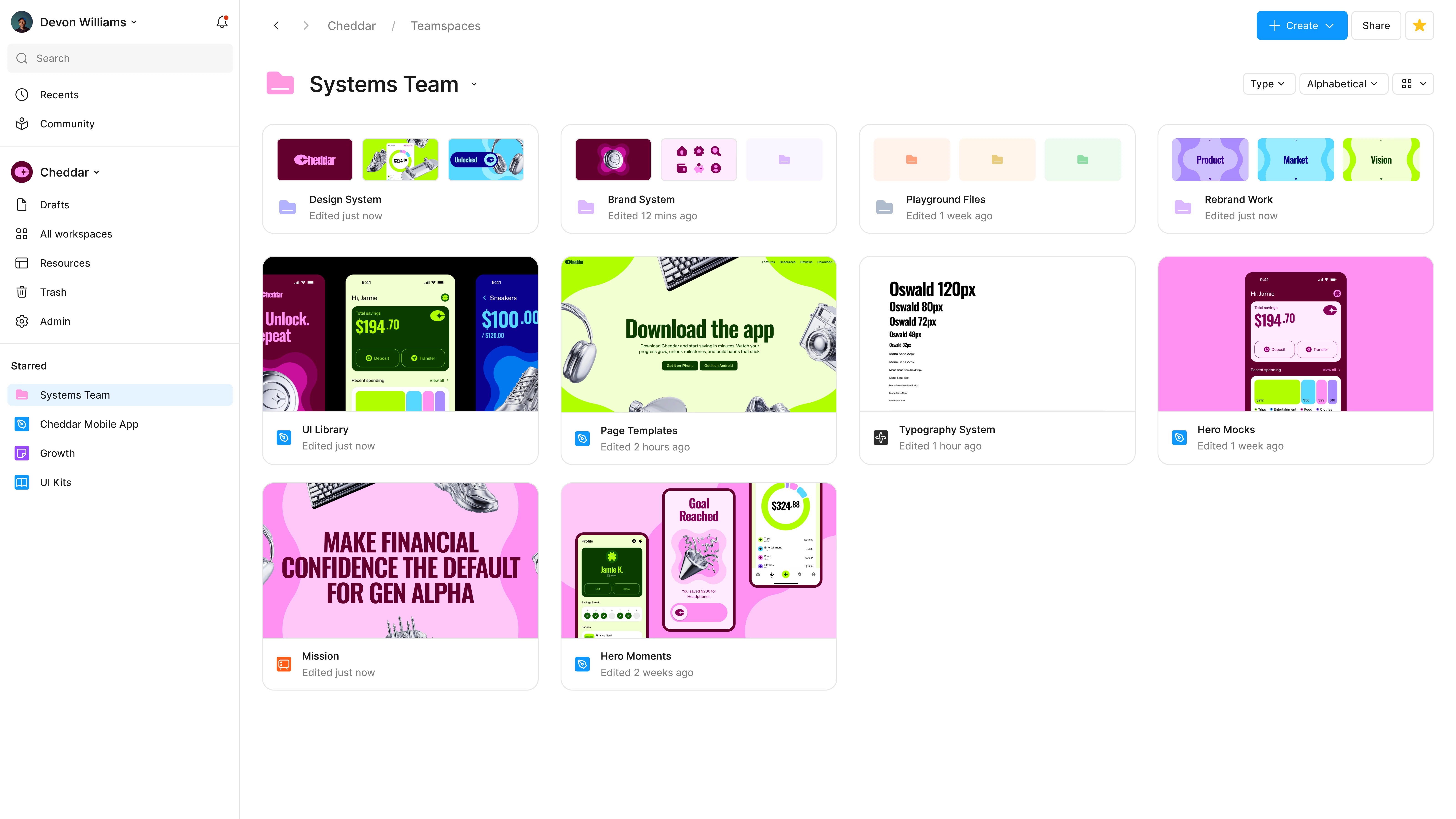
some feedback from my side regarding Folders, I like the options of a nestable folder, but I find it hard to navigate to the files I’m looking for. The folders are named, but the file thumbnails that were visible with Projects were a huge readability feature that I’m really missing now.

I was searching for it in settings, but couldn’t find a way to set it. I actually added a description to a folder, but did not actually see not one place that the description was shown? This part is especially confusing.

If I could make an improvement suggestion to a current implementation it would be to have a setting to show or not to show some folder contents thumbnails, similar to the previous implementation.

Fingers crossed this can be done!
16 replies

Will Weaver
  • New Member
  • August 11, 2026

Yeah, this sucks. I relied on visual navigation to know what I’m looking for at-a-glance :(


Jaycee Lewis
Figmate

Hey ​@Adelina3  ​@Will Weaver 👋 Thanks for the feedback. I’ll share this with the team that owns Folders. Keep the feedback coming 🙌 — Jaycee


Elizabete Avotina

Hello!

We are also unpleasantly surprised with the new update, the thumbnails helped so much to locate the right project/ folder. Now they all look the same and one needs to read through them all to find the correct one. Needless to say, also remember what was the name of the folder. Please, bring back thumbnails - Figma is for visual minds 😥

Best Regards

Elizabete 


maleneva
  • New Member
  • August 12, 2026
The new way of displaying project folders—showing only the names—is really inconvenient. It used to be easy to spot the right project immediately thanks to the preview image. Now, you have to read the name of every single folder to find the one you need. Have they considered how practical this actually is when there are a lot of folders? You have to go through the entire list just to locate the right one. Plus, I have to recall which projects are in which folder. It’s inconvenient. It takes too long. And it’s incredibly annoying.⠀At least give users the option to choose the display mode—so they can select whether to show folders with just their names or with previews, as before.


maleneva
  • New Member
  • August 12, 2026
I ran into this update today, too. There are so many project folders, and now I have to read the name of each one to find the right one, instead of just spotting the necessary preview image right away. Plus, I have to remember which project is where and what it's named.
 

Darya Kozlova

The new folder-style project view is really inconvenient! Searching for a project by folder name is slow and cumbersome. Compared to the previous preview view, it takes much more time and is just frustrating. Please bring back project previews — they were so much more convenient!


maleneva
  • New Member
  • August 12, 2026
I agree. Or at least let users choose the display mode they prefer. It should be possible to add a setting for selecting the folder view.
 

Darya Kozlova

Totally agree, a view switcher would solve the problem.


Jaycee Lewis
Figmate

Hey ​@Darya Kozlova  ​@maleneva I merged two topics since they both have new Folder-based feedback. Please keep it coming. Thank you! — Jaycee 


ariel_sativa
  • New Member
  • August 12, 2026

Problem:
With the switch from Projects to Folders (and the new ability to nest folders), we have lost the ability to see the thumbnail previews of files nested inside a folder. Folders now just display a generic folder icon in both grid and list view, with no visual indication of what's inside.

Our folder view is now a wall of identical, generic icons and text with zero visual differentiation. Previously, thumbnail previews let us scan and recognize folders at a glance. Now we have to take the time to scroll and read through all of the folder names, and navigate in and out of folders to figure out what's inside, which slows down everyday navigation considerably. This is a major UX downgrade.
 

our new view (with name placeholders)


This is a significant workflow regression for Professional teams like ours. We're forced to maintain a large number of separate folders/projects because Figma doesn't allow different access permissions on individual files or subfolders nested within a parent folder — the only way to control access is to keep things in many separate top-level folders. Since we're required to use many separate folders to work around the lack of individual access permission controls, visual differentiation between folders is essential for quickly finding the right one. Removing thumbnail previews has made an already folder-heavy workflow noticeably harder to navigate.


Suggestion:
Add the option to view or hide thumbnail previews of nested file contents to/by the view as grid or list segmented control.


djv
Figmate
  • Community Support
  • August 12, 2026

Hi ​@ariel_sativa, thanks for your honest feedback! 

I completely understand why this change has disrupted your workflow. The "wall of identical icons" framing is a useful way to put it. To be transparent, the folder icon replacing thumbnails was a deliberate design decision in the move from Projects to Folders. With folders now nestable and sitting alongside files, the team chose icons to keep the two visually distinct, but losing at-a-glance recognition is a real cost of that trade-off.


This isn't currently on the roadmap, so I don't have an exact timeline to share yet. But the team said they'd revisit previews if this came up once folders were in wider use by the Community, so I've passed your topic along to the team directly. One thing that would help me advocate on your behalf: What would a useful preview actually tell you? That a folder isn't empty, what kinds of files are inside, or genuinely recognizing specific files by thumbnail? That distinction matters a lot to which approach they'd build.


For anyone else hitting this issue, please add your use case below. Volume on this thread will help, and I’ll ensure your feedback is passed along to the team!


Elizabete Avotina

Hi ​@ariel_sativa, thanks for your honest feedback! 

I completely understand why this change has disrupted your workflow. The "wall of identical icons" framing is a useful way to put it. To be transparent, the folder icon replacing thumbnails was a deliberate design decision in the move from Projects to Folders. With folders now nestable and sitting alongside files, the team chose icons to keep the two visually distinct, but losing at-a-glance recognition is a real cost of that trade-off.


This isn't currently on the roadmap, so I don't have an exact timeline to share yet. But the team said they'd revisit previews if this came up once folders were in wider use by the Community, so I've passed your topic along to the team directly. One thing that would help me advocate on your behalf: What would a useful preview actually tell you? That a folder isn't empty, what kinds of files are inside, or genuinely recognizing specific files by thumbnail? That distinction matters a lot to which approach they'd build.


For anyone else hitting this issue, please add your use case below. Volume on this thread will help, and I’ll ensure your feedback is passed along to the team!

...the same way as it was before - to see the thumbnails of the projects inside the folder. It was really good and easy! Having to make additional thumbnail for the older would add another task - to manually update, maintain… unnecessary - instead, seeing “live” what is inside, is the most amazing thing that no other  widely used file management systems have done (eg MS One Drive, Google Drive etc.). 


Viriart
  • New Member
  • August 13, 2026

Hi ​@ariel_sativa, thanks for your honest feedback! 

I completely understand why this change has disrupted your workflow. The "wall of identical icons" framing is a useful way to put it. To be transparent, the folder icon replacing thumbnails was a deliberate design decision in the move from Projects to Folders. With folders now nestable and sitting alongside files, the team chose icons to keep the two visually distinct, but losing at-a-glance recognition is a real cost of that trade-off.


This isn't currently on the roadmap, so I don't have an exact timeline to share yet. But the team said they'd revisit previews if this came up once folders were in wider use by the Community, so I've passed your topic along to the team directly. One thing that would help me advocate on your behalf: What would a useful preview actually tell you? That a folder isn't empty, what kinds of files are inside, or genuinely recognizing specific files by thumbnail? That distinction matters a lot to which approach they'd build.


For anyone else hitting this issue, please add your use case below. Volume on this thread will help, and I’ll ensure your feedback is passed along to the team!

Folders are great, but the lack of thumbnails is terrible! Reducing everything to a view of small folder icons is a disastrously inconvenient design choice. It makes working incredibly difficult, and hardly anyone actually finds this view suitable.

You’ve deprived your users of a convenient way to work with their projects. Why not offer a choice of display options? Why not include a toggle so people can decide what works best for them?

There used to be a convenient linear view with five large thumbnails per row, making it easy to spot the right one and dive straight into it. You took that away from us and switched to a tile layout where only four tiny thumbnails are visible—it was less convenient, but we resigned ourselves to it. Now you’ve taken that away too! It’s terrible! Don’t you realize that people don’t want to search for things by name? They want to quickly spot the right image and click on it.

I am attaching a visualization of a very convenient folder display option.


Kristina.kam
  • New Member
  • August 13, 2026

I support this, it would be a great solution.


maleneva
  • New Member
  • August 13, 2026

@Viriart 

An excellent proposal for resolving the current problem.
I missed out on the linear view with five large thumbnails in a row, but it looks incredibly convenient—especially if the preview thumbnails are clickable and open the project immediately. Why abandon great solutions in favor of something archaic? Change for the sake of change isn't always justified.As for the proposed view-mode switcher, that’s a fantastic idea. If the developers love those bland, generic folders so much, let them use them—be my guest. But give designers back a proper visual representation of folders and the projects inside them.

ReginaMc
  • New Member
  • August 13, 2026

This update just hit me and it’s so disorienting. I rely on thumbnails to help me navigate, especially since FIGMA refuses to make “alphabetical” the default sort setting. I’m a visual person… I see the contents of the folder and can easily find and click on what I need. It was such an improvement from standard folder organization that I have to sift through all day every day in every other part of my job. I hate being a slave to a dozen software programs who are constantly and drastically changing workflow on me, and FIGMA has always been such a breath of fresh air in so many ways because it felt so innovative and different and so much more user-oriented. At least give us the option to have thumbnails of the contents, rather than just taking it away completely. Even if we could replace the boring gray folder icon with a logo or something, ANY visual distinction would be better than this.