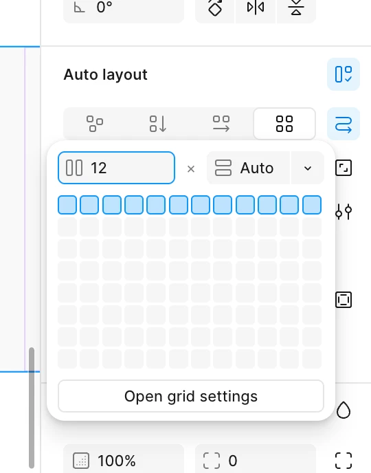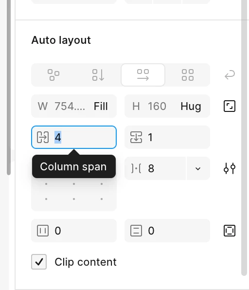
Feature request: Allow Grid Auto Layout to use responsive variables for grid configuration.
Designers should be able to define different column counts, gutters, margins, and potentially span values across variable modes or responsive breakpoints. For example, a grid could automatically use 12 columns on large screens, 6 on medium screens, and 4 on small screens.
This would bring Figma's Grid Auto Layout closer to how responsive grid systems are implemented in frontend, while allowing designers to maintain a single responsive layout instead of creating separate desktop, tablet, and mobile frames.