

Fabrice
October 26, 2021

Divider between Pages and Layers lists is hard to see
  • October 26, 2021
  • 6 replies
  • 2769 views

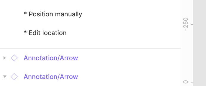
On Layers panel, the divider between the top list (pages) and the bottom list (layers) is really not easy to see and therefore grab. Could we have a more comfortable one? Minimalism is cool but not when it goes against usability. Thanks!

6 replies

November 25, 2021

This topic was automatically closed 30 days after the last reply. New replies are no longer allowed.

Michael_Saravia
February 10, 2022
  1. Describe the problem your experiencing and how your idea helps solve this.
    The left menu or navigation has a UI issue between the pages and layers sections. The divider is too subtle to differentiate between each other. When I collaborate with non designers who don’t use Figma on a regular basis. Don’t realize they can scroll through the pages to find the correct topic of the projects. And when trying to extend the page window, it’s just difficult to move the cursor to the right area to click and drag for it to be extended.

  2. Add as much context as possible (screenshots, Figma files, mockups, etc.)
    Screenshot 2022-02-10 at 10.39.32 AM
    This divider needs to be more dominant and easier to move around for non-designers and designers too.

  3. Ask questions to bring the community into the conversation
    Should one of the backgrounds within this column have a different colour?
    Should the two different subjects be moved to a tab component?
    Should the divider be thicker for easier use?

Fabrice
FabriceAuthor
February 10, 2022

Exactly. Both dividers hard to see and hard to grab.

Eline_Vanermen
February 25, 2022

I have a file with many pages with mockups for the devs to use.
This week, while demostrating my mockups, I’ve heard three different developers say on separate occasions:
“OMG! There are more pages!!! That’s why I never find anything in this file!”

Proposed solution:

When you open the file for the first time, instead of making the default pages-frames division nice and neat,
cut a page name off, so you have a visual cue there’s more

Fabrice
FabriceAuthor
February 28, 2022

In addition, even better, give us a proper divider that looks like it can be dragged up and down. Potentially with a “Layers” section header just like you have the “Pages” header.

JordiVivesMilia
September 11, 2023

Don’t know if it’s a bug, but right now there is no space.
image