
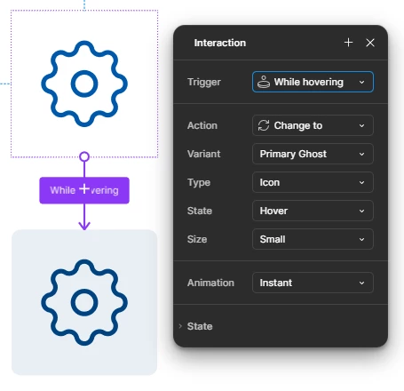
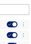
I have a button which is created in the library file in the way it has hover state while hovering:
The same button, according to the WCAG AA requirements must have a tooltip on hover (and when it’s focused while using keyboard navigation but it’s not the case here) https://www.w3.org/WAI/WCAG22/Understanding/labels-or-instructions
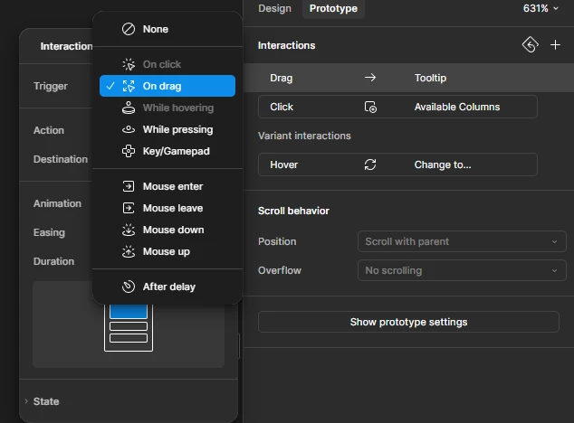
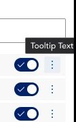
The current interaction mechanism doesn’t allow to display a tooltip on hover from the project level as the hover variant interaction is already reserved on the library level. The screenshot from the project:
Theoretically I can create a button component which already has a tooltip, like this - the variant size is equal to the button size.
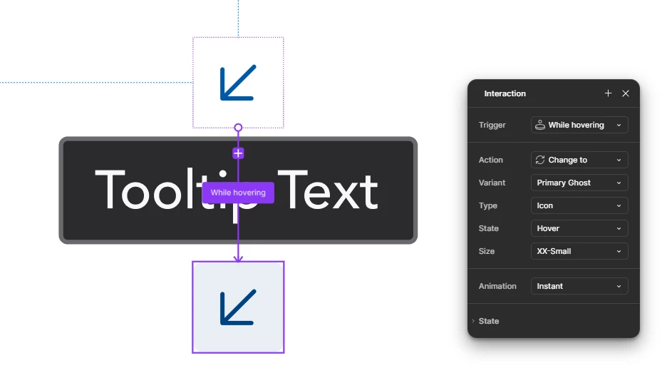
It means the tooltip belongs to the bottom button and is displayed outside of the variant:
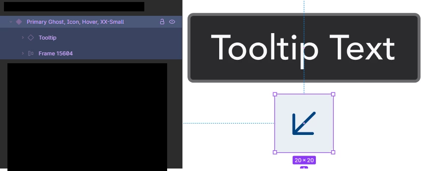
This approach works with some autolayouts:
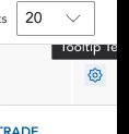
Regardless of the issue from 2.1 image, the main flaws are unavailability to override the tooltip text and control how the text wraps. Also, if the tooltip text is longer and is displayed near the edge of the screen I won’t be able to move it in a way the tooltip adjusts within the given space, implementation-wise. It will truncate the tooltip instead:

Any ideas how to approach the WCAG standard when it comes to hovers and auxilliary components like tooltips displayed at the same time?
Theoretically I could remove all the background hover changes as the WCAG requirements don’t require them as mandatory but the whole design system in Figma would become inconsistent with the coded one and it looks like a really bad trade-off.
Cheers