

Two ways to level up headline text in Figma: text on path vs. perspective + arc
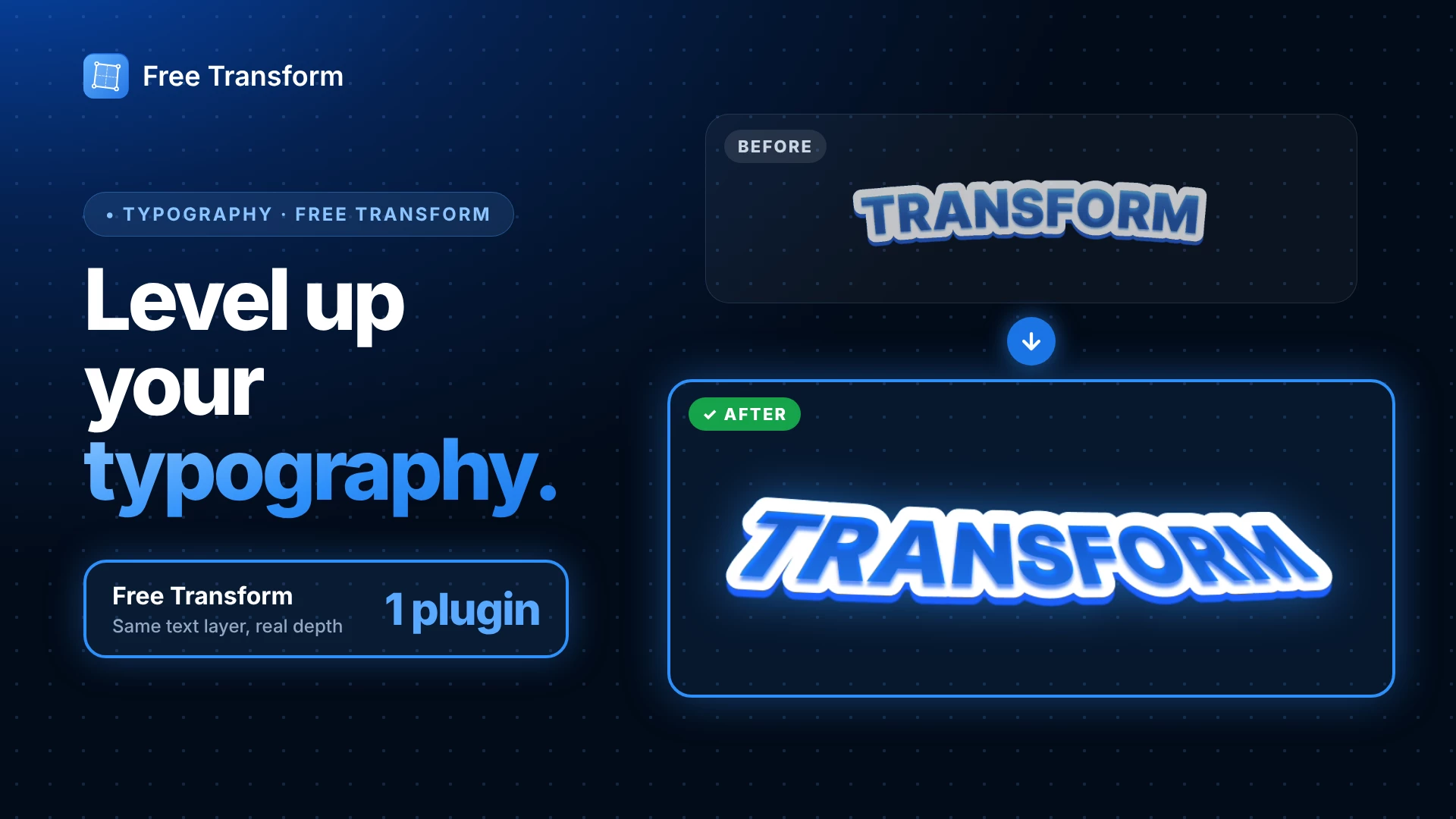
Headline text with a curve and some depth comes up a lot: thumbnails, banners, logo-style titles. Here are two ways to do it in Figma, starting from the same text layer.
Method 1: The usual way (Pen + text on path)
- Draw a curve with the Pen tool (P).
- Put your text on it with Text on path, then adjust the spacing so the letters sit evenly.
- Style it: a gradient fill and a thick outside stroke.
- Duplicate (⌘D / Ctrl+D) the text, recolor the copy darker, and offset it behind to fake an extruded edge.
- Add a drop shadow for depth.
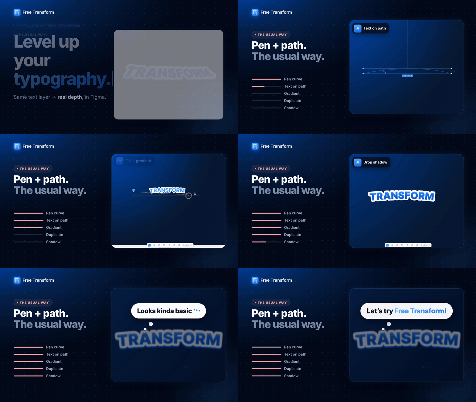
✅ Pros: Built into Figma, and the text stays live.
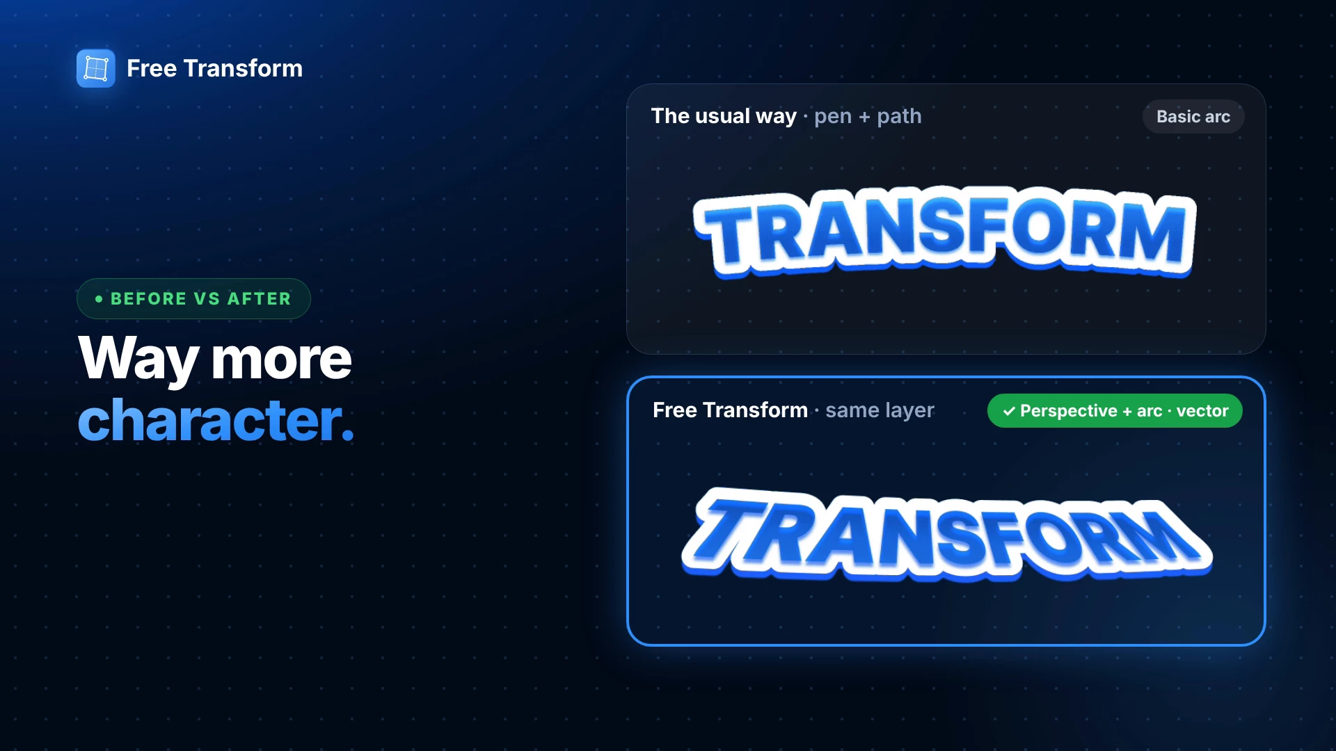
⚠️ Cons: The text only follows a flat 2D curve, with no real perspective. The “depth” comes from stacked copies, so changing the word or color means editing several layers. In my recording this took about 2 minutes, and it still looked like a basic arc.
Method 2: Free Transform (perspective + arc)
- Select the same text layer. Keep the fill, stroke and shadow you already like.
- Open Actions (⌘K / Ctrl+K) and run Free Transform.
- Distort: drag the corner handles in the preview to skew the text.
- Switch to Perspective to give it real depth.
- Go to Envelope → Arc and adjust Bend to curve it.
- Toggle Vector, then Export. You get a vector layer, so you can still change gradients, strokes or inner shadows afterwards.

✅ Real perspective and a bend together, from one layer, in under a minute. It stays vector and you never leave Figma.
⚠️ The exported result is a vector shape, not editable text. Keep the original text layer next to it if you might change the wording later.
Which one to use?
- A gentle curve and live text: Method 1 is enough.
- A title that pops (perspective, a bend, a bold 3D feel): Method 2 gets there faster and looks more polished.
👉 Try it out: https://www.figma.com/community/plugin/1648207154922389186/free-transform