Every time I finished a desktop layout in Figma, the same chore was waiting: rebuild the whole thing for mobile. Resize, restack, refit — by hand, screen after screen. I looked for a tool to speed it up and found the existing ones were either broken or abandoned.
So I built Zeno.
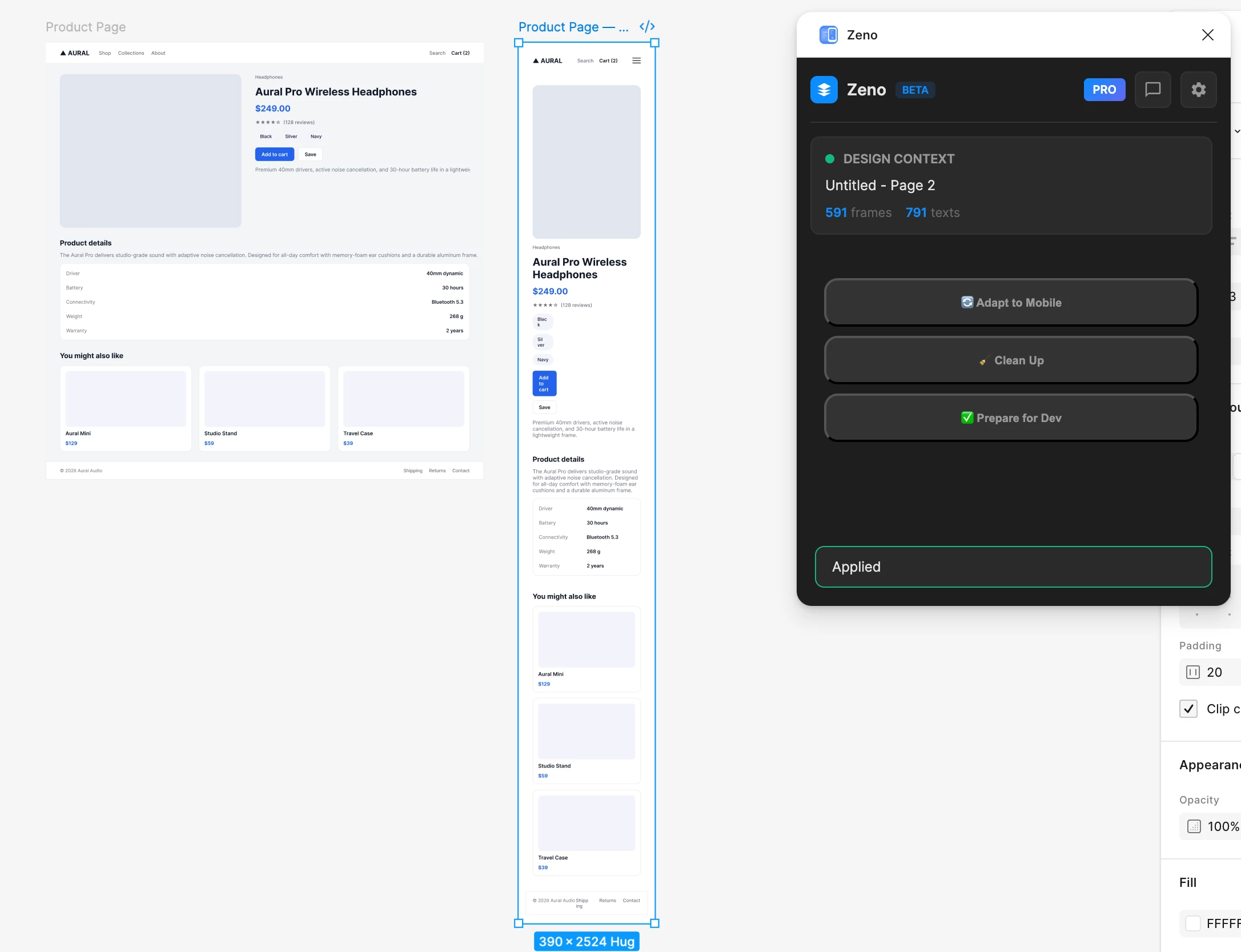
What it does — 3 tools:
🔹 Adapt to Mobile — takes a desktop layout and generates a mobile version in one click
🔹 Clean Up — fixes messy layers, spacing, and naming
🔹 Prepare for Dev — flags handoff issues (detached styles, odd values) before you ship
The honest part (because I'd rather you trust it than feel oversold):
Adapt to Mobile is around 70% of the way there. On clean auto-layout files it works really well. On freeform or messy files it still needs a human pass afterward. It's a strong starting point, not a magic finish — and I'm improving it with every piece of feedback.
I interviewed designers while building this, and a lot of Zeno came directly from the pains they described. So if you work in Figma, I'd genuinely love for you to try it and tell me: what works, what breaks, what's missing?
👉 https://www.figma.com/community/plugin/1653711948873377984
There's a free trial, no account needed. Happy to answer anything in the comments — I read and reply to all of them.
Thanks for taking a look 🙏
— Eugene