Chart Studio: from CSV to editable charts for Figma dashboards and presentations
Hi everyone, I'm the developer of Chart Studio. I built it for the point in dashboard and presentation work where sample charts need to become charts from real data.
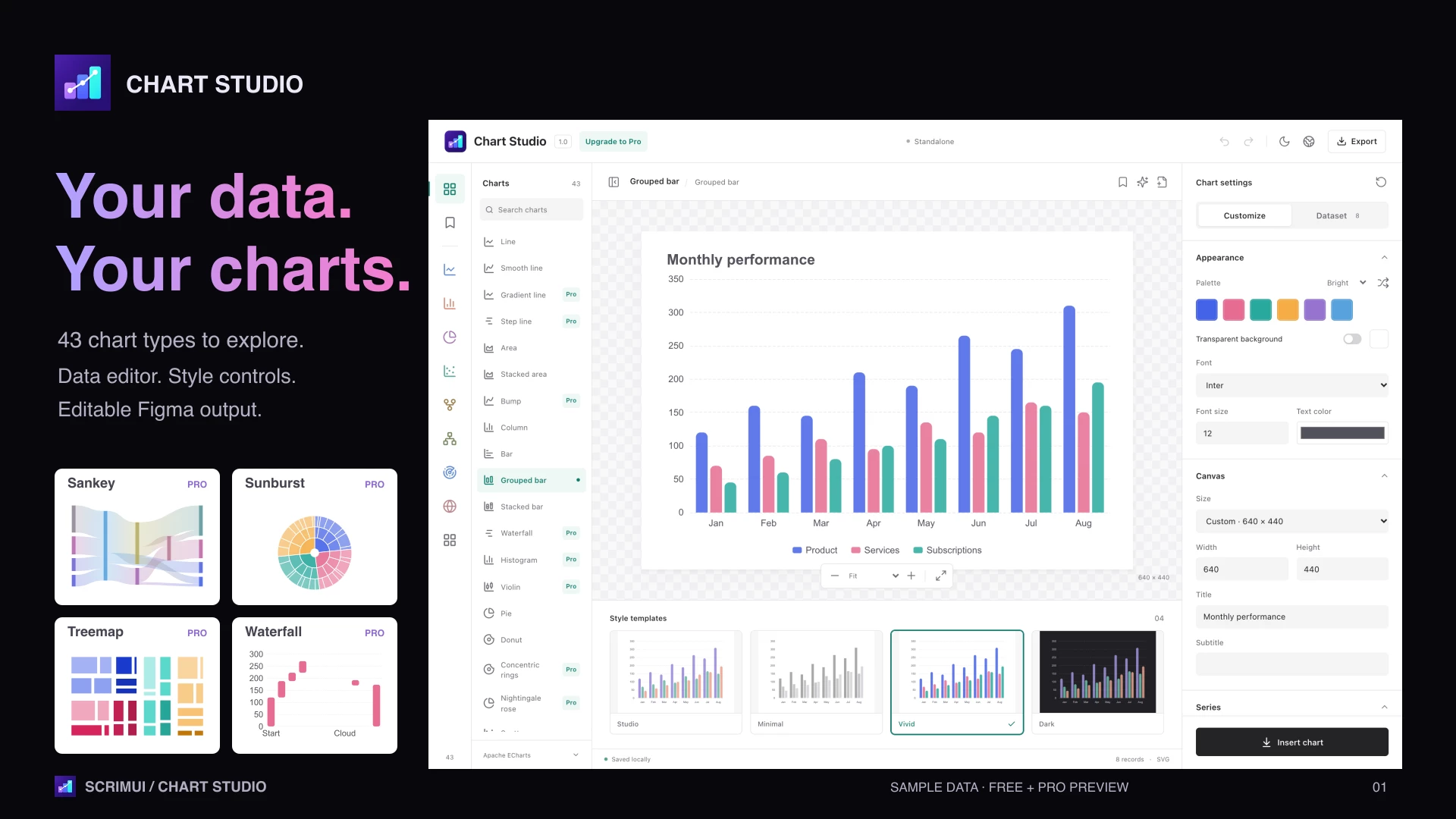
Choose a chart, paste a table or import CSV/JSON, adjust colors, fonts, labels and axes, then insert vector output with optional native Figma text layers. For example, turn monthly revenue data into a grouped bar chart and match it to your dashboard's palette.
The 12 free chart types include line, area, bar, pie, donut, scatter and radar. These support unlimited insertion, no watermarks, and standard SVG, PNG and data exports.
There is also an optional one-time Pro purchase on Gumroad. It unlocks all 43 chart types, including Sankey, treemap, heatmap and waterfall, plus XLSX and public Google Sheets imports, PDF and offline interactive HTML exports. The free chart types do not require a license.
A few practical limits: insertion creates a new chart rather than overwriting the existing one. Online imports are one-time imports, with no automatic synchronization. Unavailable fonts fall back to Inter. Core editing and local imports run on your device; chart data and styles are stored in the inserted Figma node's metadata and travel with the file. Optional AI uses your own provider and API key, with provider fees separate.
Try the plugin:
https://www.figma.com/community/plugin/1688934672862377167
The attached images show the plugin interface with sample data. I'd appreciate feedback on the data-to-design workflow: what chart control do you most often need to change after placing a chart in your dashboard?