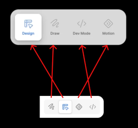
The order of modes in the quick toggle UI should match the toolbar
I discovered by accident the new ⌥+TAB keyboard shortcut to quick toggle between modes (not sure what that’s officially called?). This seems super useful, except for whatever reason the order the modes are displayed in the quick toggle UI, is completely different from the order they’re displayed in the keyboard.
In the toolbar they are ordered: Draw, Design, Motion, Dev Mode. Motion is relatively new, but I’d assume this is the order nearly everybody is used to.
After hitting ⌥+TAB the quick toggle UI appears and the modes this time are ordered: Design, Draw, Dev Mode, Motion.
This feels unnecessarily confusing to me. I rely heavily on the spatial positions of the active mode icon in the toolbar to see which mode I’m in. The icons themselves are relatively small and visually similar, so I feel like their position is a much stronger visual cue than the icon itself. So when the spatial consistency is suddenly broken, I have to stop and consciously read the labels and think about it for a moment, rather than relying on the positions I’ve already internalized. To me, that added cognitive effort almost defeats the purpose of a quick switcher feature.
Anyone else agree?