Review updates window needs ground rework
There is a couple if usability issues related to this window
1 – Review updates window – lies color modes
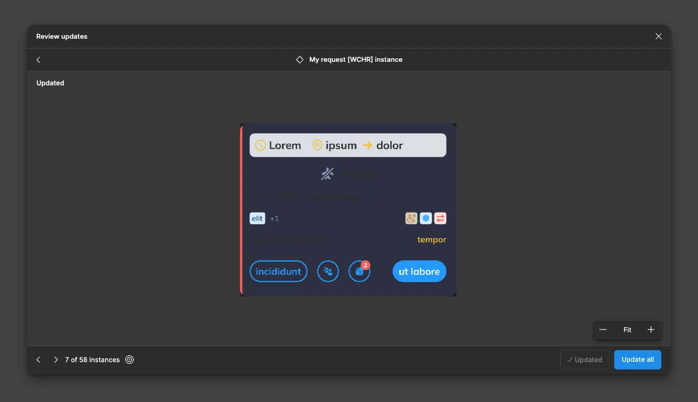
Reviewing components from external library using variable modes for e.g. Dark / Light UI - this window shows fake color modes for sub frames of the component. Thus it makes impossible to validate if specific elements are ok to or not.
Example: review window displays Background from Dark mode, but texts from Light mode
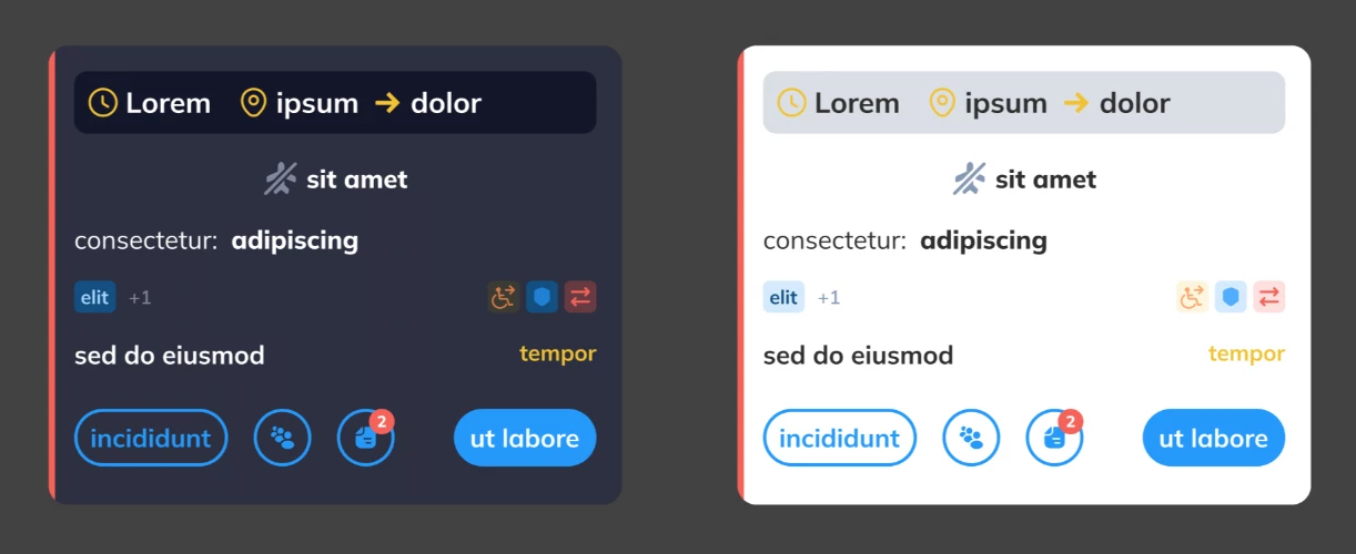
In reality components look like that
2 – Weak usability – Clickology when large number of components to review
Example: To review 250 components I need to perform one thousand of clicks

Solution proposal:
Instead of that, I would recommend using strategy from text editors, commonly known as “find and replace and go to next one”. In our case it could be: “Update & next” or similar.
In 99% of cases I use it like that. If there is a second verification needed after update - I can click “< back”
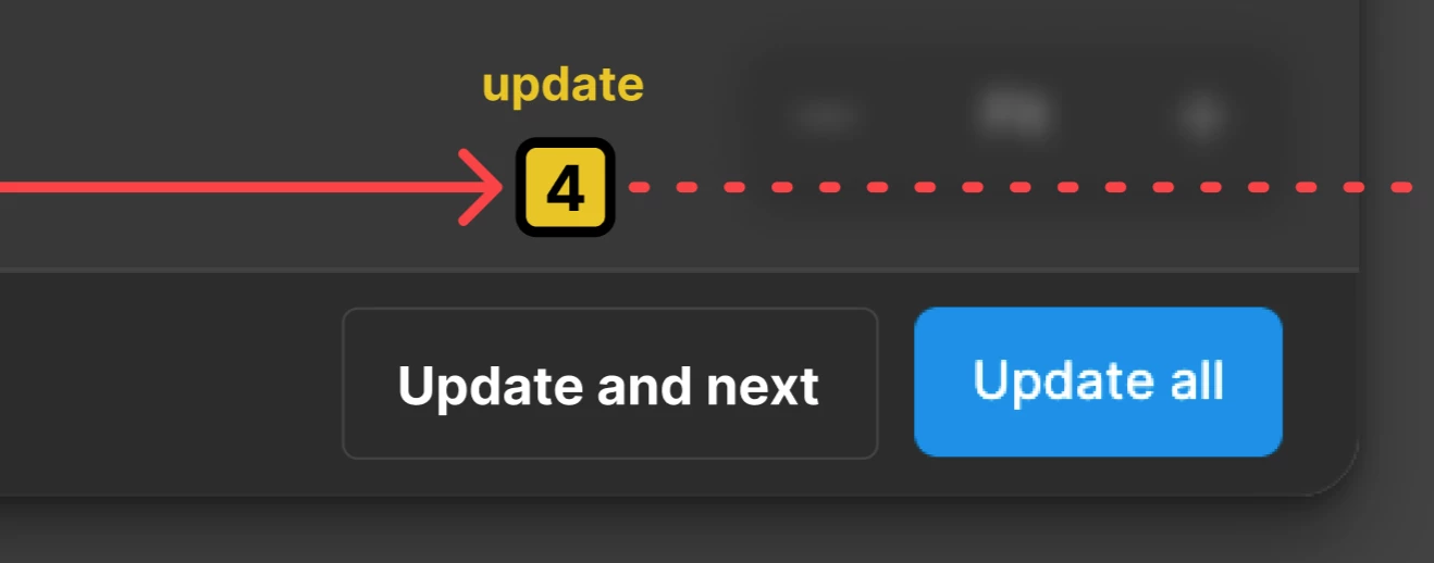
2b – Go to instance > change to Toggle “Follow each component on canvas”

3 – Differences only
When validating large number of updated components usually only 25% of components are affected with the change. Reviewing them all it tedious and time consuming process (1000 clicks for 250 components!)
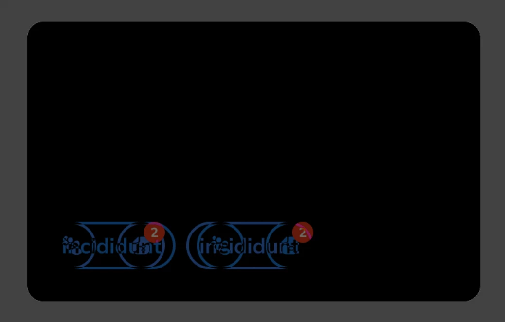
Figma gives useOverlay mode - wich seems to look nice, but does not work as intended.
Example: Lets imagine I have replaced buttons sequence for some specific variants of the component.
Now I can see this
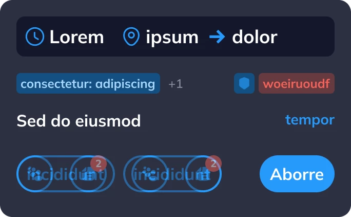
But for larger or complex components it is tiring proces to find the difference.
Solution proposal: Use the Difference blend mode known from photoshop instead of Transparency slider
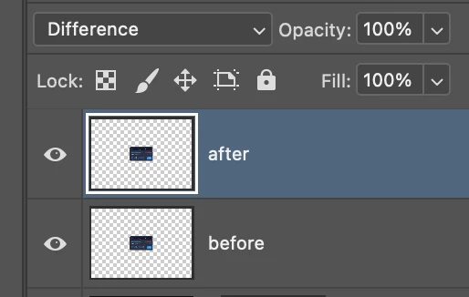
Effect preview