In Previous (old UI) of Figma many things was clear and straightforward.
Here is a small example from Pages list on the left sidebar
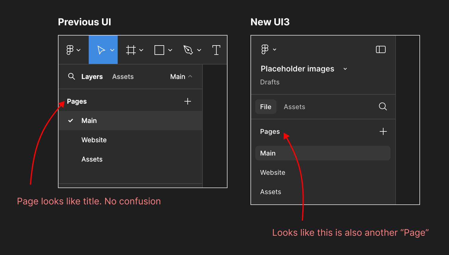
Problem: Now on UI3 the title “Pages” doesn’t look like a title, sometimes I am confusing it with the list. Because in some of project I give a name “Pages” to my page. So first Pages should look like a title not a part of the list
Second problem of UI3 is no checkmark icon on selected page (on left sidebar). Previous (old UI) had a checkmark on current page. But on UI3 it has just background which is same as hover color.
There are much more things which was better than new UI3.