Question
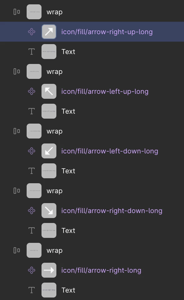
Layer thumbnails create too much visual noise and reduce scanability
Hi Figma team,
I’d like to share feedback about the new layer thumbnails / previews that appear in the Layers panel.
These small background previews create a significant amount of visual noise. Instead of quickly scanning layer names, the eye is constantly drawn to the gray squares and tiny images.
In practice this makes the panel harder to use when working quickly:
- White or light-colored icons become almost invisible on the gray thumbnail background.
- Many layers end up looking like nearly identical gray rectangles.
- Text names lose visual priority — you start looking at the pictures instead of reading the layer names.
- Overall scanability of the Layers panel drops noticeably, especially in large files with many similar components or icons.
For fast everyday work the previous, cleaner list of layers (without these previews) was much more efficient. The current thumbnails rarely provide useful information and mostly add distraction.
It would be great to have an option to turn these layer previews off (or at least make them less prominent / optional).
Thank you for considering this feedback.