

OnlyRodas
New Participant
April 2, 2025
Question

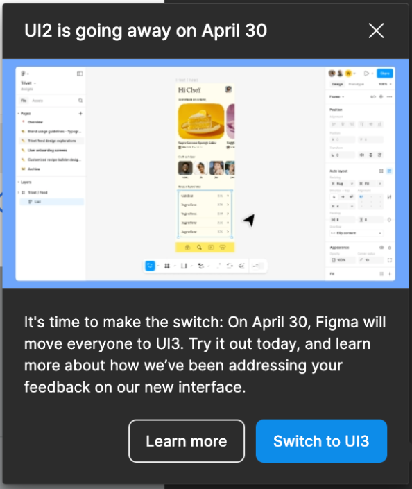
Forcing UI3 on us is a HUGE mistake! Let us choose! - April 30
  • April 2, 2025
  • 60 replies
  • 1725 views


I can't believe Figma is forcing this change on us. UI3 is, without a doubt, the most unfriendly design possible. It has made my workflow painfully slow and incredibly unproductive. What’s the harm in letting people CHOOSE which UI works best for them?

I always thought switching to UI3 was a HUGE mistake, but I never felt the need to comment on it because UI2 was still an option. Now that you're FORCING this change, I have to speak up.

This is NOT an upgrade. It’s a downgrade in usability, efficiency, and user experience. Figma was supposed to be about flexibility and user-centered design—so why ignore the feedback of those who actually use the platform every day?

Give us back the choice. Let people stick to UI2 if they want. This forced migration is a slap in the face to long-time users who built their workflow around UI2.

This topic has been closed for replies.

60 replies

April 30, 2025

Just hoping they see the headline, pretty much says it all.

You’ve had a community of UX designers screaming at you that they don’t want this UX.  Your tool is made for UX designers.  The language about “it’s hard getting used to a new UI blah blah” is patronizing (we all literally understand that, it’s part of our profession).  Stop reading iconoclastic books about being “bold” and doing the “unpopular” thing and comparing yourselves to Steve Jobs.  Designers are a different breed and we rarely drink the Kool-Aid.


The fact that you've pushed this on a community despite overwhelming feedback not only undermines that community, but also undermines the fundamentals of UX process, starting with research and knowing your user.  This is pretty 101.

I love Figma, but today is almost as disappointing as the announcement that Adobe would be purchasing (phew).

manggo
New Member
May 1, 2025

When I found that Figma could no longer switch back to UI2, I was close to collapse!!! When I could switch, even though UI2 did not work properly with the proportional zoom function, I still kept using UI2. Forcing myself to use UI3 really made me want to smash my computer when designing!

manggo
New Member
May 1, 2025

I'm broken after the forced update to UI3 on ​​4.30! All UI interfaces have become strange and difficult to use! I even need to relearn how to use Figma. The main operation areas and components have become difficult to identify! The design of the floating window is even more maddening! I can't stand being forced to pay attention to the floating window at any time when designing, which is very distracting! If this bad user experience cannot be fixed, I believe most people would rather give up or find other alternative tools.

Eugen1
New Member
May 1, 2025

You know what’s funny about the new UI. The “actions” in the right panel are dynamic based on layer type you select, so you have to relearn the pattern of “where the F is that button?” all the time

The button “Ignore auto layout” is in different places depending on the layer… UX at its fines. And someone tested that and said it’s good UX :) at a multibillion dollar company

Too bad we’re too deep invested into Figma to transition to Sketch or smth else...

Shane_Schroll
New Member
May 1, 2025

Switched to Penpot today after opening up Figma today and seeing it completely wrecked on the UI and UX. Penpot has a generous free license (unlimited files and team members) and is open source - so that any changes you don’t like can be avoided entirely. Not sure what Figma is thinking but they have lost their minds if they think this is what people want.

SomethingFishy
Active Member
May 1, 2025

You know what’s funny about the new UI. The “actions” in the right panel are dynamic based on layer type you select, so you have to relearn the pattern of “where the F is that button?” all the time

The button “Ignore auto layout” is in different places depending on the layer… UX at its fines. And someone tested that and said it’s good UX :) at a multibillion dollar company

Too bad we’re too deep invested into Figma to transition to Sketch or smth else...

I think this is most of my frustration with this UI. There’s no consistency in that dynamically changing sidebar. That, and the number of actions that are buried beneath layers of clicks makes it exponentially more difficult to use. Just soooo many [tiny] pop-out windows under other pop-out windows… 😵

Figma is lipstick on a broken box layout where component interactions dissolve on contact with other pages.
Dima_Novosad1
Active Member
May 1, 2025


This needs to be memorized.

Pia_Blumenthal
New Member
May 1, 2025

The new UI3 is really bad. Some of the most important settings have been reordered lower in the list or buried beneath the contextually changing components, making them HARDER to find. UI2 was significantly better for quickly locating and selecting options. Really disappointed that this is also being forced upon us – in the middle of a design review I’m giving no less.

Wow XD
New Member
May 2, 2025

I can’t use normally figma with that new UI3. God please listen to me and return an old ui..

KennLucas
May 2, 2025

My brother freaked out once because he was frustrated by Windows 98 and was mad they “forced” him to upgrade from Windows 3.1. Railing against progressing software tools is sad coming from people who design new software tools.