Question

Figma, Your New Left-Hand Menu/Panel Is a Disaster – 7th Jan 2026

  • January 8, 2026
  • 37 replies
  • 1109 views

Show first post

37 replies

a2609661273
  • New Participant
  • January 16, 2026

How do I close this sidebar?


a2609661273
  • New Participant
  • January 16, 2026

How to close the sidebar


a2609661273
  • New Participant
  • January 16, 2026

Can this be turned off? I remember there was such an option


Matheus_Pimentel

This update is genuinely one of the most frustrating UX changes I’ve experienced in a professional design tool 😡 😡 😡

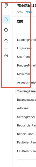
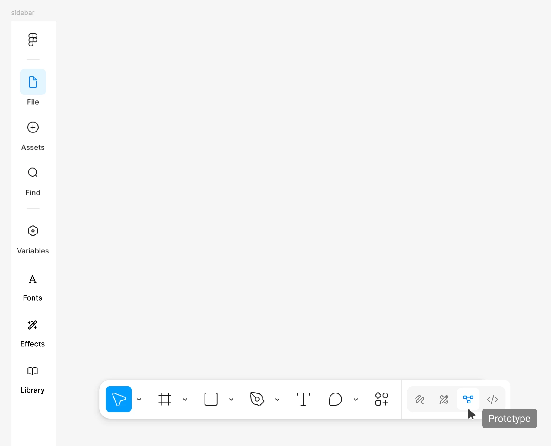
The new left-hand navigation panel permanently steals ~60px of horizontal space on small screens, which is completely unacceptable. That space is my primary working area — the canvas. I am literally losing room to do my job so a panel can sit there doing nothing most of the time.

Yes, Variables, Files, Assets, Find, and Library are important.
No — they are NOT minute-to-minute actions.

They do not deserve permanent, always-visible real estate. This panel is idle 90% of the time, yet it constantly punishes my workflow.

On smaller displays, this feels especially hostile. Instead of prioritising the canvas (the entire reason Figma exists), the UI forces a bulky navigation column that adds zero value moment-to-moment and actively makes precision design harder.

This change feels like it was designed for:

  • Large monitors only

  • Product demos

  • Feature discoverability

…not for actual day-to-day designers working fast, zoomed in, and space-constrained.


What makes this worse

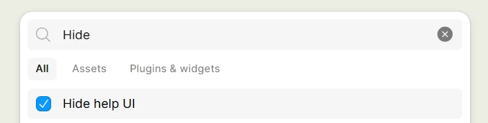
  • There is no way to fully hide or disable this panel

  • Collapsing all UI is a blunt workaround, not a solution

  • There is no respect for screen size or user preference

  • The previous solution worked better and did not need fixing


The two solutions that would actually fix this

  1. Remove this panel entirely and revert to the previous UI behaviour

  2. At an absolute minimum: let users completely hide this panel permanently

Not temporarily.
Not “collapse everything”.
Not keyboard gymnastics.

A simple, explicit option to turn it OFF.


Right now, this feels forced, wasteful of space, and completely misaligned with how professionals actually use Figma. Please prioritise the canvas again — it is the core of the product, not an accessory.


I really still don't understand the reason for this bar; it was unnecessary and takes up space that wasn't needed.


Matheus_Pimentel

Can this be turned off? I remember there was such an option

Unfortunately, this modification cannot be disabled. It didn't even exist before, so there was no way to disable it. It's a recent addition, but it lacks functionality and user comfort. The latest modifications made to Figma have been terrible for the user experience.


Arthur_Kazais

Who ever responsible for this should be fired and go back to Canva or Adobe, this is such a horrible design decision and so not Figma.


Hallan_Dionisio

Perhaps you should get a larger screen. 60px horizontally shouldn't be a problem.


Slava_Bronevitskiy

Perhaps you should get a larger screen. 60px horizontally shouldn't be a problem.

Seriously??

You think telling user base to get larger screens is the solution to the problem introduced here?

What should laptop users do? Get new laptops according to you? What should corporate employees do according to you, tell their managers to replace all monitors at the office because you think it’s a good solution to compensate for Figma’s bad design decision?

Don’t forget to tell Apple to start building Macbooks larger than 16” okay?

We can assume you’re offering to cover the costs for all the above. Nice.


Hallan_Dionisio

Perhaps you should get a larger screen. 60px horizontally shouldn't be a problem.

Seriously??

You think telling user base to get larger screens is the solution to the problem introduced here?

What should laptop users do? Get new laptops according to you? What should corporate employees do according to you, tell their managers to replace all monitors at the office because you think it’s a good solution to compensate for Figma’s bad design decision?

Don’t forget to tell Apple to start building Macbooks larger than 16” okay?

We can assume you’re offering to cover the costs for all the above. Nice.

To be honest, if 60px is such a big problem, then yes, companies and users should get larger screens.

Small screens have never been good for design, and nowadays it's very easy to get a second screen.

If Figma can come up with a better solution, okay, I'll be happy. But this change was excellent for my use.


MichaelC
  • New Member
  • January 26, 2026

This is the most frustrating UI change Figma has ever done. PLEASE revert this or make it a setting. UI feels so claustrophobic now.

--Sincerely every designer working on a laptop

PS:

I can forgive the new style headers, even though it pushes down frequently accessed settings like “fill and stroke” colors below my viewport and I have to scroll. But… for the love of God…. Please get rid of this stupid floating question mark. I don’t need to open up YouTube Videos or join the forum right here. I need to access my style settings. 


Nellya
  • Power Member
  • January 27, 2026

Please get rid of this stupid floating question mark. I don’t need to open up YouTube Videos or join the forum right here. I need to access my style settings. 

You can hide it


Yishi Account

The left navigation bar should at least be able to show or hide the buttons, as it seems to occupy a large area