

Feedback: Huge vertical spacing in the new Variables Panel is reducing density (+ Feature Request: %, em, rem units)
Dear My Love.. Figma Team,
I wanted to share some critical feedback regarding the recent UI update to the Local Variables panel, along with a highly requested feature suggestion.
🚨 [IMPORTANT] Feedback 1: Excessive Spacing Between Variables
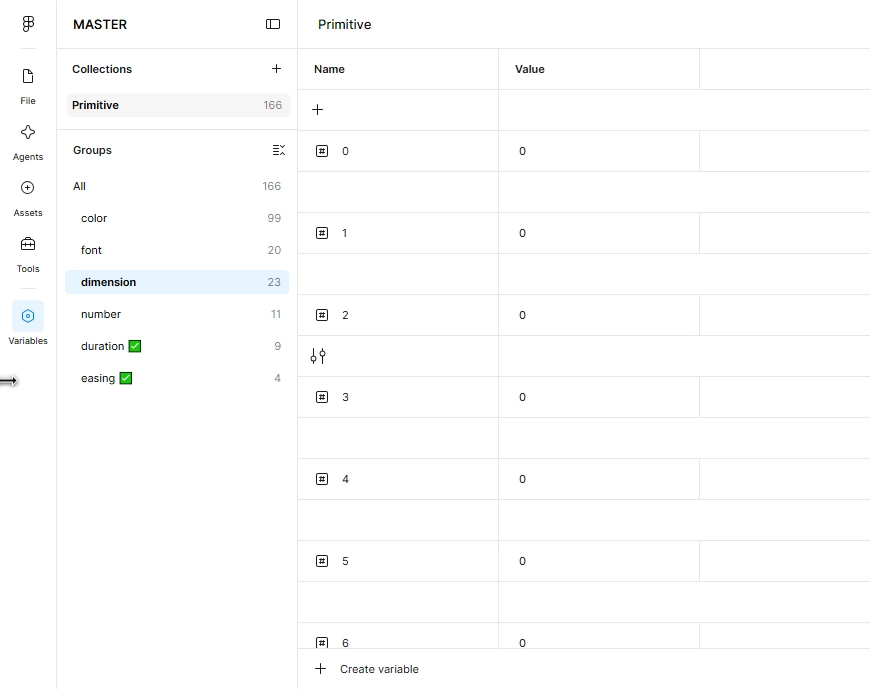
Since the latest update, there is a massive, unnecessary vertical gap/spacing between each variable row in the table (as shown in my screenshot).
The Issue: This drastically reduces information density. It looks less like clean UI and more like a bug.
• The Impact: For large design systems with hundreds of primitive variables, this requires an exhausting amount of scrolling. It completely disrupts the workflow and makes the panel feel cluttered yet empty at the same time.
• Request: Please restore the compact, dense layout or at least give us a "Compact View" toggle in the settings.
💡 [IMPORTANT] Feedback 2: Support for Relative Units (%, em, rem)
While we are on the topic of variables, we desperately need support for relative units in number/dimension variables.
• The Suggestion: Please allow us to input values using percentages (%), em, rem, or other responsive CSS units not just absolute pixels (px).
• The Impact: Modern web design relies heavily on fluid typography and relative spacing. Having to calculate and hardcode everything in pixels limits the true power of Figma variables for front-end handoff.
Please look into these issues, especially the spacing regression in the latest UI.
Thank you!