I was very excited to hear that grids were coming to Figma. CSS Grid was introduced years ago and brought with it many things that flexbox was incapable of doing, so I was hoping for a similar level of new capabilities here, and I genuinely cannot believe that this feature is being shipped in its current state (even as a ‘beta’). This is a very long post, but I feel like this feature has been implemented so poorly that it legitimately sows doubt in Figma’s capabilities to deliver features in the future.
Inability to ‘hug’ contents
Both rows and grids themselves are unable to resize themselves to match their contents (‘Hug”).
Row heights must be either “Auto” (1fr) or a fixed height, meaning that if you want your rows to be sized per their elements, you’ve now manually defined each row height in px (not even a variable value), and instead of getting a clean CSS output, now you have however many rows defined in exact values, destroying any chance of scalability.
This alone makes this feature nearly useless to me.
‘Cannot remove row from a grid when it has content’
One of the great aspects of CSS grid is that, without having to do anything to the children of the grid, I can change the number of columns/rows and the grid will re-flow all the elements for me.
Figma does not do this. It will add rows/columns only if they are larger than current, but it will not remove rows/columns unless they are empty, so you have to manually move everything into the place you want, and then you are able to remove the extra rows/columns. This is an incredibly cumbersome way to handle this and immediately made this feature hard to use.
Why do I even need to define the number of rows?
One of my biggest gripes with Figma’s ‘Fill’ mode is that there are no percentage based widths. Say I want my items to take up 25% width, but I only have 3 items total, I now have to create an empty ‘spacer’ frame so that my design can stay responsive without manually setting pixel values
With grid, well now I can define my number of columns and get the nice percentage based widths I want, but I also have to define the number of rows, making it incredibly tedious, and since I can’t even set their heights automatically, I genuinely might still be better off just using horizontal auto layout with spacer frames.
Inability to select the elements in a row/column all at once
In all other areas of Figma, selecting a parent and hitting Enter will select all children. In grid, selecting a row/column and hitting enter only allows you to change the width/height, you must manually select each item one by one.
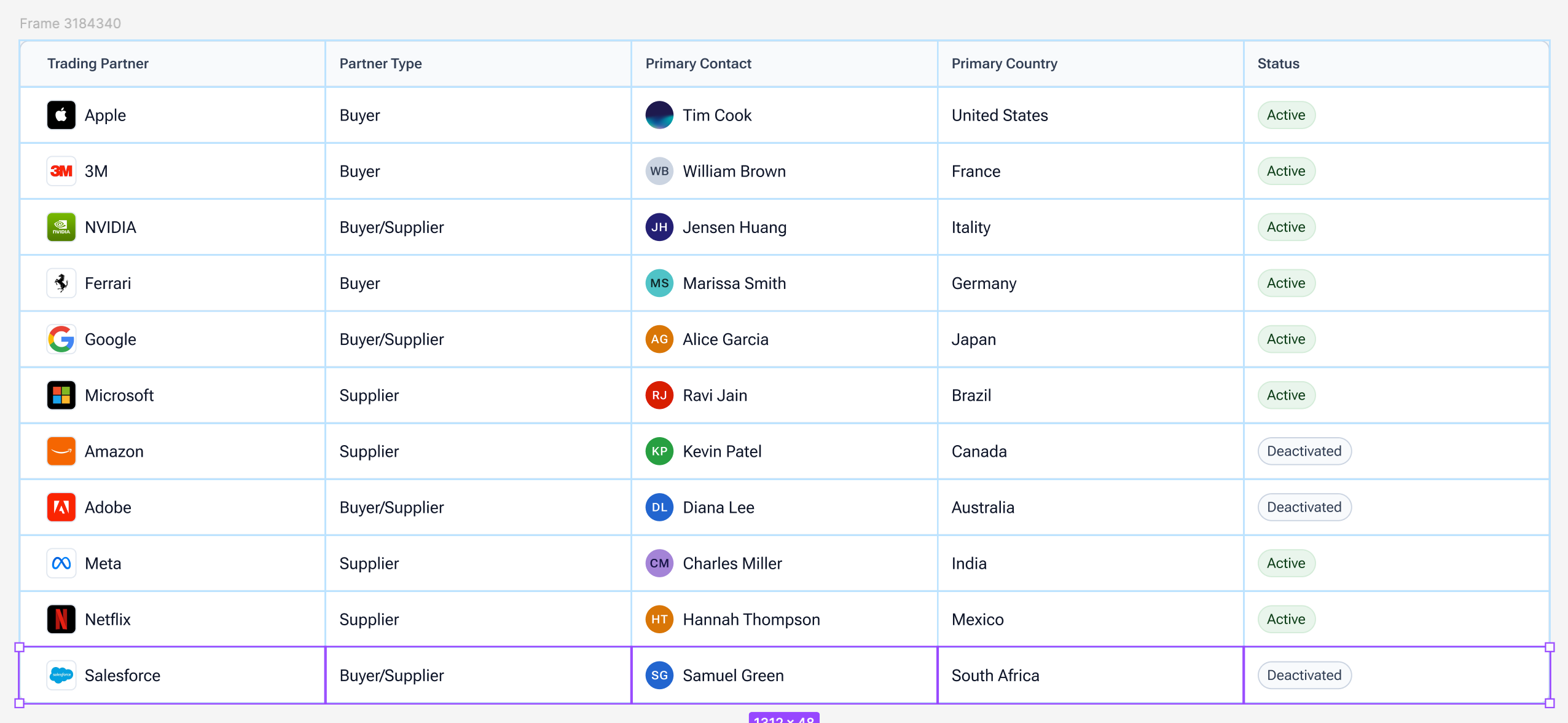
Table behavior
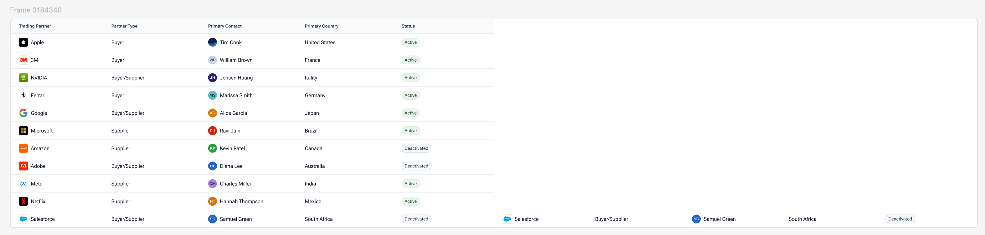
After I’ve manually selected each item in a row, now I’d like to create a new row, let me hit Cmd+D and... After I’ve manually selected each item in a row, now I’d like to create a new row, let me hit Cmd+D and...
oh. This also happens in reverse when selecting an entire column. Tables to me seem like the most obvious use case of grid, because managing tables in Figma has been a pain for years, you either get nicely sized rows, or nicely sized columns, but now trying to use Grid for table somehow creates an even worse experience. Duplicating a row grants you more columns, and duplicating a column grants you more rows. You have to manually add the row/column first before duplication, and then it will work as expected.
I sincerely hope that some of these issues/limitations have already been addressed internally and are just not public facing yet. I’m very disappointed in this release, as Figma has had years to approach their CSS grid implementation, and they’ve provided a solution that is obnoxious to use and far too limited in scope.
[Subject line updated by a moderator and linked to new features post on May 9, 2025 — changed from “Grid for Auto Layout is horribly limited in scope and very awkward to use” to “[Config 2025] Grid Auto Layout Flow — let’s hear what you think!”.]
Hi all! First, big thank you to everyone who took time to share feedback on Figma Grid. During Config 2025, we were ecstatic to share all the work we’ve done to make it happen.
Your input really helped us understand where things are working — and where things can improve — across different workflows, use cases, and team sizes. The purpose of this post is to give you a reflection of every user who's utilized Figma Grid, and what we’re doing to improve the experience.
🗣️ Top Common Concerns and Limitations
The ability to “Hug Contents” for columns and rows Grid columns and rows are not able to adjust dynamically to fit or “hug” their content. This causes rigid layouts and requires manual resizing.
Missing smart item swapping Reordering items between columns and rows was a slow and tedious process. Drag-based swapping was expected, but not available in grid.
Adapting content when adjusting grid size Previously columns and rows could not be removed unless they were empty, prompting an error message. Ideally, when columns are removed, remaining content should shift to fill available space. To circumvent, designers need to move or delete contents before they could adjust the size of their grid
Lack of variable support for gaps Designers are not able to apply variables to grid gaps, making it harder to maintain spacing across different grids and files.
🔧 What we're doing to address these things
Here’s what we can share so far:
Hug contents. This is one of the most requested features. We’re actively working on adding “Hug” resizing options for columns, rows, and grid containers.
Item swapping. You can now swap items within the grid if they span the same number of cells. This better mirrors expectations of auto layout behavior.
On-canvas column and row deletion with content. The ability to delete a select column or row directly from the canvas, even if it contains objects, has been live for several weeks. If items span multiple cells, their span will shrink accordingly.
Content reflow behavior. We’ve updated the grid picker so that content now shifts when columns and rows are removed. This improves responsiveness and makes layout changes more intuitive.
Variables support for gaps. You can now apply variables to the space between columns and rows. This allows for more scalable and consistent spacing across design systems.
We know what we’ve recapped above may not cover everything you’re looking for, and we encourage you to keep the conversations going. Whether it’s about Figma Grids, or any other Figma product, please engage with us (and each other) in these spaces:
Tip: try running a search in our forum to see if there are existing threads that are similar to your thoughts. Our community is a great place to have conversations, and you may find existing information that helps.
Thanks again for being part of the Figma community!
Totally Agree, the previous auto layout was better, it allowed me to hug or fix content but i cannot do that anymore in the new UI and there’s no way i can go back to the old ui
Hey! So couple things that I think would make this great along with the other notes.
Please make it easier to resize the gaps of columns and the columns themselves. I think at the very least, it would be great to use the existing design pattern when you hover over a gap with two objects that aren’t connected via auto-layout (pink gap thing) and expand or close the gap
pink gap thing
Make it easy to add columns by having a (+) appear at the corners.
add column in corners
That’s all :) Thank you for the amazing new products and features 🫶
I’d like to emphasize that these complaints are not lodged at the developers who worked on this feature. I’m sure internally it was well known that this feature was not ready for the public, but Config 2025 demanded it be released early.
I’m glad to see the Figma team taking notice of this feedback by calling out this thread, and glad to see that some of my complaints are already planned for future release: https://x.com/disco_lu/status/1920959957794517071. Hopefully we can keep the good news coming and Grid can see its proper functionality in due time.
For now, this feature just slowed down my working projects. It's completely bugged, can't even make the same things I was able to do in the previous one auto layout feature. So sad.
Is it that hard to Figma team to make a flexgrid/flexbox like auto layout, really??
While I agree with everything aforementioned, I also think the Grid should be enabled on the instances of the components so that we could change the number of columns/rows. Use cases are: creating flexible grid-based form/table components where each cell is a swappable slot, therefore designers could adjust the number of columns and rows on the instance, without the need to create a bunch of similar components for each specific occasion, or detach..
I made a separate post about this here. Please upvote if you think this might be useful.
Adding my displeasure with the current implementation to the pile. It’s completely useless for anything that needs to be responsive in nature (so pretty much everything). I had hoped that a grid implementation could have finally solved auto layout’s shortcoming of not being able to use percentages (even if it would be considered a hack because percentages should be there regardless), but without the option to hug content it sadly doesn’t. And that’s just to try to get something functioning that should have been there years ago. There’s still all the other issues of it being the most basic, bare-bones version of grid without the extensive flexibility of what’s actually possible with it; from different units allowed to reflowing of content.
Penpot nailed it a year ago on their first attempt, yet Figma still has trouble releasing anything with even light complexity. The only reasoning I can think of is that Figma the company wants their product to be so incredibly simple to use for beginners that it forgoes usefulness for those who are more experienced and/or need power user options (even though having functional parity with things like flex or grid layout absolutely should not be considered a power user need). It seems like their only concern is to capture market share and get investment into their product (now platform I guess) so that its shortcomings don’t matter due to it being the industry standard and every company doing UX work has to use it. Even Adobe has the decency to make their products useful for beginners and professionals for all of their products even though they’re the defacto for many industries. Once again in our industry the lack of competition really hurts the consumer. And like clockwork every year after Config, I’ll say that I hope Penpot can gain some traction in the space.
It’s annoying that Figma designer’s continue shift things around. Who thought that switching places of the gap width and the alignment was a good idea? Why?
Totally!!! Why do you guys constantly want to move stuffs around? Do you know how muscle memory works? Do you know how annoying it is?