Figma Sites – What We Heard and What’s Next
Thank you for sharing
Hi everyone! Thank you for joining the conversation and sharing your experiences with Figma Sites following our Config 2025 announcements. Your posts — from first impressions to deep technical insights — help us understand where Figma Sites is landing well and where we need to refine the experience.
We've read every reply in the thread and are sharing this summary with both our product and engineering teams to help shape what comes next.
What we heard
Here are the most common and impactful themes raised by the community here in Figma Forum:
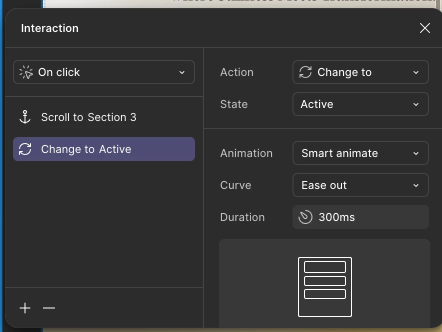
1. Accessibility: Export Options & Integration Flexibility
A key request was the ability to export clean, semantic HTML/CSS or integrate Figma Sites with existing CMS tools. Many of you see Figma Sites as a powerful tool — if it can fit into their broader publishing and dev ecosystems.
“Are there plans to allow code export (HTML + CSS for publishing elsewhere, or to integrate into other CMS’s or existing codebases)? That would be the make-or-break feature for my use.” (2 likes)
— Etienne_Despres
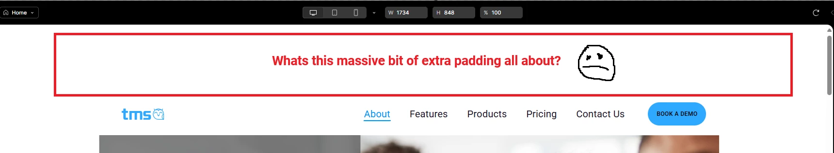
2. Accessibility: Structure, Interactions & Design
From nested pages to font fidelity, scroll-to-section behavior to video embeds, designers are eager to bring more interactivity and polish to Sites — especially when building client work or portfolios. Designers illustrated the importance of Figma being sensitive to the folks using this product and the opportunities to make it more accessible for all.
“Figma, at your scale, I would implore you to get this right and not ship products that will perpetuate continued creation of inaccessible digital products. Your average user may never notice these features, or how they could make things worse, not better, for accessibility. And even if they do notice them, some of them seem to actively make it more inaccessible.” (16 likes)
— Emily Lawes
“Do y'all plan to get Figma Sites to the point where it can produce semantic HTML and provide a way to provide accessible names to icon buttons and images? [...] I hope that as you iterate on this product you ensure the folks paying to use it are set up for success.” (16 likes)
— shkeating
3. Rollout Access Clarity
Many of you were excited to try Sites but weren’t sure why the feature wasn’t available yet — especially those on paid plans. Questions about seat types, timing, and how to actually find Sites in the UI came up frequently.
“Just upgraded my account to try Figma Sites. Have a full seat on Pro. See no access to Figma Sites anywhere... any ideas?” (3 likes)
— matt abrams
What we're doing with this feedback
We’ve shared your input directly with the teams working on Figma Sites and are actively tracking themes that surfaced most frequently, and — in a few cases, updates are already underway.
Here’s where some of that feedback stands now:
- Accessibility: A substantial portion of your feedback emphasized semantic HTML and assistive tech compatibility. We support tagging today, and are exploring how to improve semantic structure across blocks, including default behaviors that impact screen readers. Keep an eye on this Figma Sites article — Improve the accessibility of your site — we’ll continue updating it with fresh resources and guidance as they become available. More to come soon!
- Export & CMS Support: Code export and CMS integrations are top-of-mind. While not available yet, these areas are being explored for future roadmap considerations — especially as more teams request publishing flexibility.
- Font Fidelity & Customization: Good news — custom fonts support is coming soon. We’ve heard your reports on Google Fonts and variable text rendering inconsistencies. These issues are under investigation, and we’re reviewing how font handling can better match your design file expectations.
- Nested Pages & URL Structure: This is a frequently requested improvement, and we’re gathering examples to explore solutions that support scalable site architecture. Most recently, we announced updates to apex domain support. Learn more here: Apex domains and custom subdomains in Figma Sites.
- Component Behavior & Breakpoints: Multiple users noted differences between Figma Design and Sites when it comes to variables, auto layout, and component states. We’re reviewing this feedback to smooth out those inconsistencies and make responsive behavior more predictable and performant. For more details and latest updates, keep an eye on this article: Create a responsive component that automatically adapts to each breakpoint.
💡We’ll continue to update release notes and relevant forum threads as improvements go live. Keep an eye out at: Figma product news & release notes.
What’s next — want to keep the conversation going?
Still have more to add? We’d love to hear more:
Again, we're deeply grateful for your thoughtful posts — from detailed bug reports to feature improvements. Your feedback helps ensure Figma Sites is accessible for everyone.