

Solved

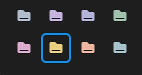
New Project Folder Color Options

  • August 25, 2026
  • 1 reply
  • 28 views

Tyler King

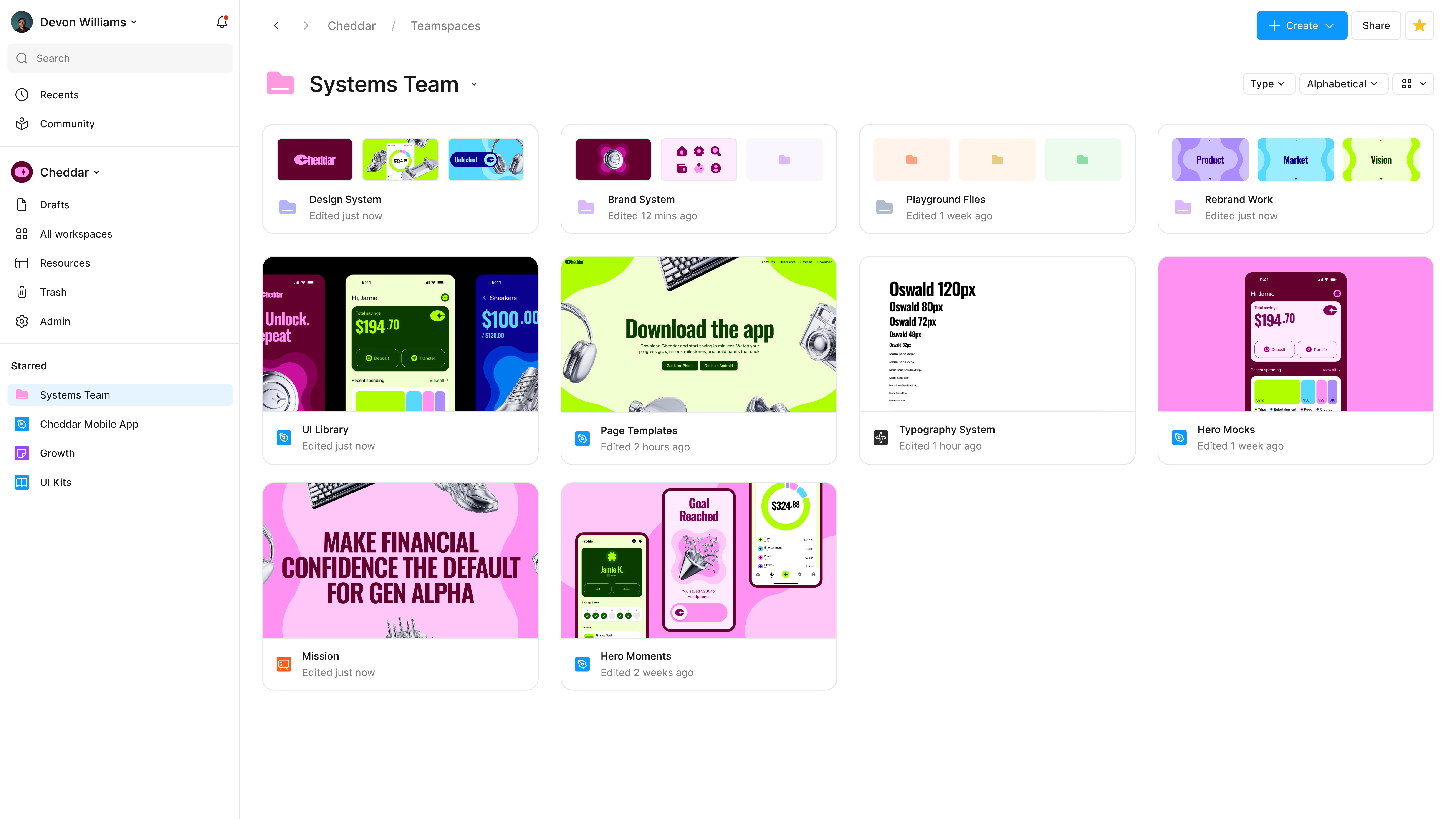
The new folder colors are too muted and inaccessible. 5 of the 9 colors look identical for colorblind users.. When using color at icons that size, the color should be much more high contrast. Please consider higher contrast options.
 

Best answer by Gayani_S

Hey ​@Tyler King, thanks for reaching out, and thanks for laying this out so clearly!

You're right that several of the current folder colors sit too close together in tone at that size, especially for anyone with a color vision difference. It's something our team is actively looking into for the folder color set. I don't have a timeline to share yet, but I've made sure your report is included in what they're reviewing.


Really appreciate you taking the time to write this up! 

1 reply

Gayani_S
Figmate
  • Community Support
  • Answer
  • August 25, 2026

Hey ​@Tyler King, thanks for reaching out, and thanks for laying this out so clearly!

You're right that several of the current folder colors sit too close together in tone at that size, especially for anyone with a color vision difference. It's something our team is actively looking into for the folder color set. I don't have a timeline to share yet, but I've made sure your report is included in what they're reviewing.


Really appreciate you taking the time to write this up!