Question

Figma Sites rendering issue with grouped card section

  • June 8, 2026
  • 1 reply
  • 9 views

Lynn Chang

New to Figma.
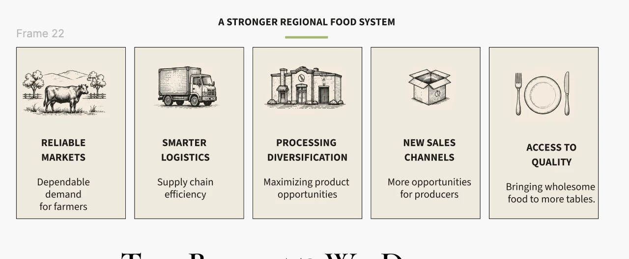
I have a section consisting of 5 cards (image, headline, body copy, and background rectangle for each card).

In the editor, the section displays correctly and fits within the page width.

After publishing, the cards are rendered far apart across the page, with one card pushed to the far right and the others separated from the container.

Troubleshooting performed:

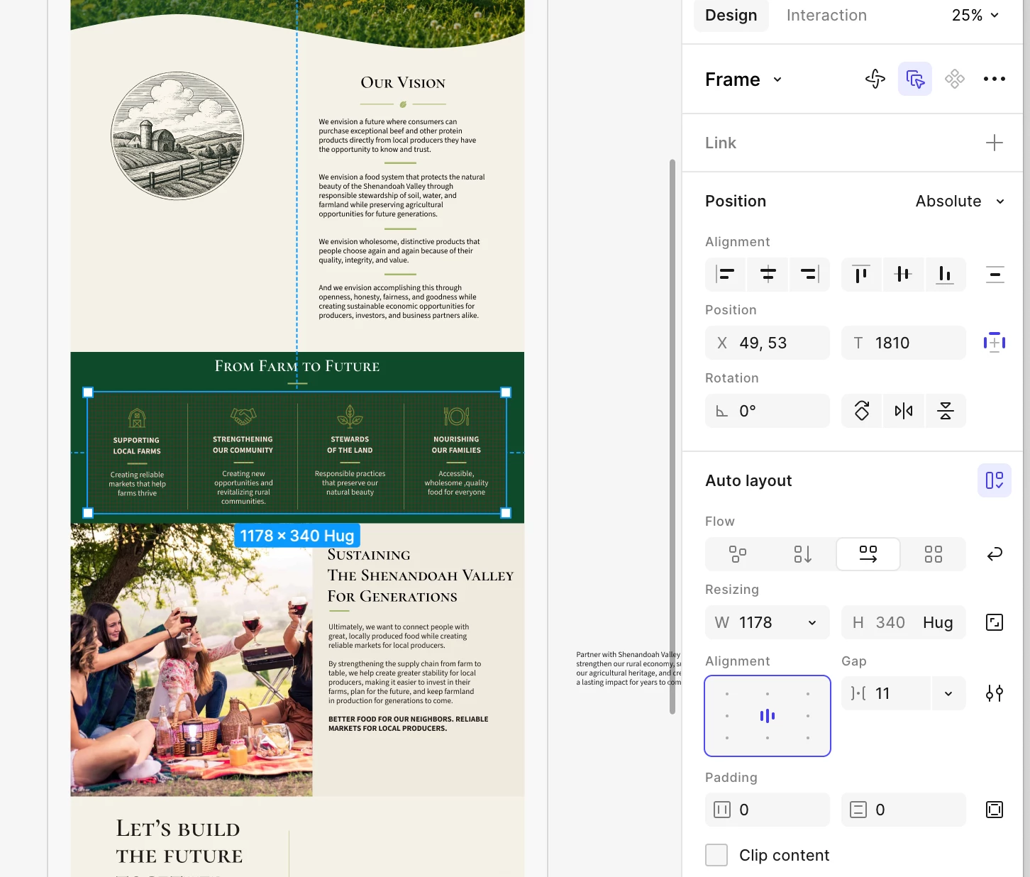
  • All elements were regrouped into a single group.
  • Issue persists after publishing.
  • Converting the group to Auto Layout (Shift-A) made the layout worse and redistributed elements into a grid.
  • Individual elements within the section are shown as Position: Absolute.
  • Relative is unavailable (grayed out).
  • The parent section is also shown as Position: Absolute.
  • Please shoot me.

    I made the box grey here so you can see how I organized the cards. I had to attach how it’s displaying - but basically the boxes are allover the place.

    I am new - please explain like you’re explaining to a dummy. Use baby Figma language I can understand.
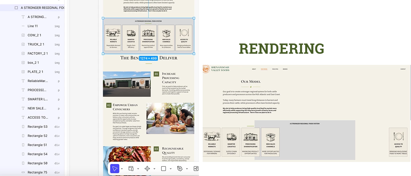
     

1 reply

Jaycee Lewis
Figmate

Hey hey ​@Lynn Chang 🙌 Welcome to Figma! You haven't broken anything, promise. 🙂

The ELI5 version: your cards currently use absolute positioning. Think of them like fridge magnets stuck at exact coordinates. The editor shows them exactly where you pinned them, but a published website is stretchy (responsive) — it resizes to fit different screens. Stretchy pages don't understand fridge magnet instructions, so when you publish, the cards scatter back to their raw coordinates.

To fix this, we need them to use relative positioning so they can flow naturally. Here's what the official doc on positioning elements in a webpage explains about how this mechanic works:

By default, any element added to a blank webpage is set to absolute positioning. If you add auto layout to the webpage, the element will automatically switch to relative positioning. Relative positioning is ideal for collections of items where the layout needs to reflow for different screen sizes.

That's why the Relative option was grayed out. It's not a bug — elements automatically use relative positioning only when placed inside an auto layout frame. We're just waiting for you to give those cards a proper container.

Here's the step-by-step guide to get them behaving:

  • Wrap them: Select your five cards and press ⇧A (Shift+A) to put them in an auto layout frame (If they stack strangely at first, don't worry, we'll fix that next)
  • Direction and spacing: With that new frame selected, go to the right sidebar and click the horizontal layout icon, then adjust your spacing and padding until it looks right
  • Set to Relative: Click into any of the individual cards. You'll see Position is no longer grayed out — ensure it's set to Relative
  • Fill the space: Set the cards' horizontal resizing to Fill so they share the row beautifully

Pro-tip: Test this with just two cards first. Wrap them, publish, and make sure they hold their ground before updating all five.

If they still act stupid, could you share an un-zoomed screenshot or a quick screen recording of your right sidebar with the parent section selected? That'll show us if the main section needs a quick adjustment too.

If you want to go deeper on the container settings, the Guide to auto layout covers direction, spacing, and resizing in detail. We've got this 🤩 – Jaycee