
Components - size of boolean toggle too small in Figma

  • April 10, 2026
  • 3 replies
  • 21 views

Kirit

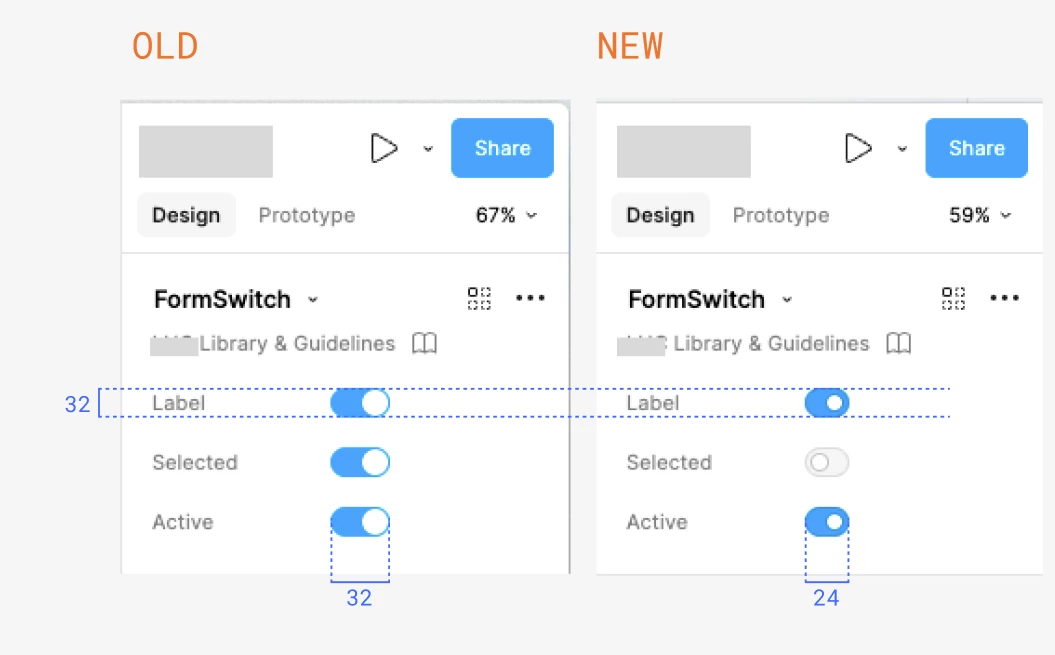
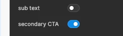
In the ‘off’ state the clickable area for the toggle that switches booleans in components is tiny! The newest update makes the toggle smaller, and the border colour is very faint. Basically impossible to see and the clickable area is ~16px.

Make it bigger please! I’m trying to get my work done, not hit an apple with a bow and arrow at 100 metres away

3 replies

Martina Verni

So it seems the toggles of the panel prompts have now less clickable area, which makes them just a bit harder to click? I am not sure what is being achieved here, as it seems the height is like before, they are just reduced in the width. I am having to focus more to be able to click the area with my mouse each time I need to change a prompts...


Kirit
  • Author
  • New Member
  • April 12, 2026

Yes! Thank you for this comparison. I thought maybe it was just the size of the white circle inside, didn’t realise the whole thing has become smaller. Completely agree its much harder to click.


Celine_
Figmate
  • Community Support
  • April 13, 2026

Hey everyone, Celine from Figma here! Thanks for flagging this and for the detailed description!

I've passed your feedback along to the team internally. I don't have any updates to share just yet, but please know it will be considered as we look into next steps. Appreciate your patience and thanks again for sharing your feedback 🙏