
Hey everyone, in this short little post I want to share with you the idea that I had. Basically I am using slots not as advertised that you can add multiple instances to the slot, but I use it specifically to only insert one instance at maximum. But there’s a twist to it, I use it as an “predefined Injection spot”.
What does that mean? Well exactly what it says. I use the slot within a component to decide exactly where the content later will be placed within. And by that I mean the Z-stacking of elements. The slot is filling the entire height and width of the device for this use case.
I always wondered how design teams actually store their designs on canvas. Do they add smartphone bezels? Do they add the notch for iPhones? Some maybe, some maybe not. But we all add toolbars and system-keyboards (things that are ALWAYS on top of the designed content)
For quite some time I wanted one component to rule it all. And now I basically made it:
(This image is not a simulator, it’s a frame with a toolbar, a notch and a fader on the top and bottom)
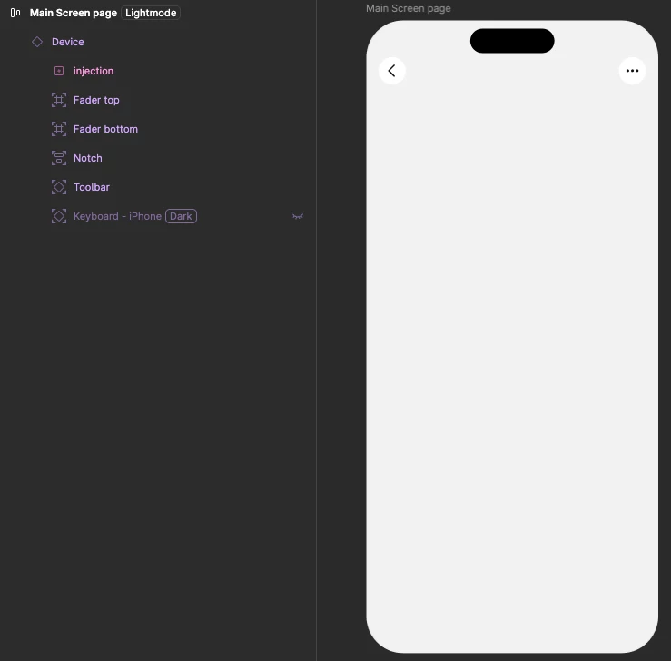
The slot is named “Injection” because that’s where we inject the content into. All other elements are absolutely positioned and have their corresponding constraints set so they adapt to layout changes (width/height)
But the smart part here is that you can have this component and add the content layer later, yet ensure that the content is always underneath these top-level-Z-Index objects (like keyboard, notch, toolbars, ...)
How does that look in practice while designing a content screen and wanting all that smartphone context like correct size, notch, keyboard, etc.? Watch the video:
I could see a future where apple and google release a component within their library that features a “ready made iPhone” where you just drop your content into the injection-slot and have a bunch of sub-components that all come with this main “Smartphone” component.
Also this method is really great for having content that adapts automatically to different screen sizes as well. You just have a small, medium and large “Smartphone” component and set the slot within to auto-fill the width and height. That basically means your content always scales within that “Smartphone” component.
Let me know your thoughts on this! I would love to see if this is something others are struggling and would love to have. Cheers!