Hi,
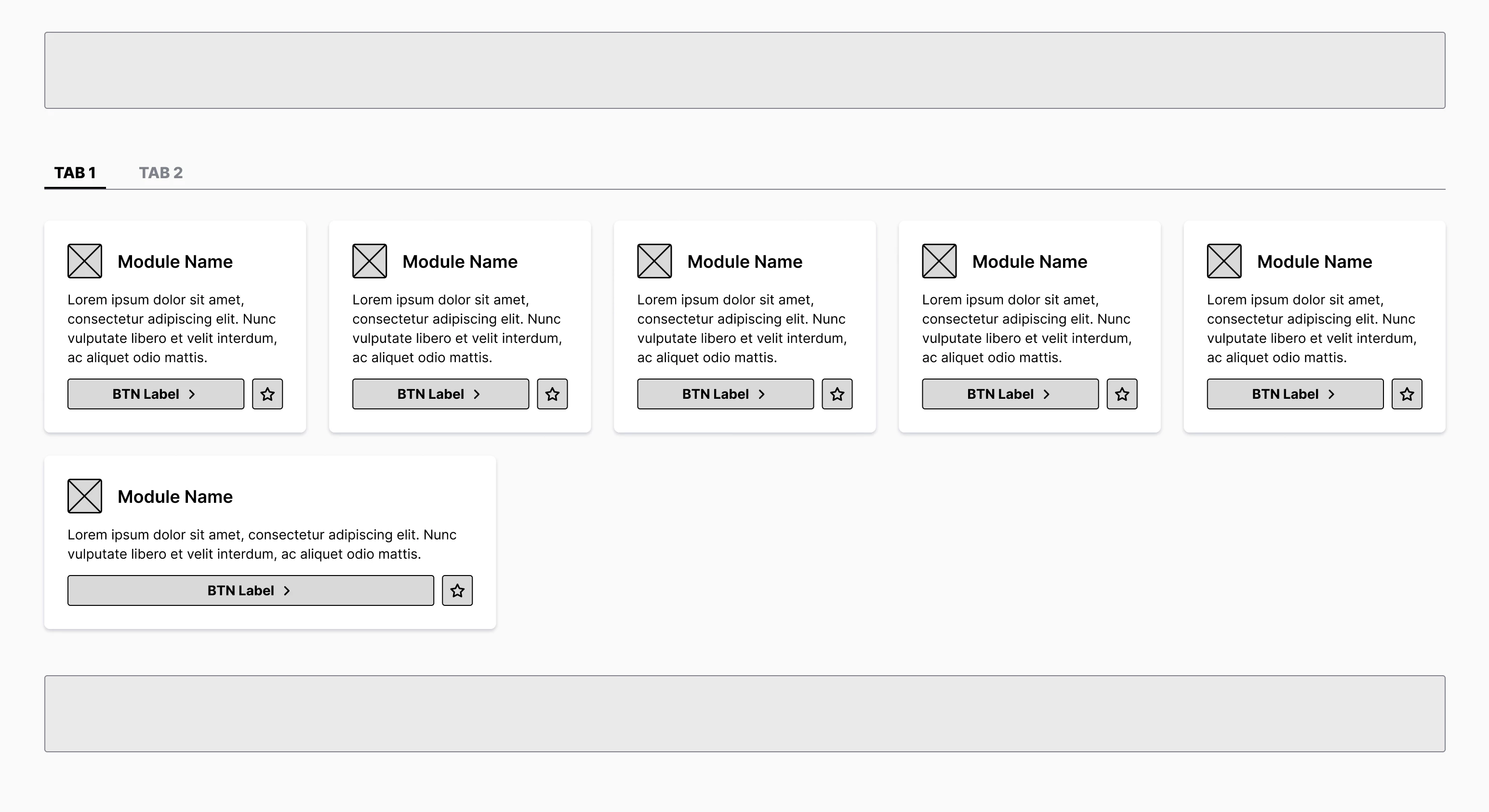
I need your help! I’m creating a grid layout with cards and auto layout.

Demo video: https://www.dropbox.com/scl/fi/uglipepcq41ox0o49cy6m/figma-cards-autolayout.mov?rlkey=1uhlzb7gksu6g7qeqvq2qtb07&dl=0
As you see in the video, there is a grid layout with cards. I have added extra invisible cards to the grid to fill the gap in the grid. Every card has Fill width and a min width. When I simulate the responsiveness, up to a certain point everything works fine. The cards resizes and moves as the window size changes. I need the wrap effect to display mmore acrds on a row if the screen is bigger, fewer if thescreen shrinks. But as you see the last card cannot resize as I wish (also because the invisible cards on the right) after a bigger screensize. Also the invisible cards creates an empty row at a wide screen width. This empty row remains when I switch to the second tab. Is there a solution for this? I need to present the responsiveness and the empty row didn’t help. :(
